November 5, 2024
🌟 New Features
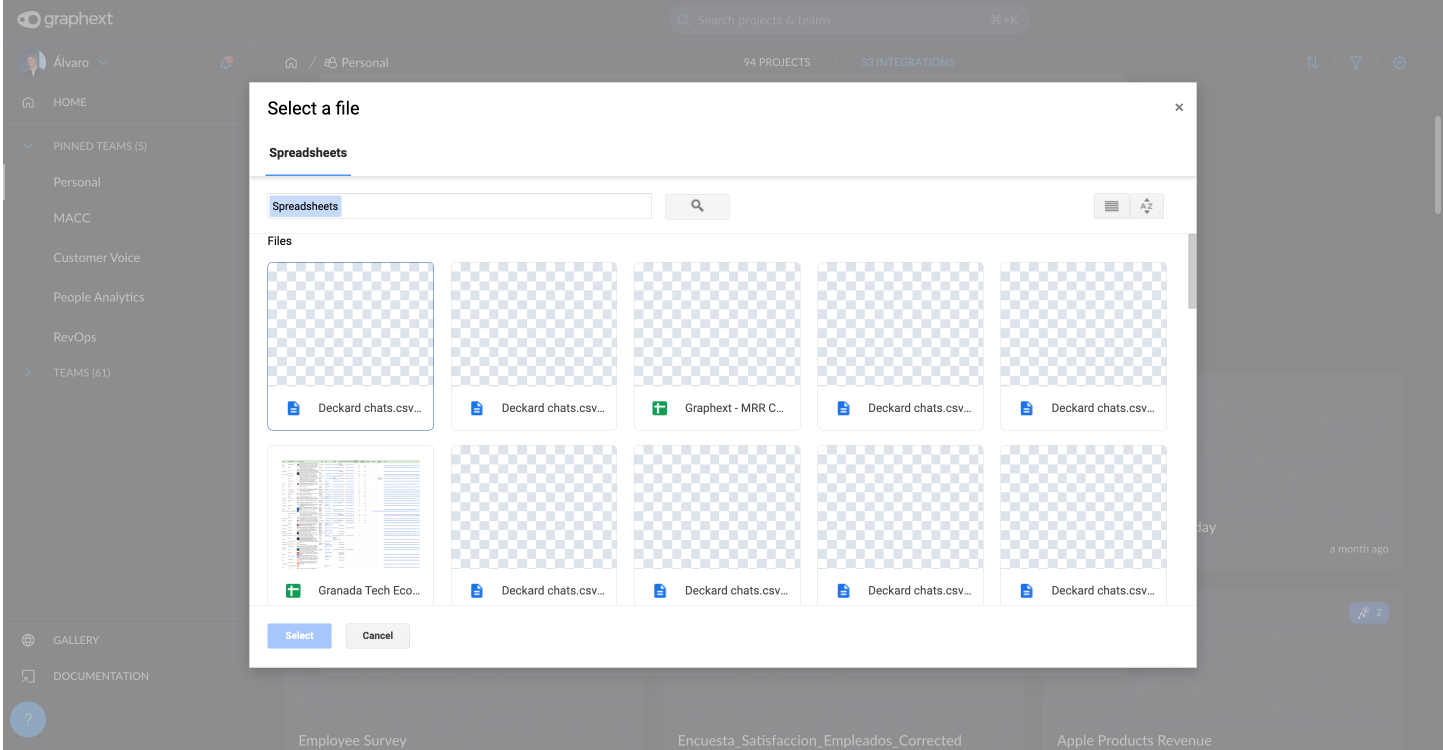
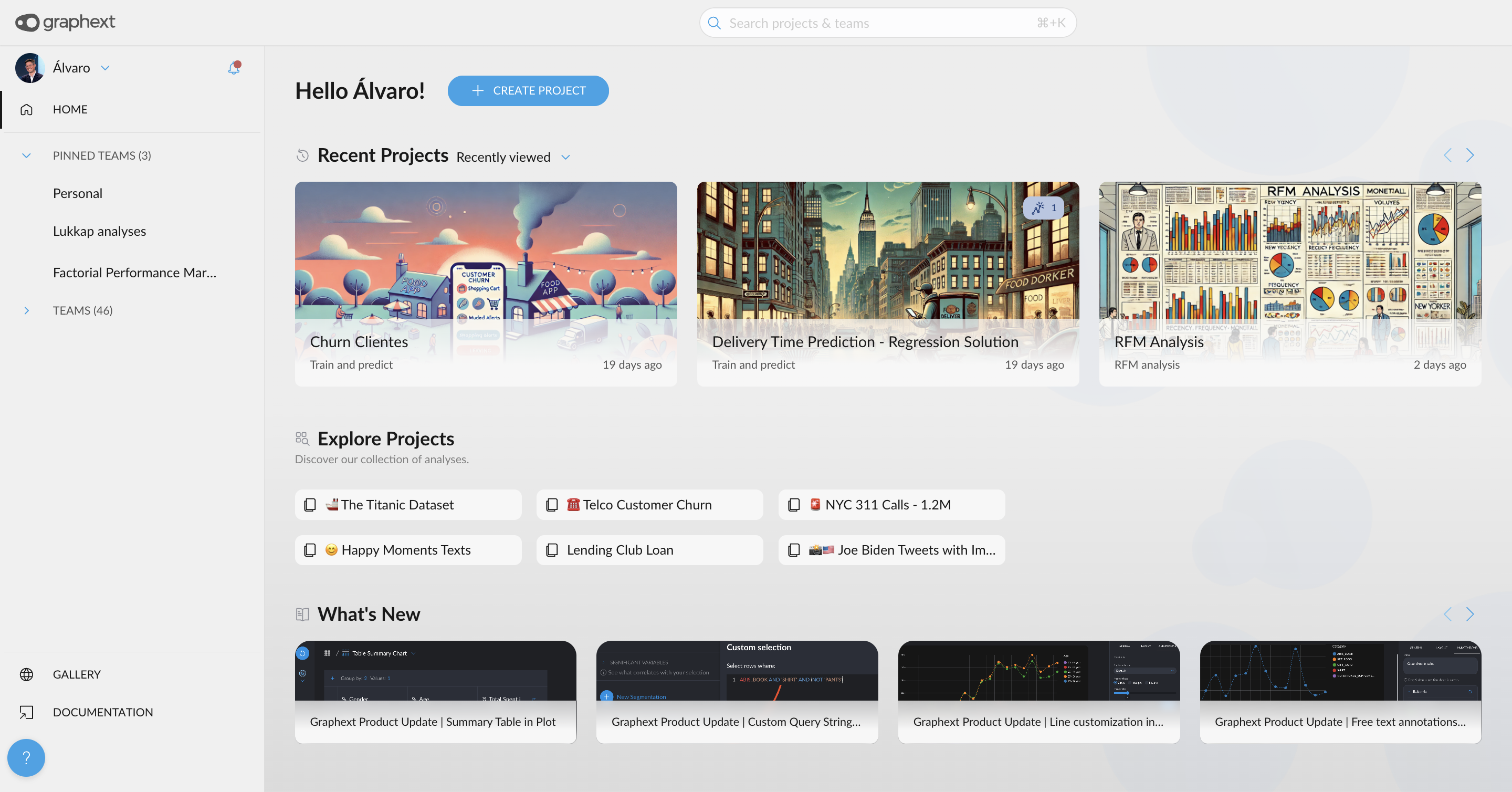
- Hall Redesign Implementation: The Hall has been redesigned for better clarity and navigation. The distinction between Home and Teams is now clearer, offering a more intuitive experience. Additionally, "What's New" is updated more frequently, and recent projects now include more filtering options, such as recently created, recently updated, recently refreshed, recently viewed, and Trending Projects coming soon
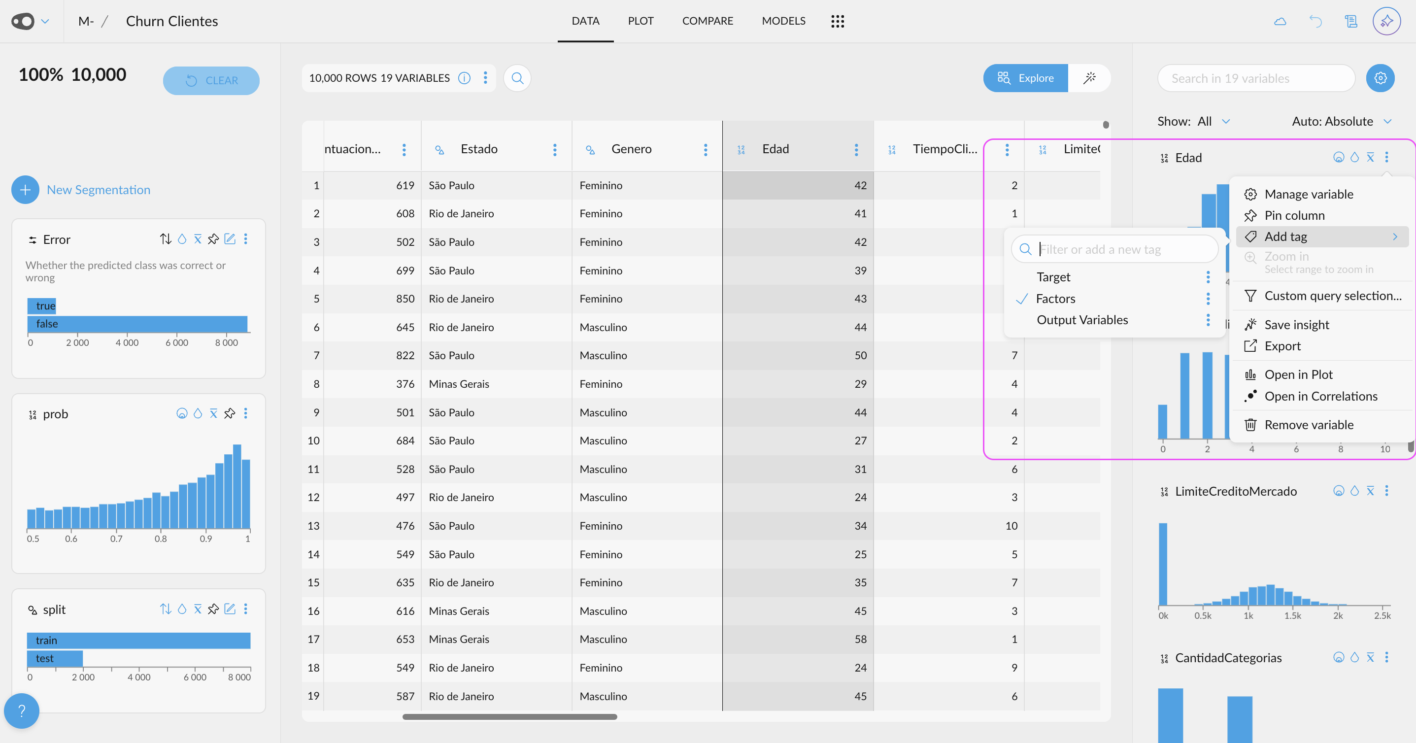
- Quick Variable Tagging from Other Sections: You can now tag variables quickly from other sections, not just from the VM, making it easier and more efficient to tag relevant variables across your workflow. This feature is especially useful during EDA (Exploratory Data Analysis) before training a predictive model, allowing you to tag variables, such as those with high correlation to your target, for more focused analysis.
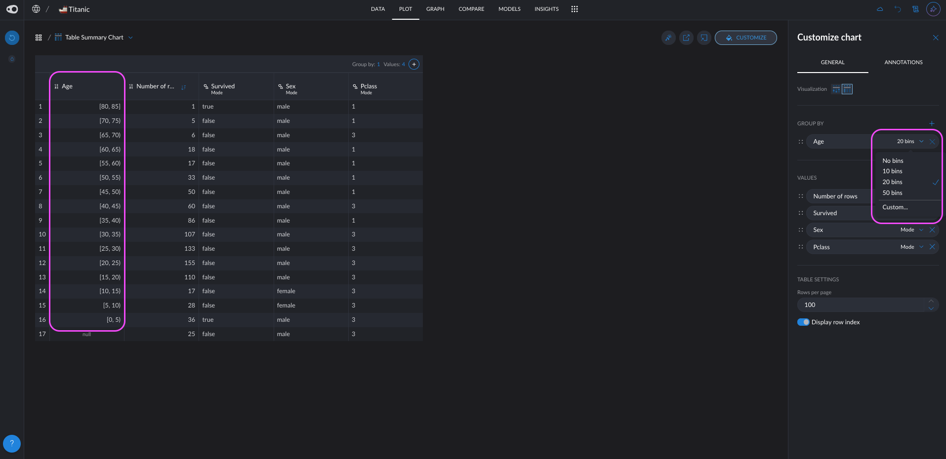
- Discretization for Numeric Columns in Group_By: Implement the ability to create bins when using a numeric column for group_by, allowing for more granular grouping of data by dividing numeric values into specified ranges or intervals
🛠️ Improvements
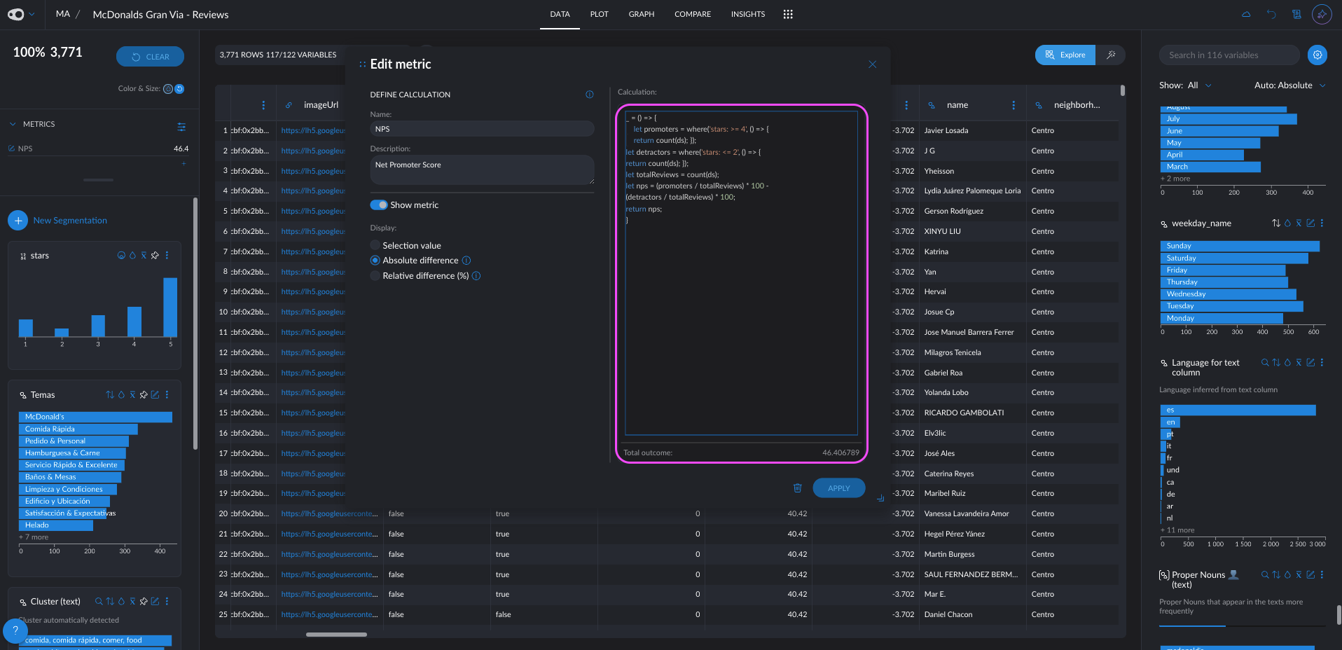
- Metrics Formula Editor with Syntax Highlighting and Autocompletion: Edit your metric formulas with ease using a new formula editor that includes syntax highlighting and autocompletion, making it faster and more intuitive to create and modify formulas.
🐛 Bug Fixes
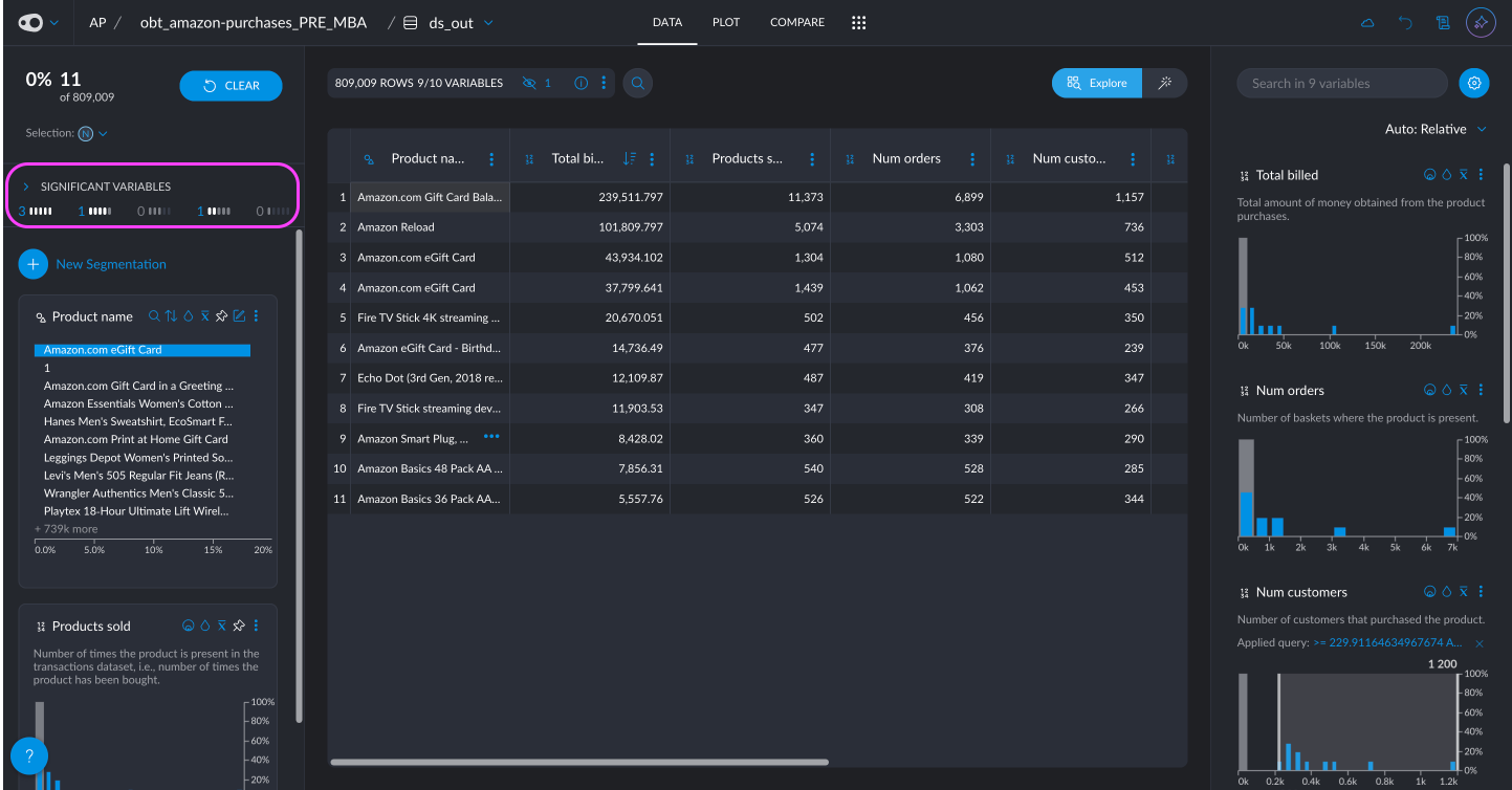
- Fix for Significant Variable Navigation: We have fixed the issue where clicking on a significant variable would not take you to the crossfilter if the "Show" was set to a specific group of tags. Now, it will automatically change the "Show" to "ALL", ensuring smooth navigation and proper visualization.
🎨 UI Updates
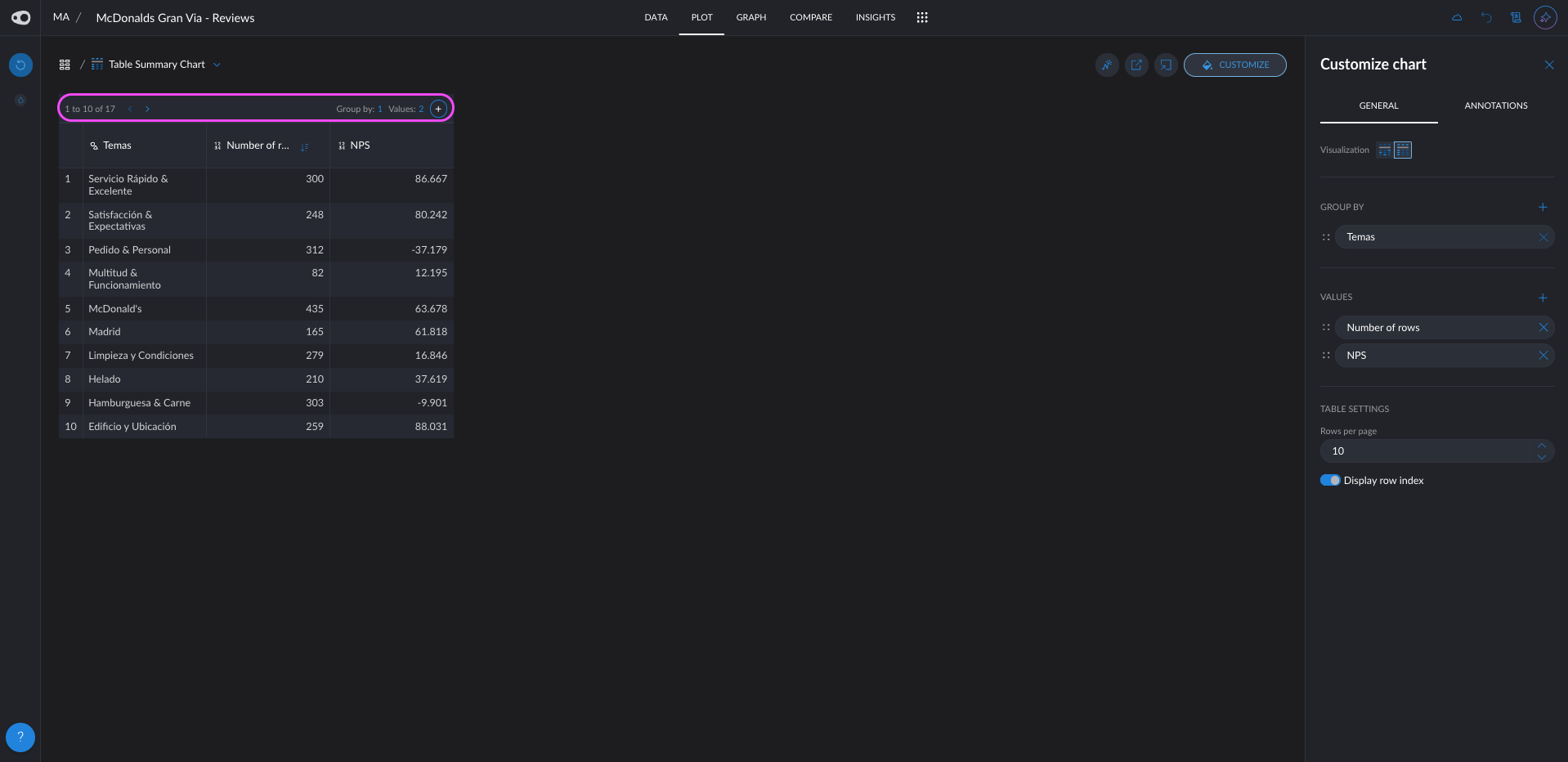
- Updated Table Header in Plot: The header of the tables in plots has been rearranged for improved usability. The "+" button is now positioned on the right, while the pagination is moved to the left, offering a more intuitive layout for managing and navigating tables.
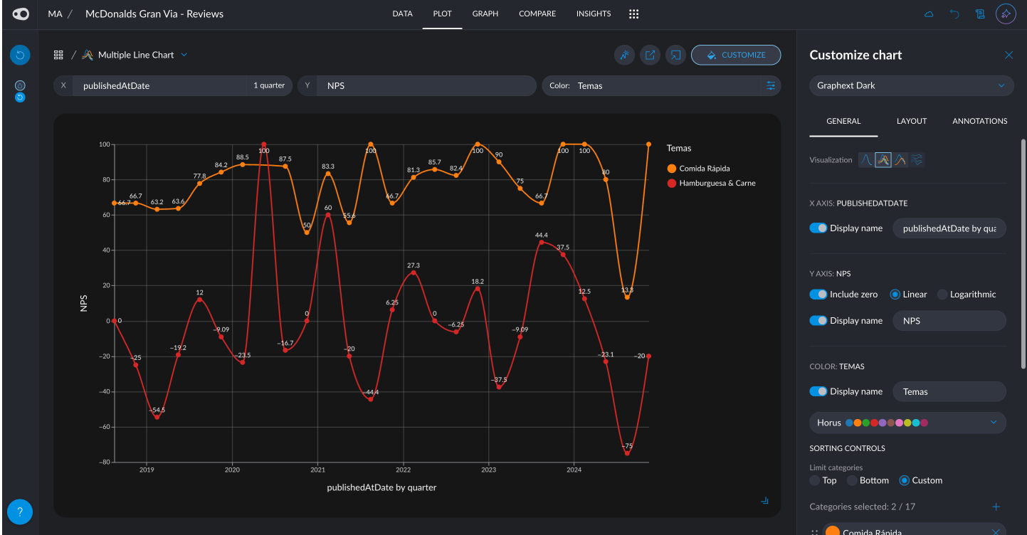
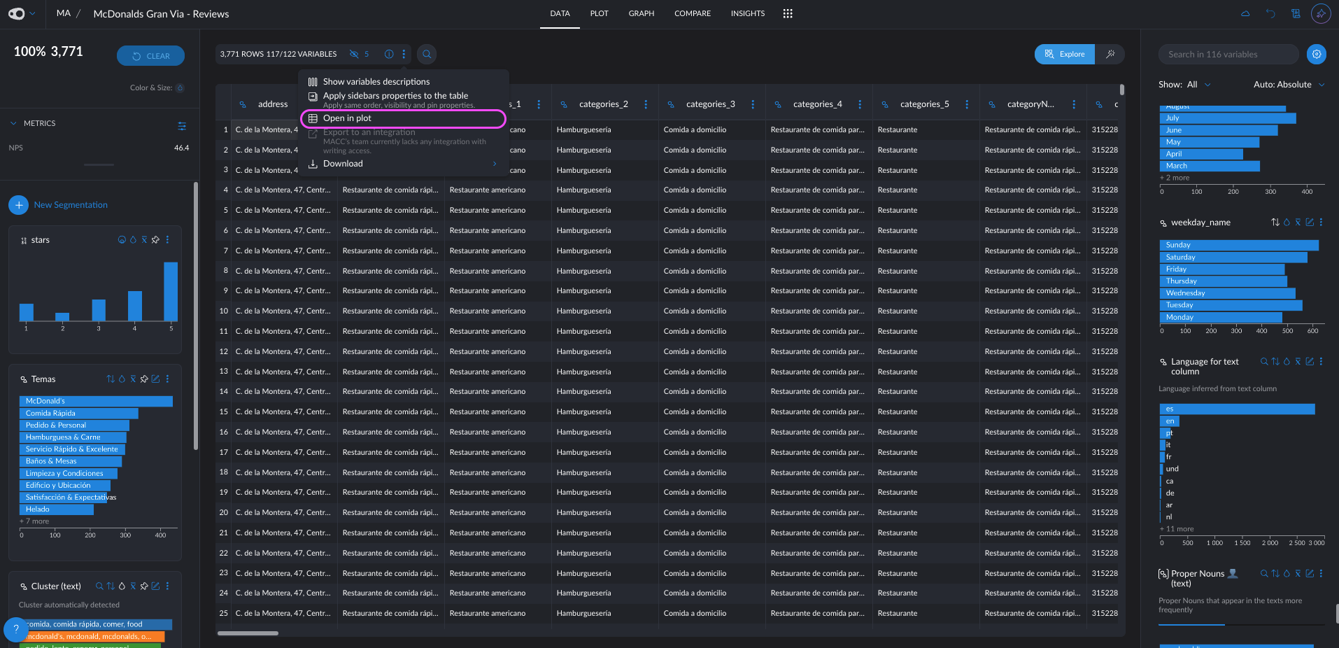
- Shortcut to Open Plot from Data Table: Easily open the plot directly from the data table with a new shortcut, streamlining the transition between data exploration and visualization for more efficient analysis.
🔧 Technical Updates
- Optimize metrics aggregation