January 7, 2025
🌟 New Features
- Integrations Navigation and Query Preview: Connecting to your data source just got smarter! Graphext now validates your connection before proceeding, reducing errors and saving you time. Once connected, explore your data warehouse with a navigation panel on the left-hand side. Click on tables to preview their structure, including variable names and data samples. You can even preview query outputs, such as joins, before creating your Graphext project. Watch the video example to see this streamlined workflow in action!
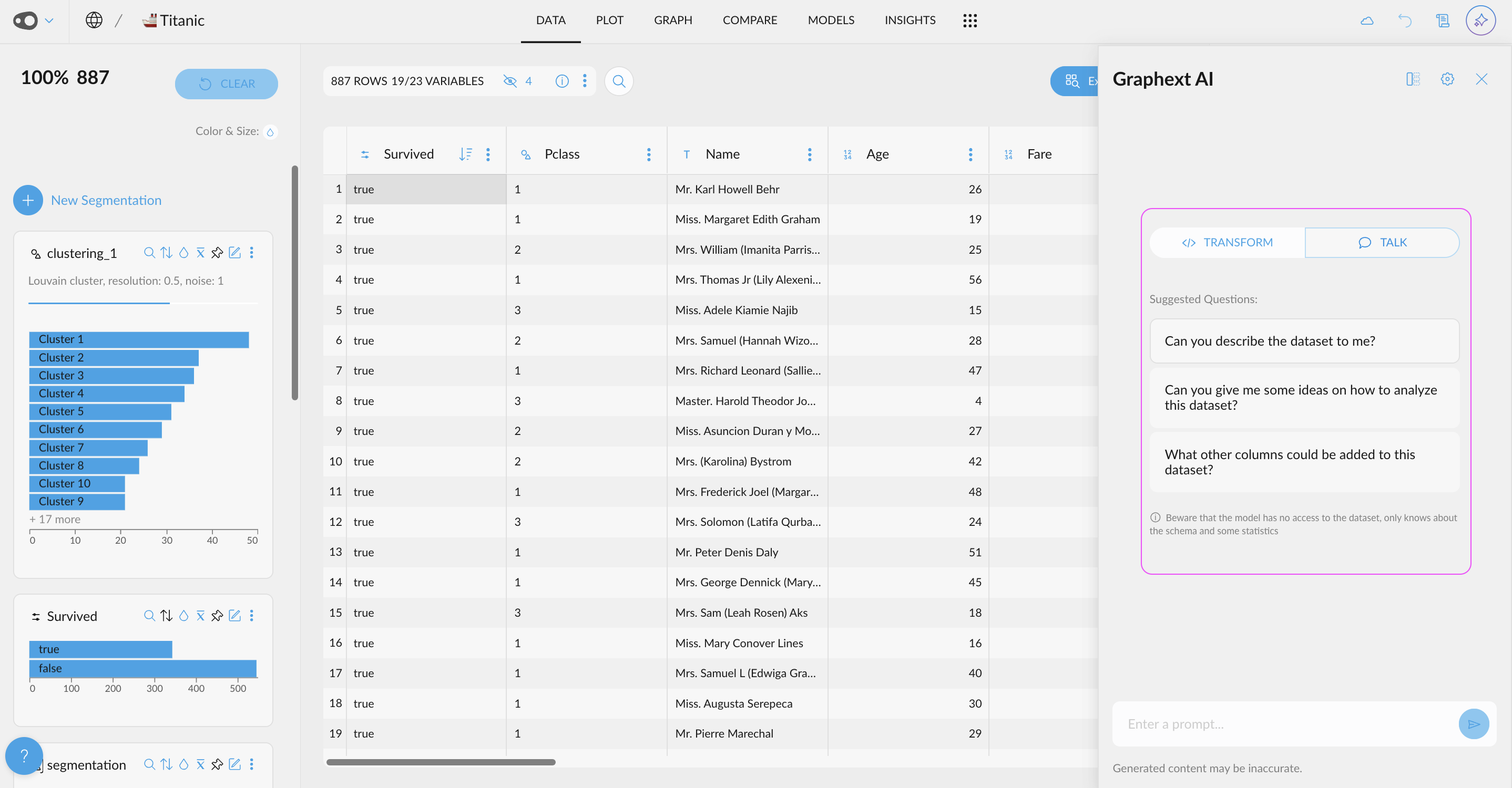
- Chat Freely with the AI About Your Data: Introducing a toggle to switch modes in the AI Chat! Seamlessly switch between Chat Freely mode for open-ended questions and Transformations mode to focus on specific data operations.
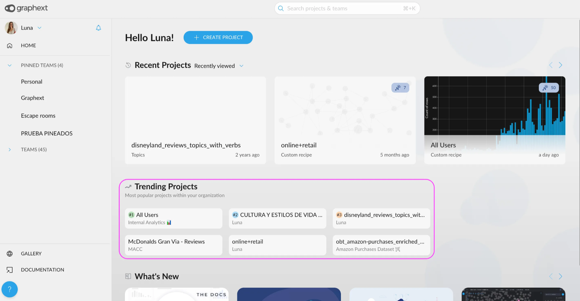
- Discover Trending Projects in the Home Section: Find out what’s buzzing in your team! A new section in the Home view highlights recently visited projects from teams you’re part of. Stay informed about the projects generating the most interest and quickly find the ones your teammates are discussing in daily meetings.
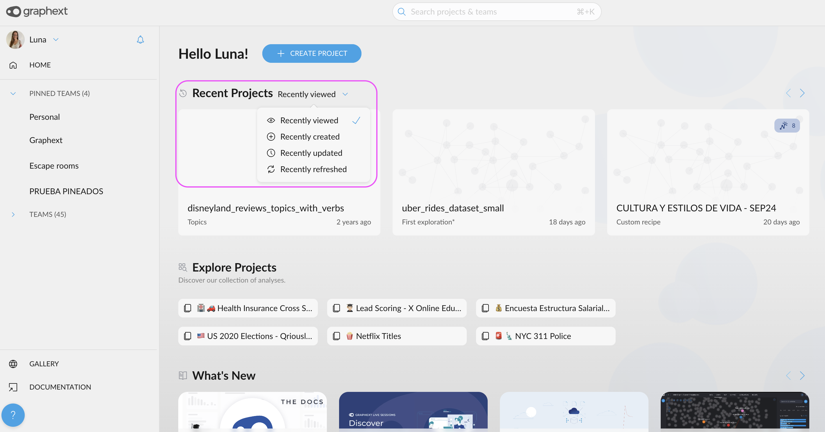
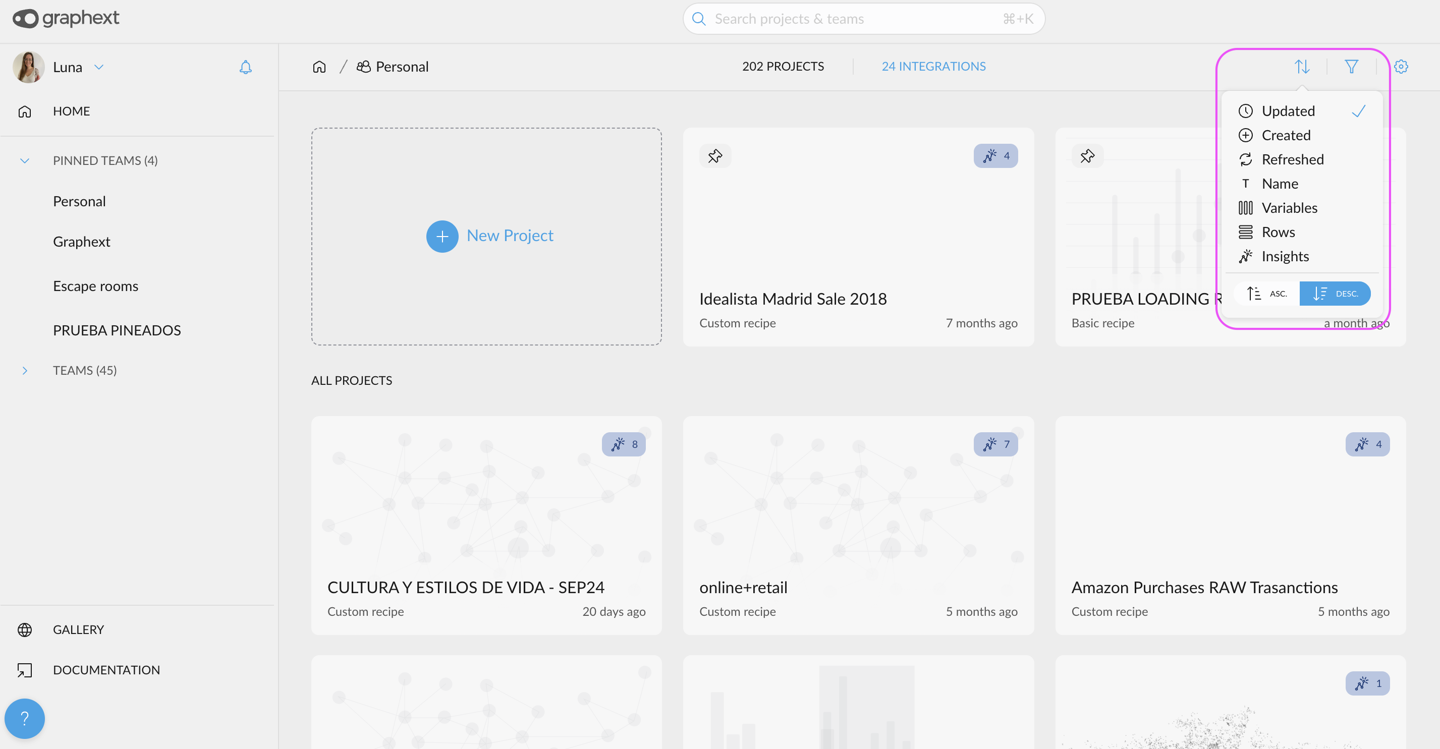
- New Filter & Sorting Criteria for Projects: Organize your projects with greater flexibility. In both the Home and Team views, you can now sort projects by additional criteria: viewed, created, updated, and refreshed. Find what you need faster than ever!
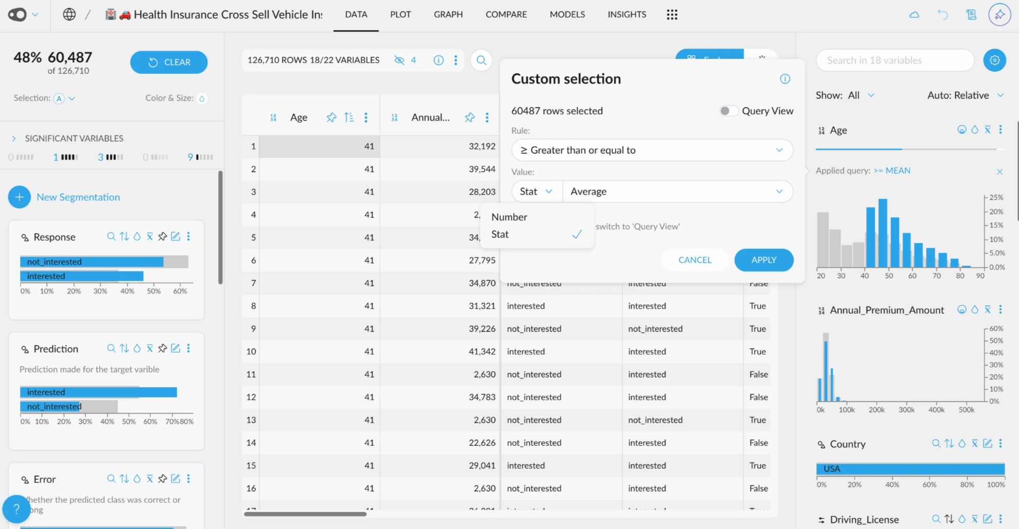
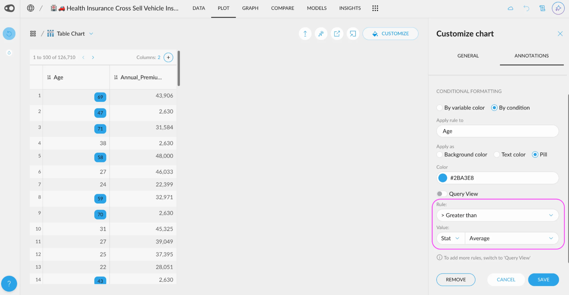
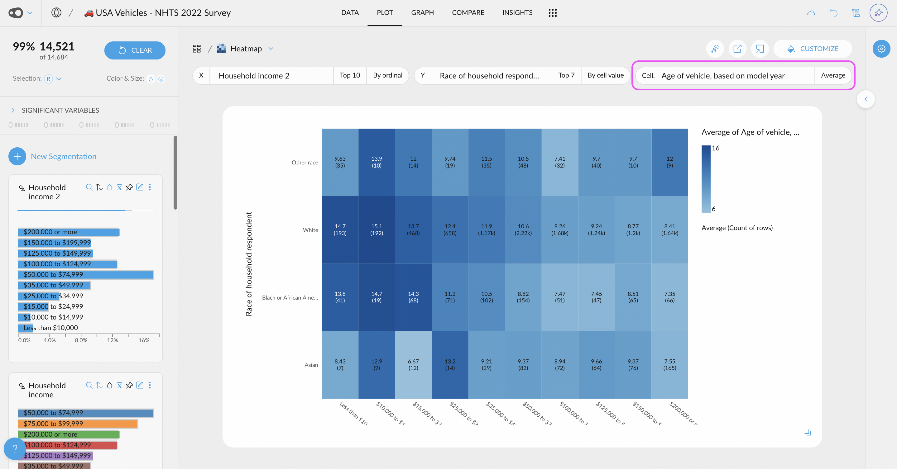
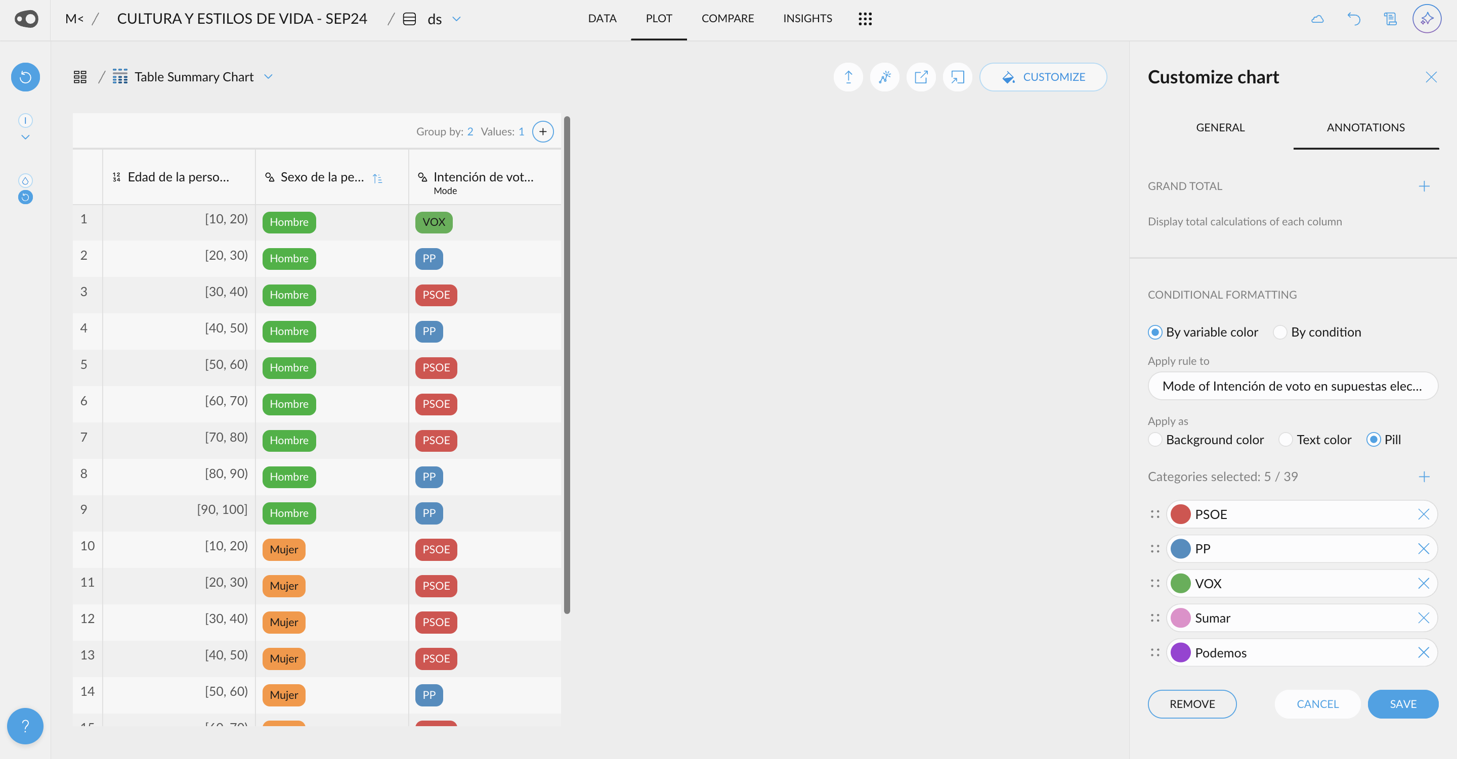
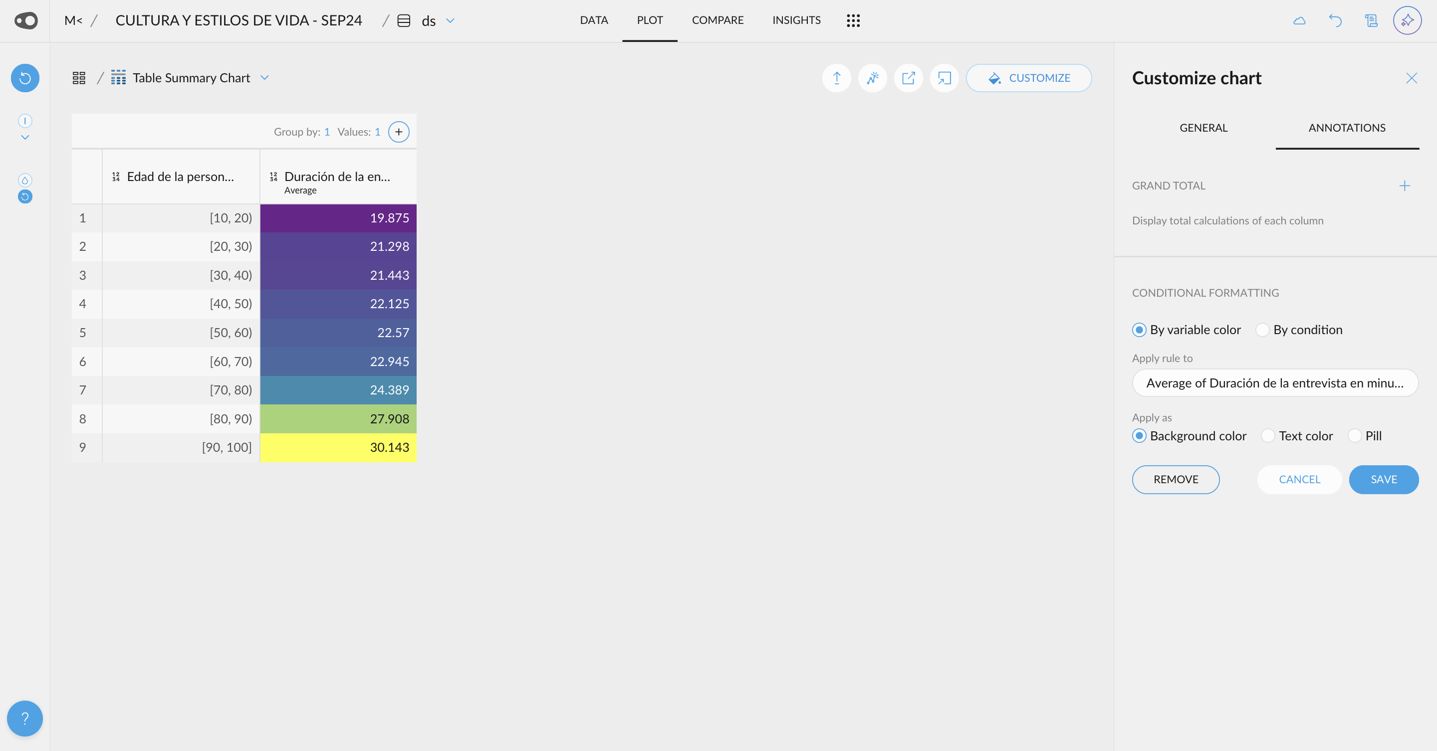
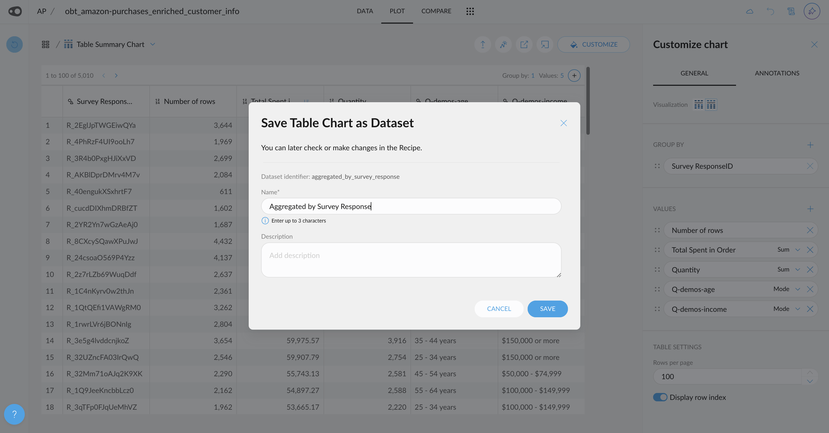
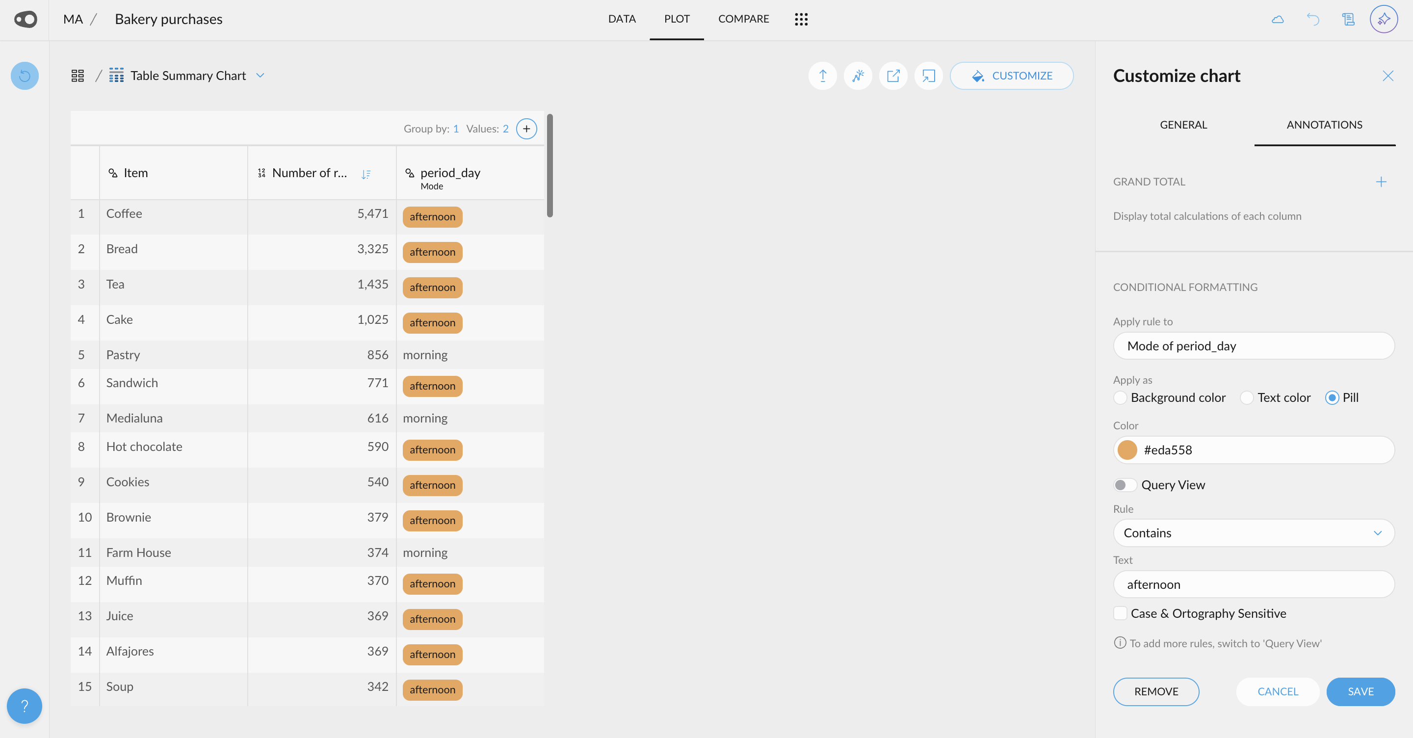
- New UI for Quantitative Variable Selections: A new user-friendly interface allows you to customize your selections with just a few clicks. You can also use this UI, for the coloring rules in the table in plot