Docs Pricing

What's new in Graphext?

Page 1Next
March 18, 2025

New AI Data Enrichment, Metrics with AI, SHAP values visualizer and much more…

🌟 New Features

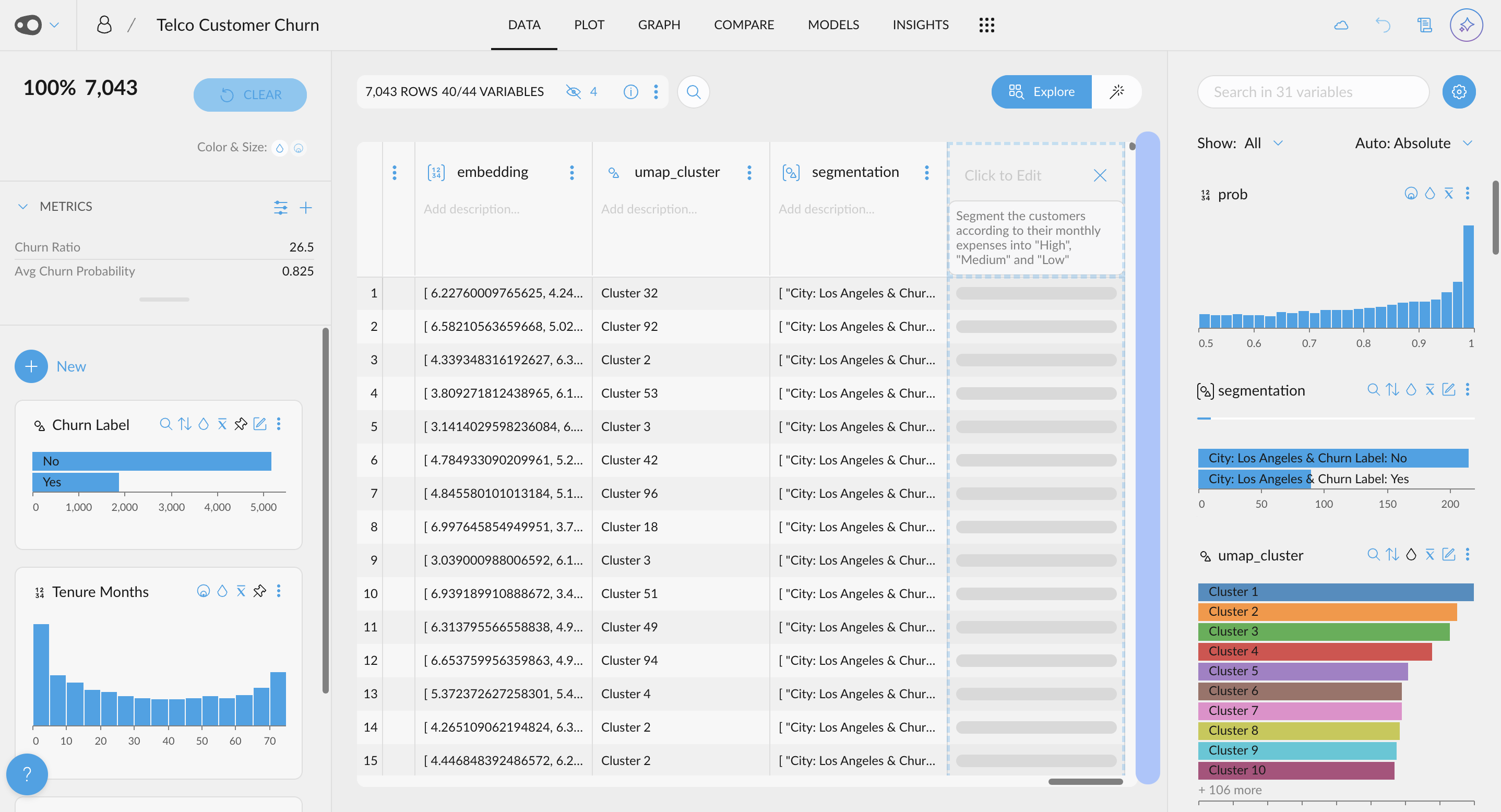
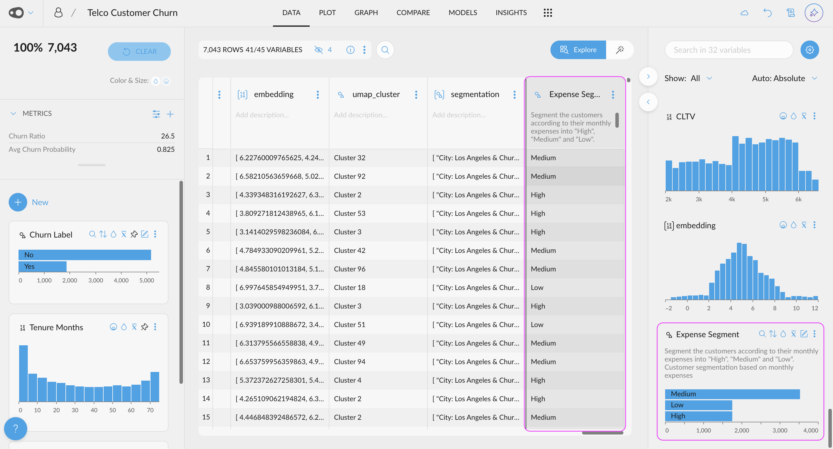
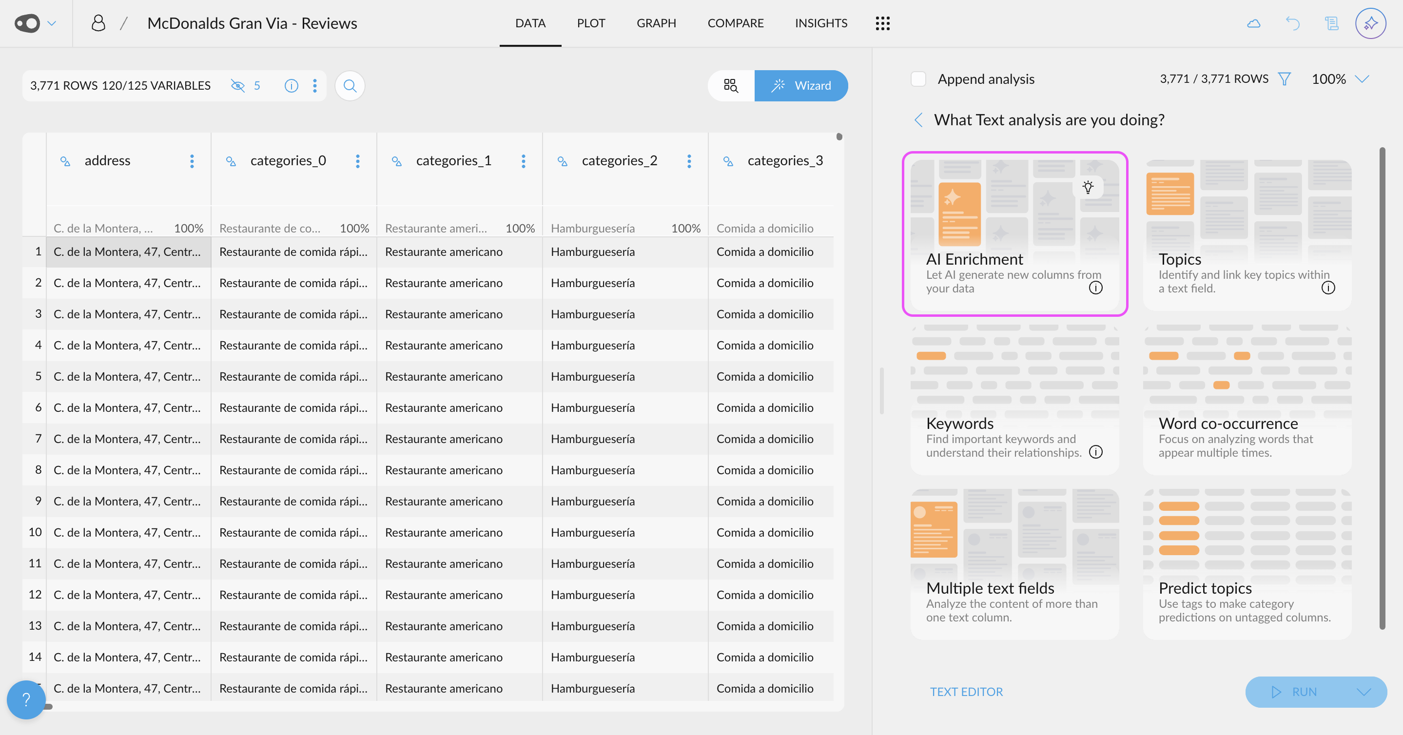
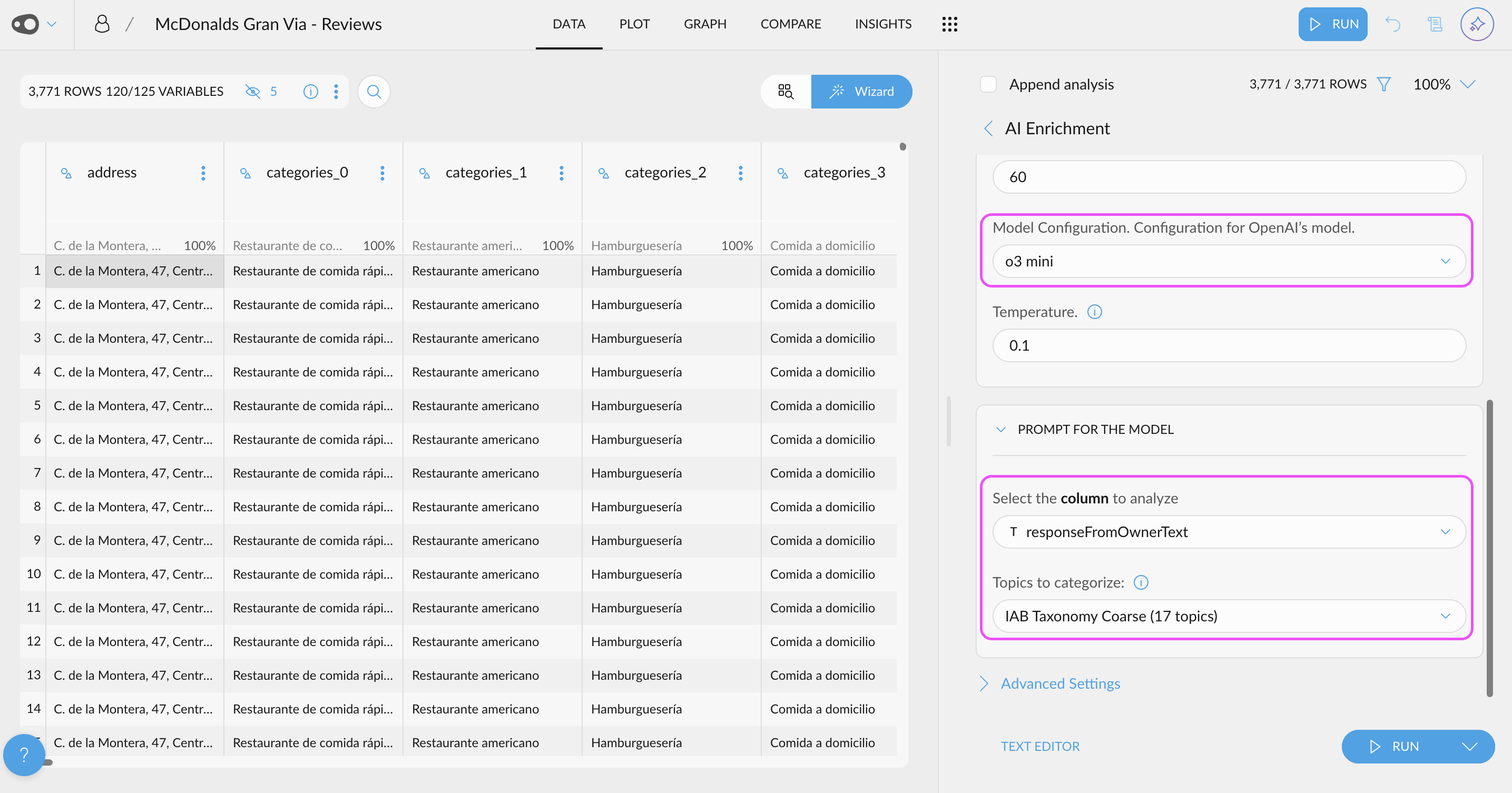
  • New AI Enrichment UI: We've revolutionized data enrichment with AI through a new, optimized UI for data analysis. Now, you can leverage the power of LLMs using your OpenAI API key to automatically generate new columns—for example, classifying text as fact or opinion. You can also categorize content based on custom topics relevant to your business or use standard taxonomies like IAB. Once enriched, you can explore these new columns alongside your existing data—for instance, analyzing the main topics of negative reviews—to uncover deeper insights and trends.

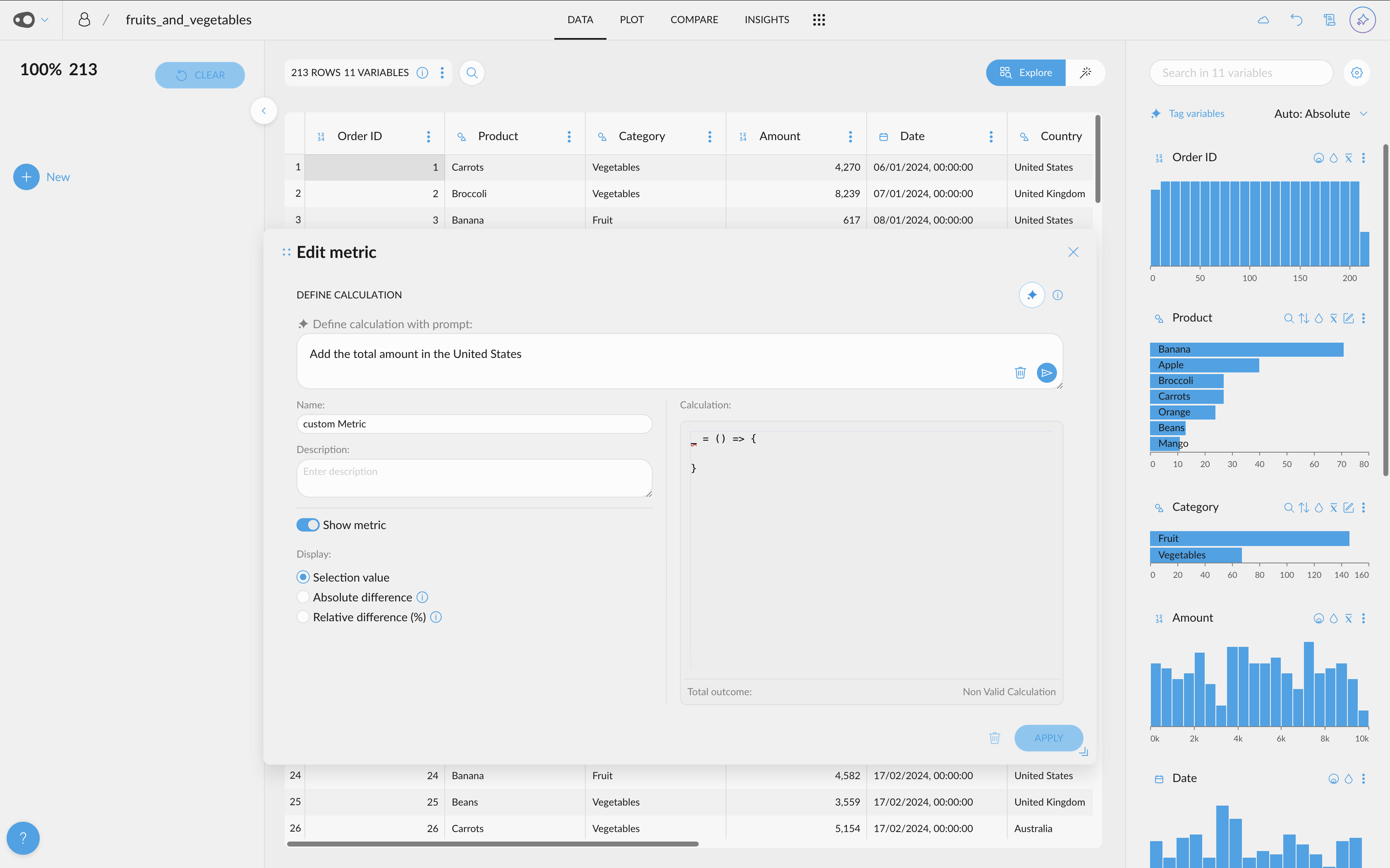
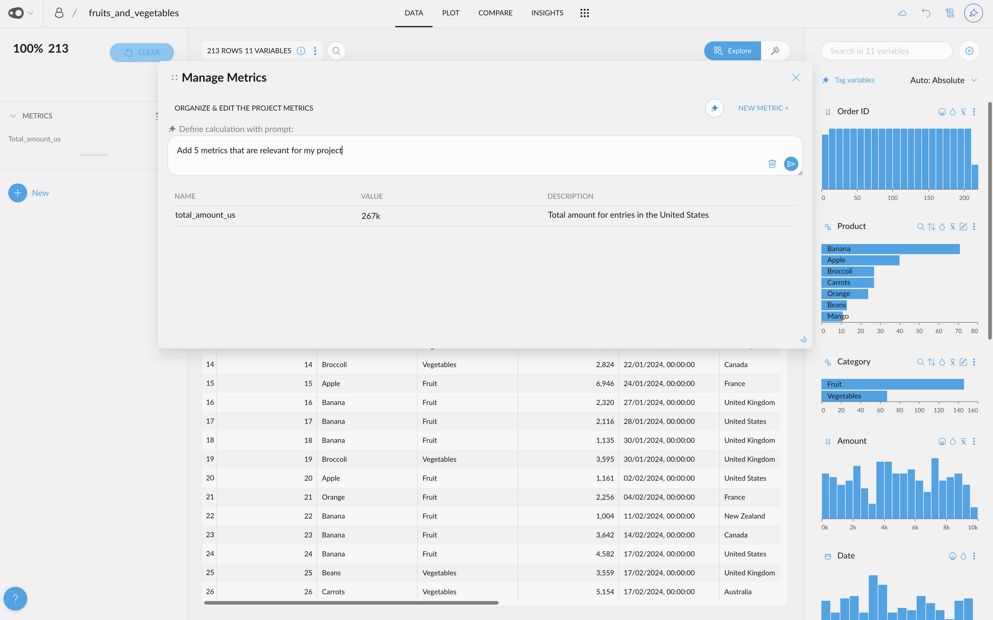
  • AI-Powered Metric Creation. Use AI to generate metrics! Effortlessly generate new metrics from scratch, refine existing ones, and even create multiple metrics at once.

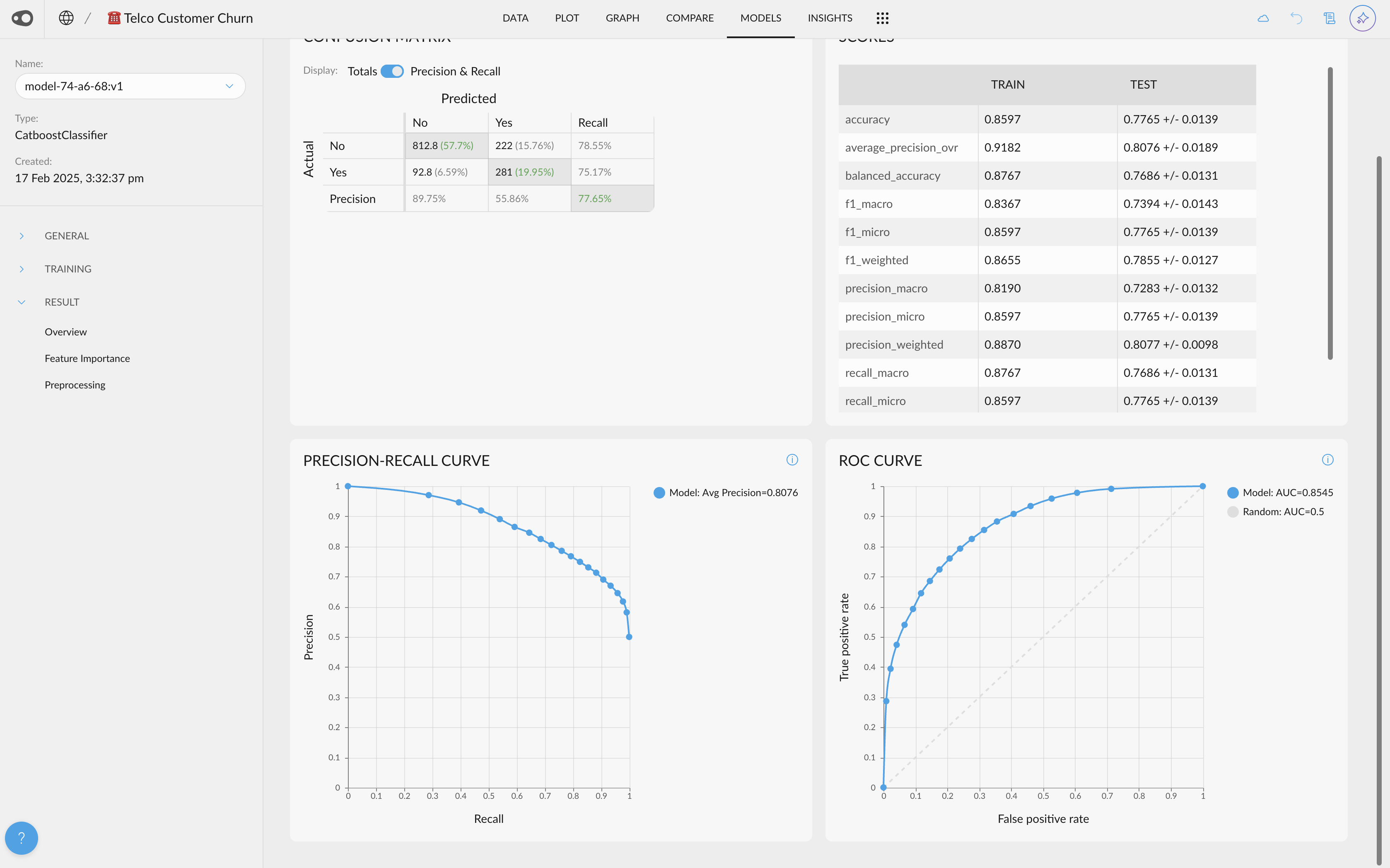
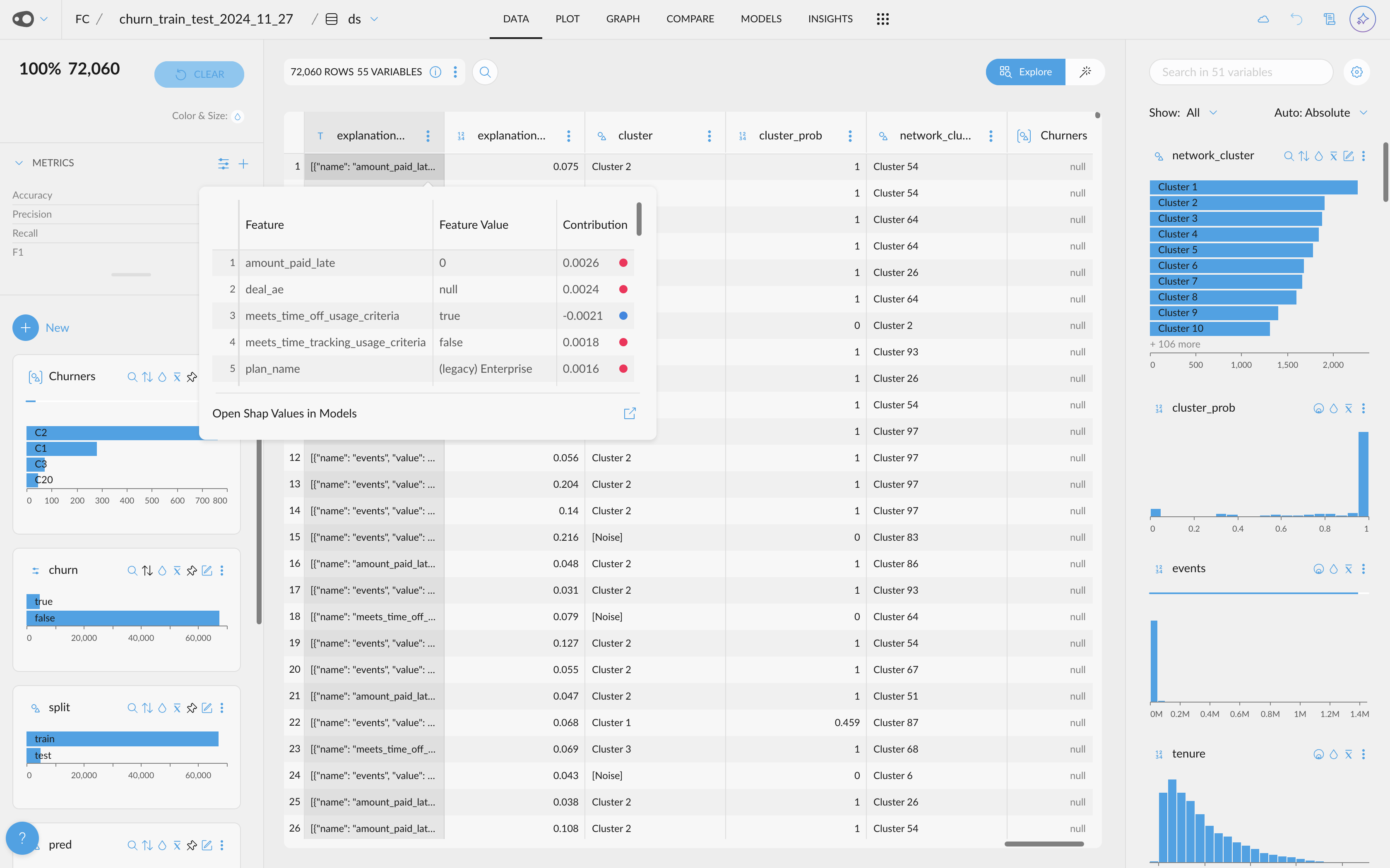
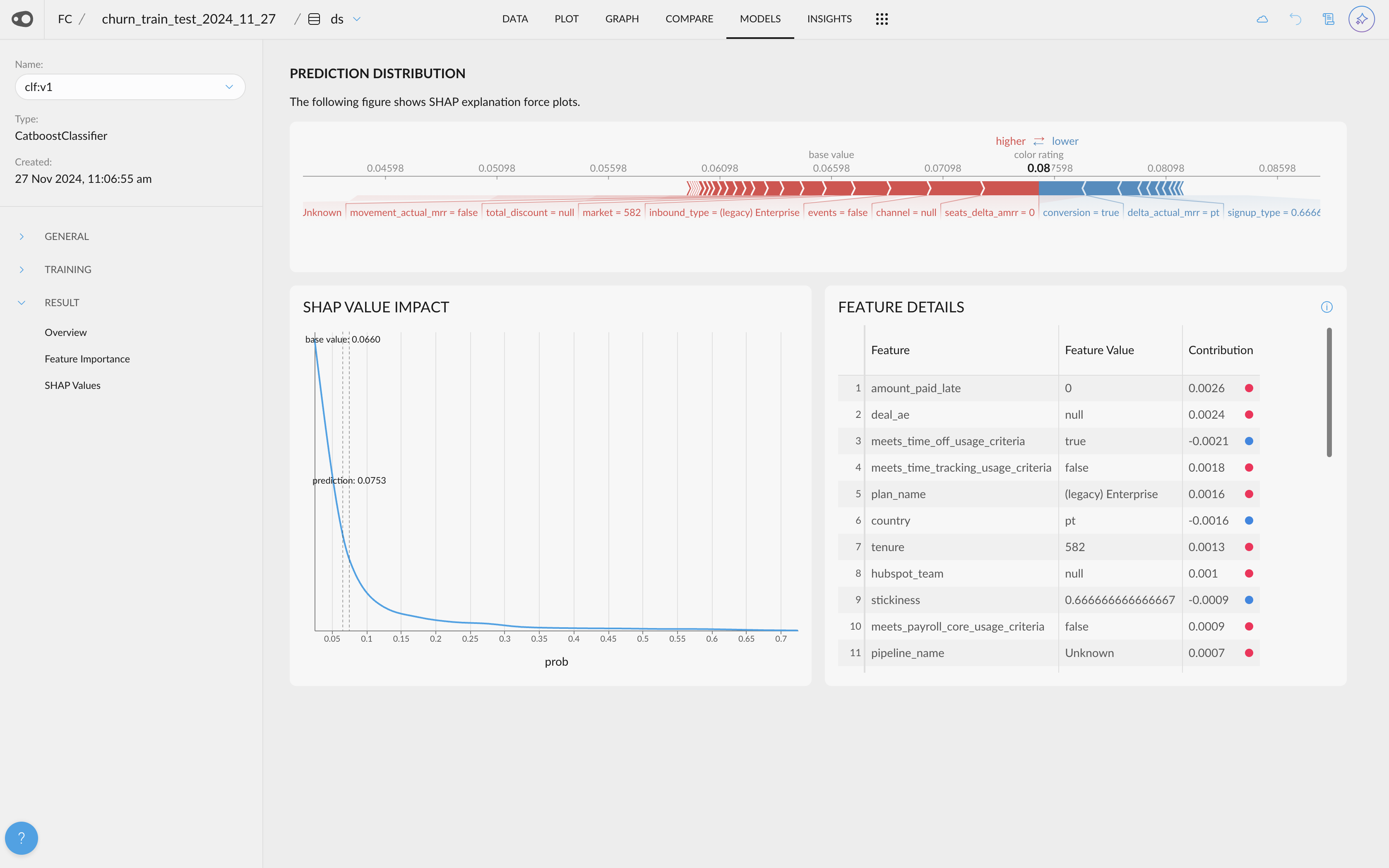
  • Shap Values Visualization. If your project has a column with Shap Values (this can be done by adding the explain_predictions step to the recipe), you will be able to access their visualization.

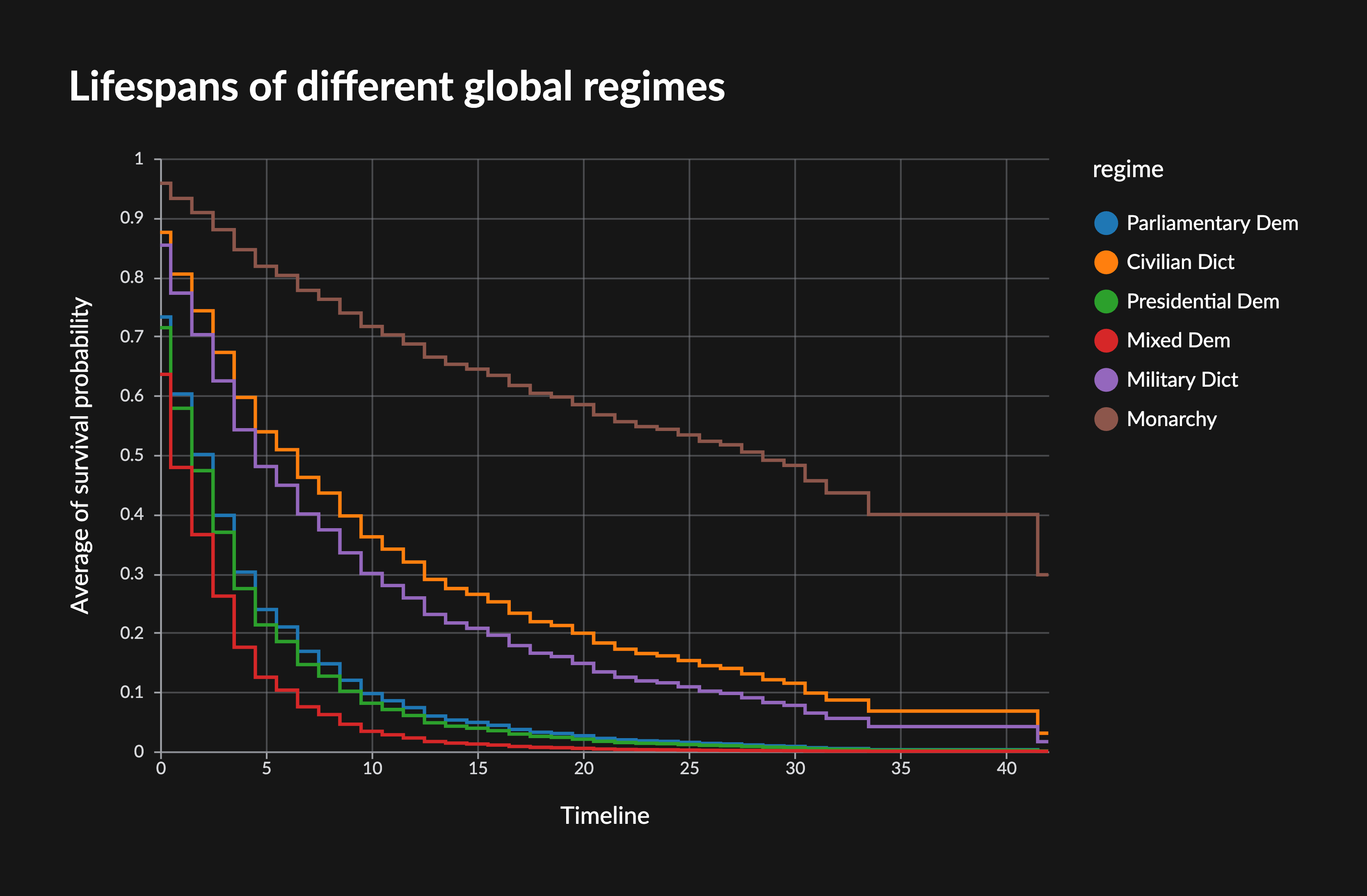
  • Survival models and functions. You can now train Cox-proportional hazard models in Graphext and predict scalar values (median/expected/percentile survival duration) as well as whole survival functions (probability of survival over time). Adds steps to train and predict with survival models. Hazard models are also called time-to-event models, and estimate the risk or probability of an event happening at different points in time (think customer churn, time to signup etc.).

🛠️ Improvements

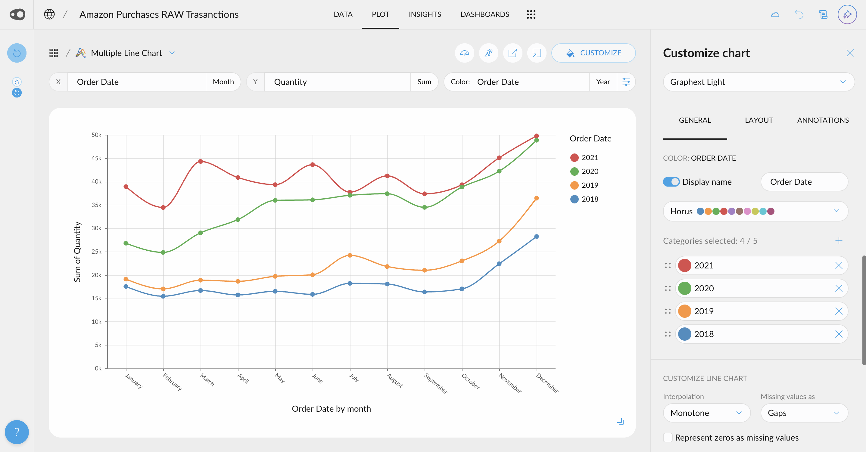
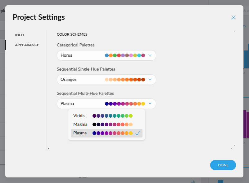
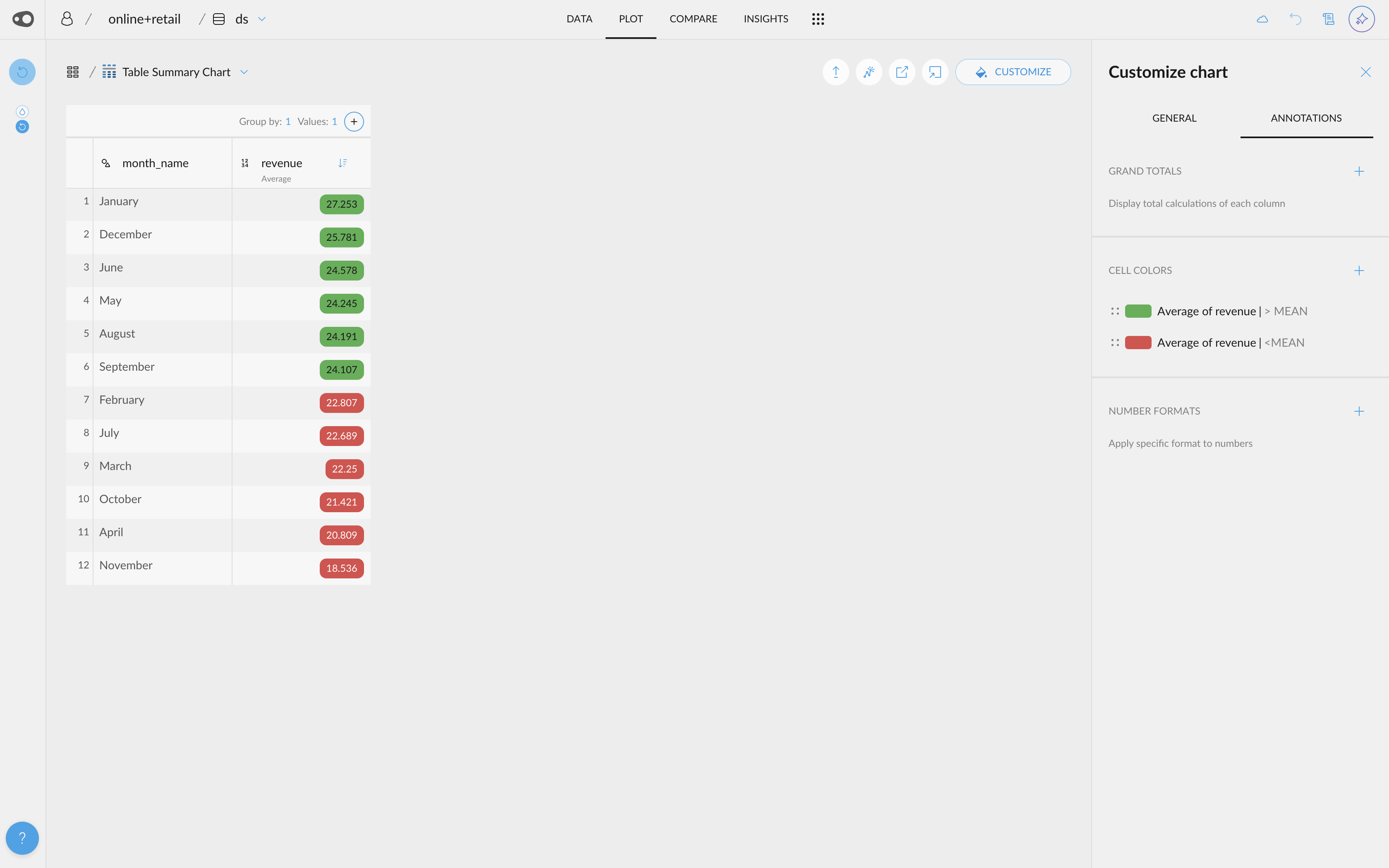
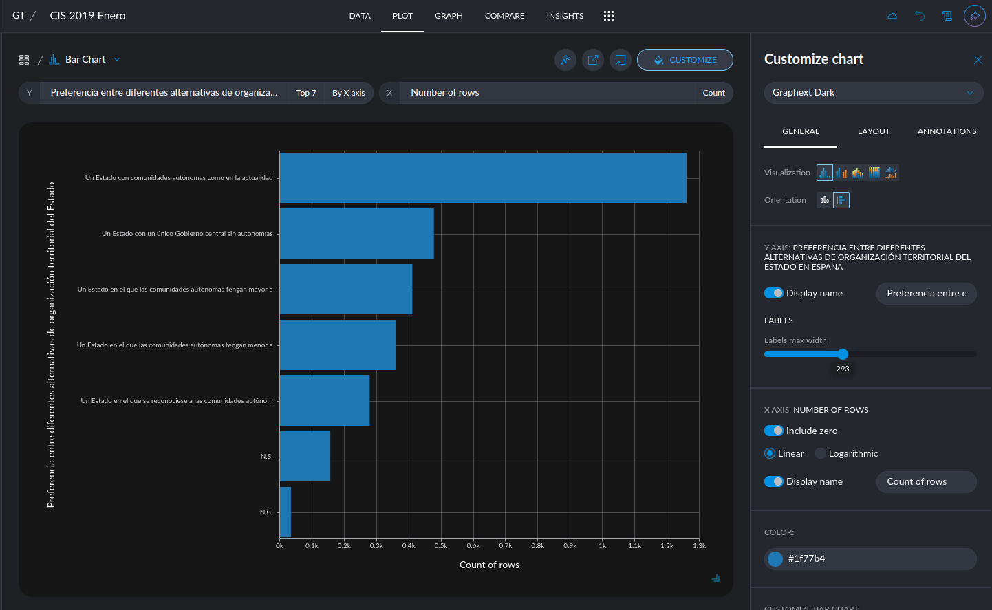
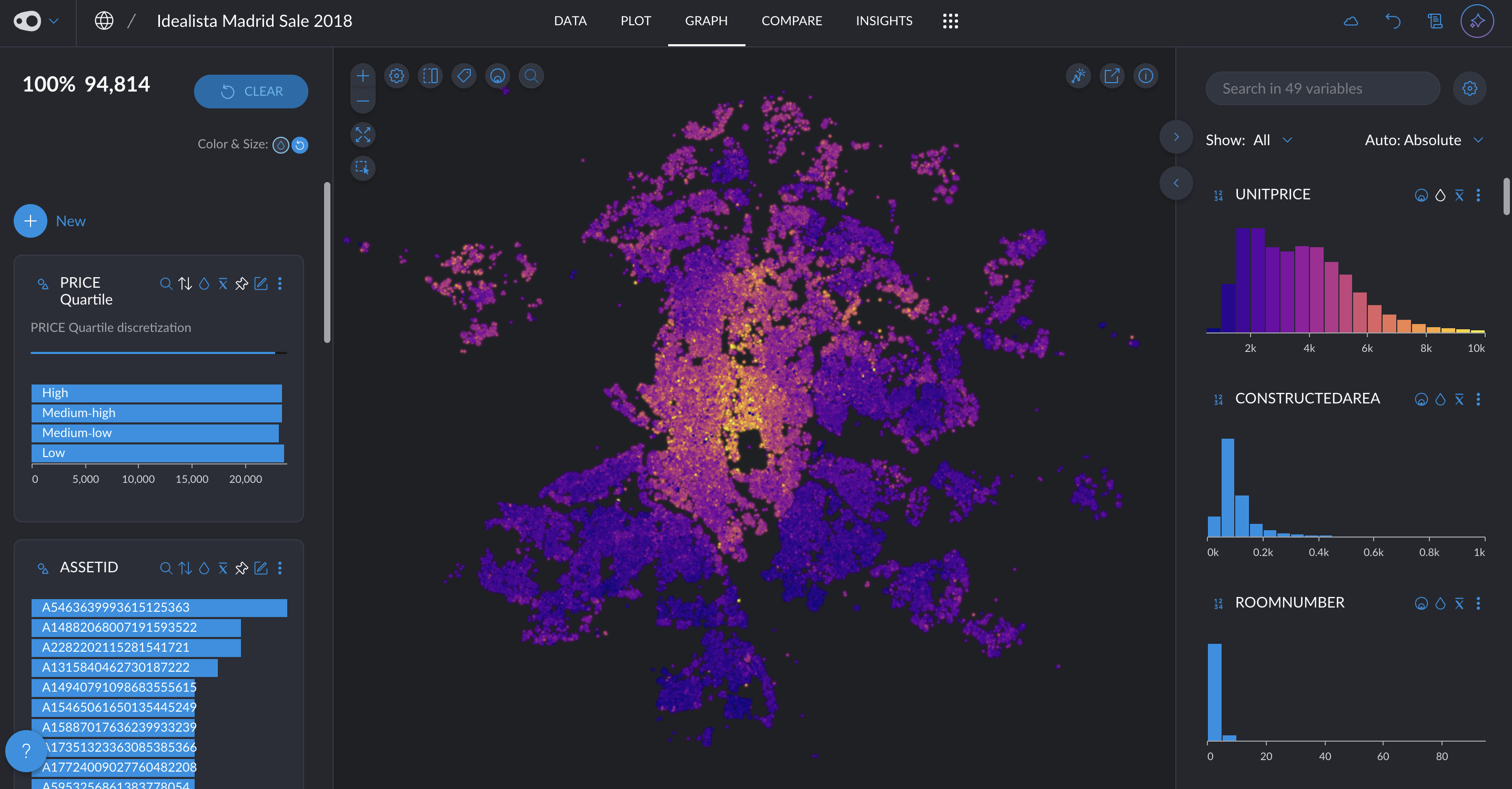
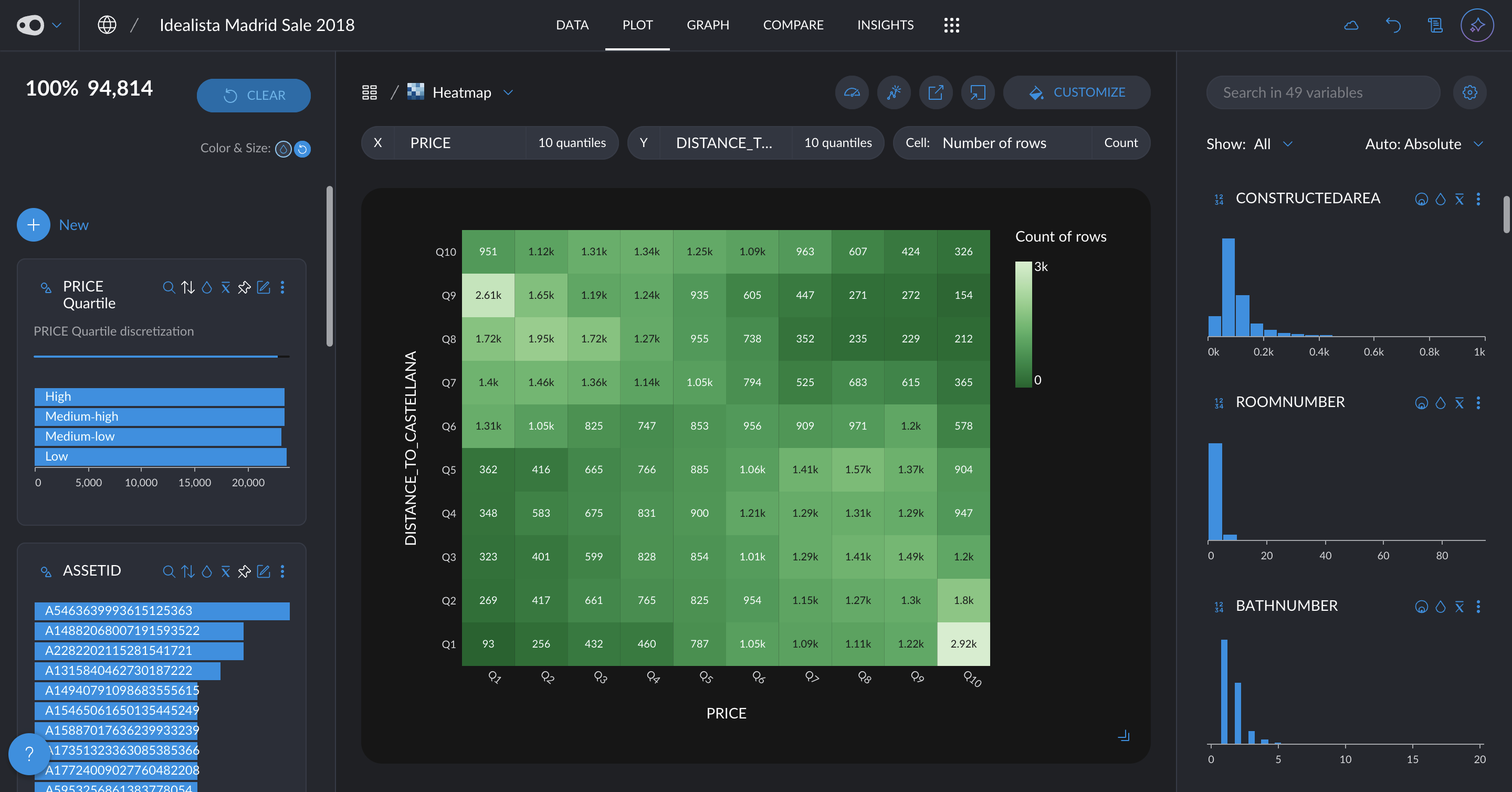
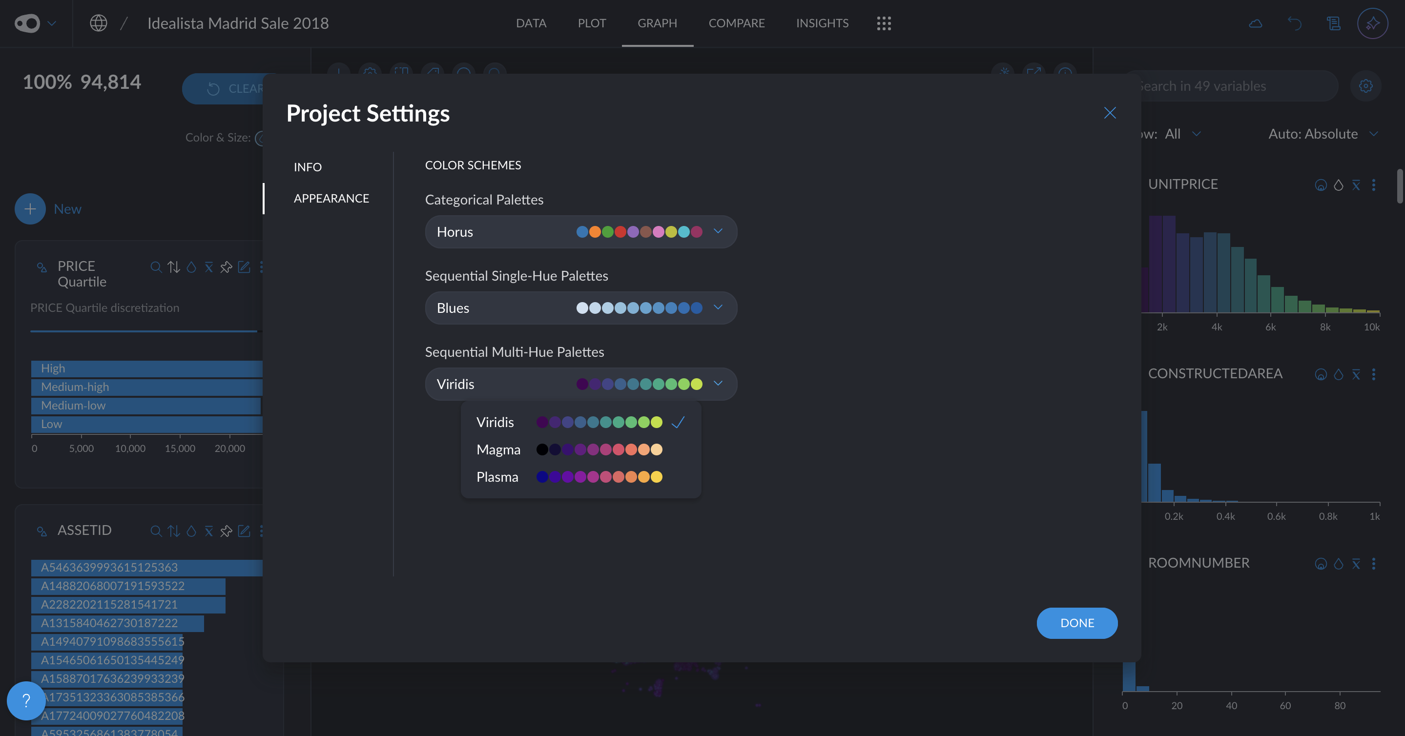
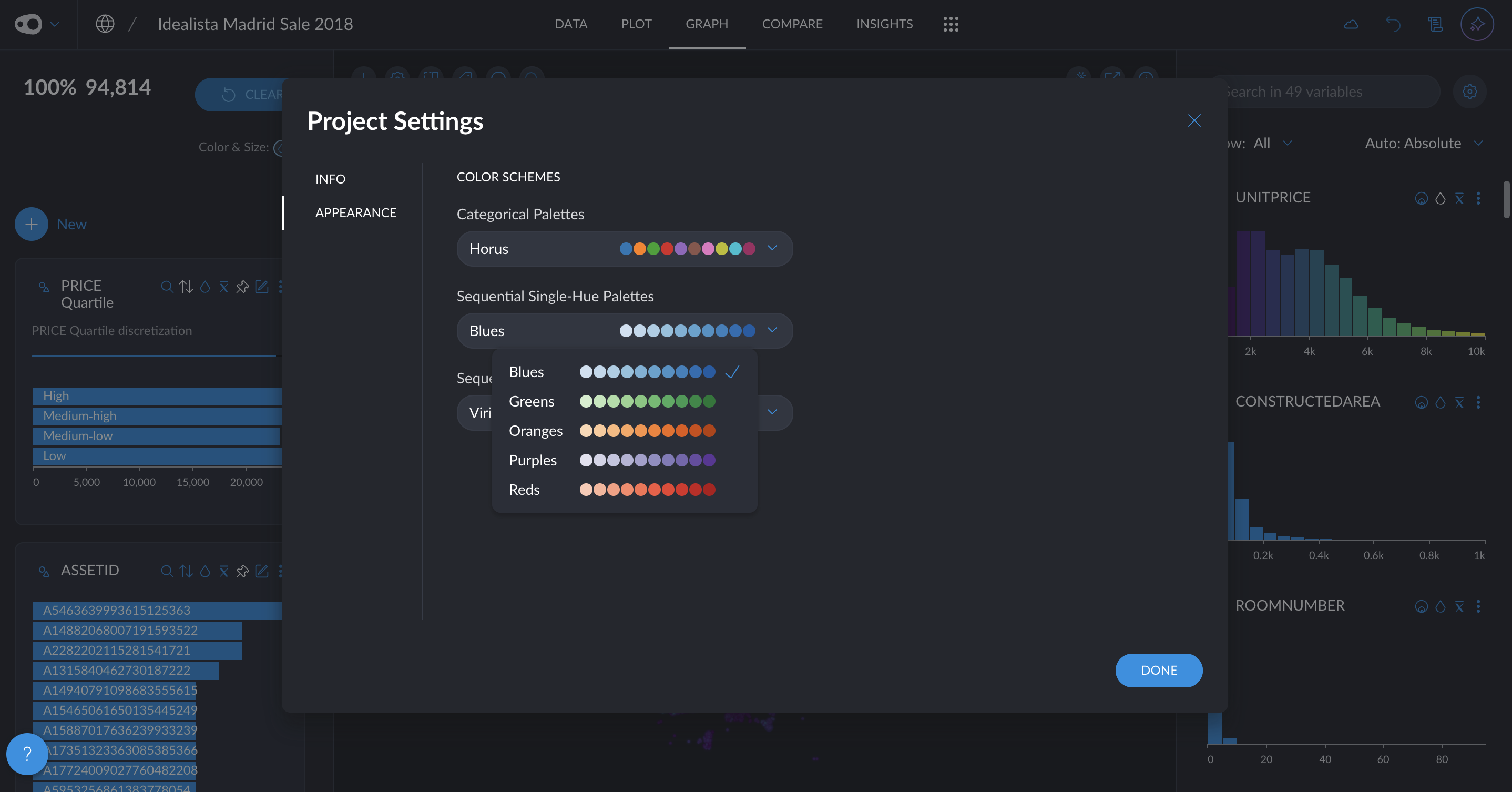
  • New quantitative color palettes: You now have more options beyond the default Viridis and blue multi-hue palettes for visualizing quantitative data. Soon, you'll also be able to customize color schemes at the plot level, including divergent palettes like red-green for enhanced contrast and readability. Go to project settings in the top left corner.

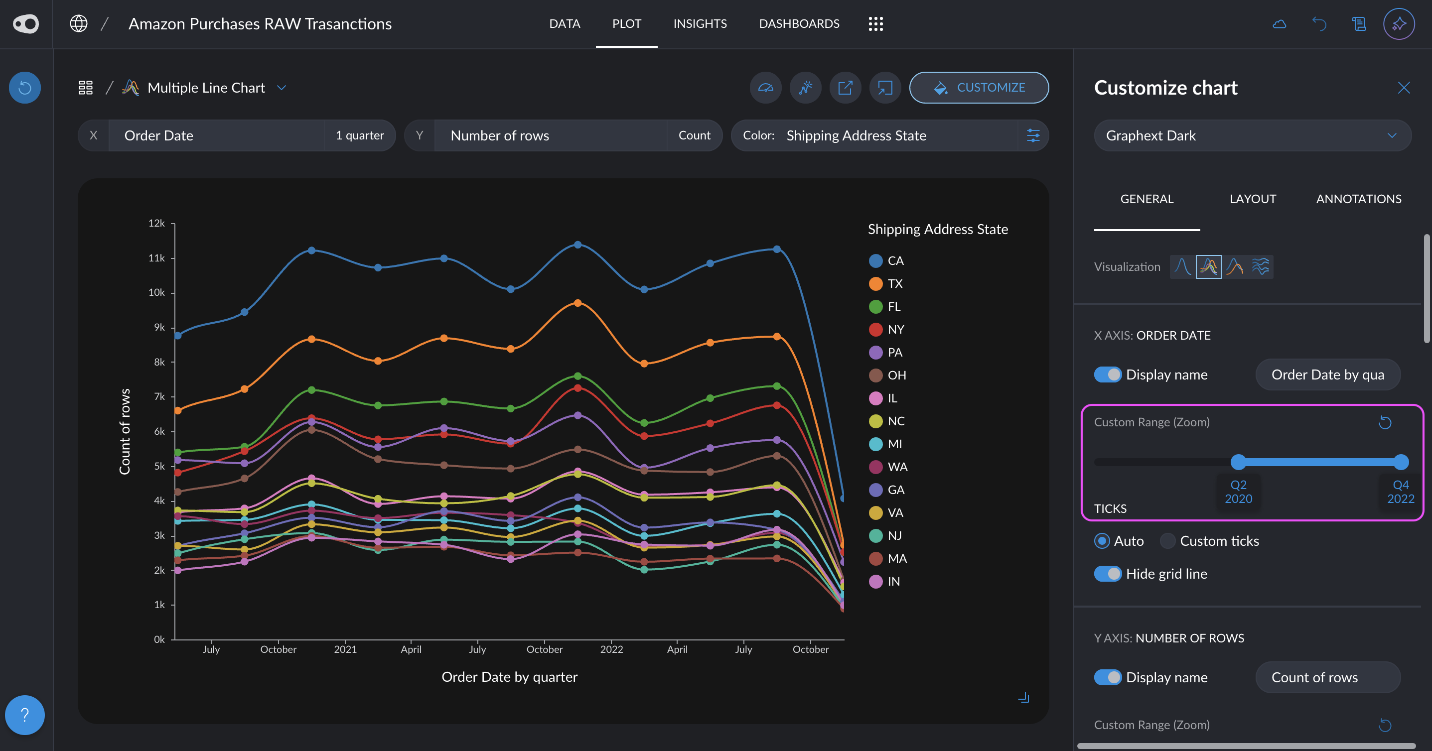
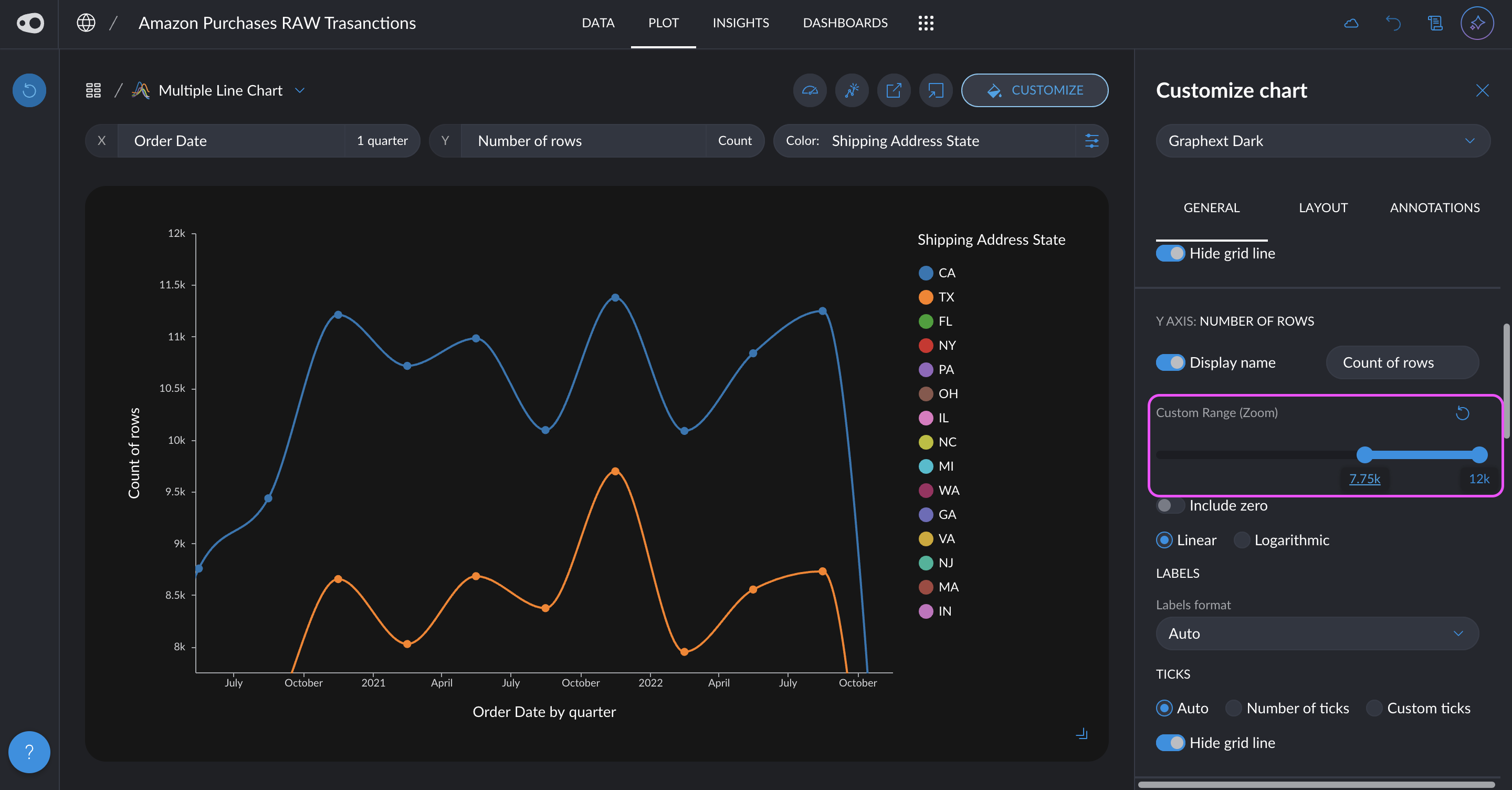
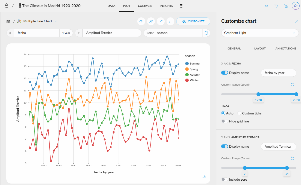
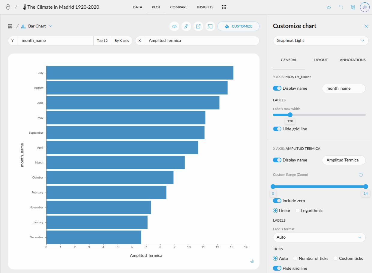
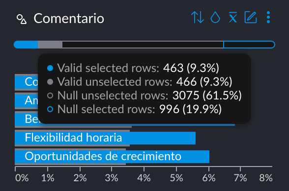
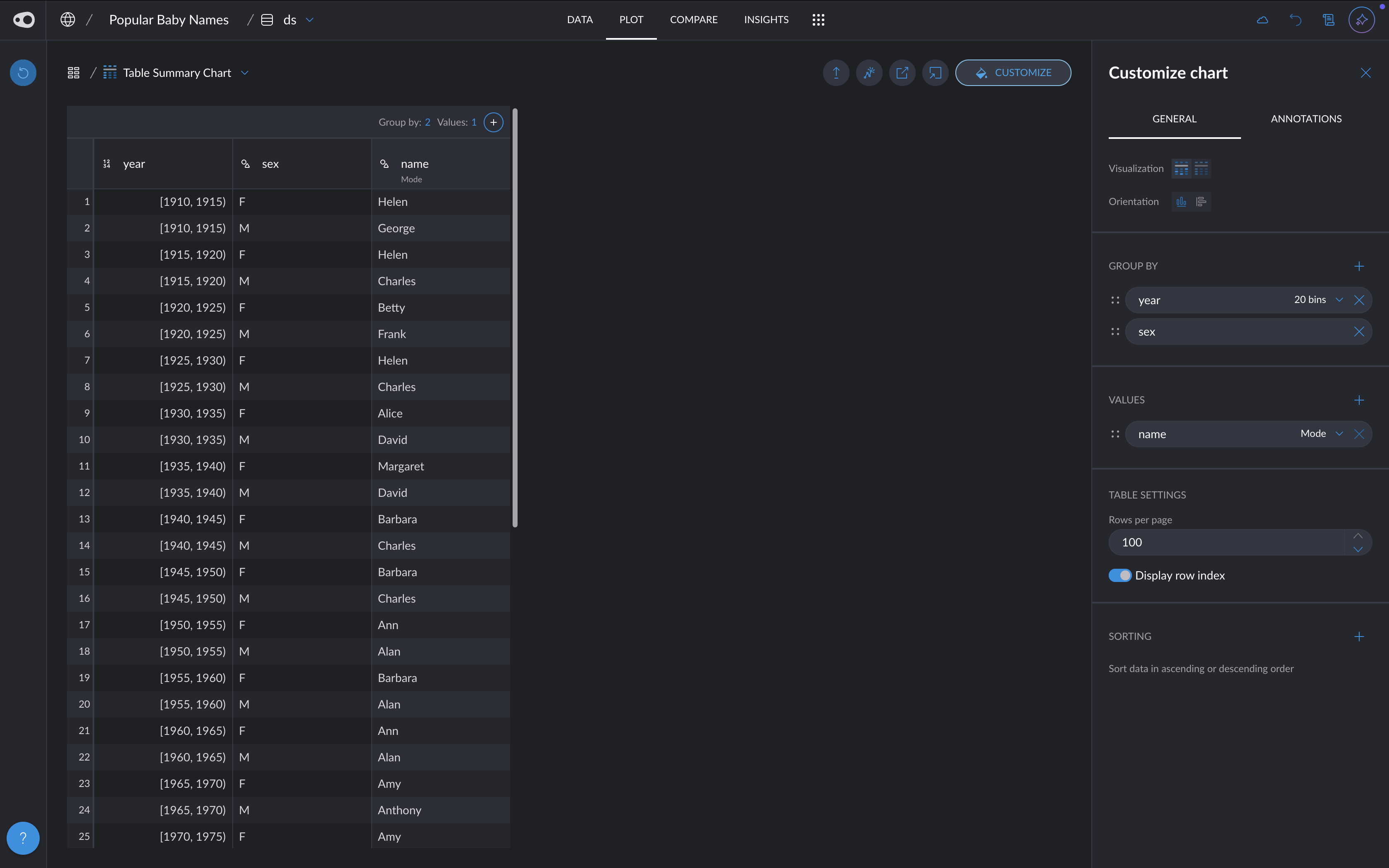
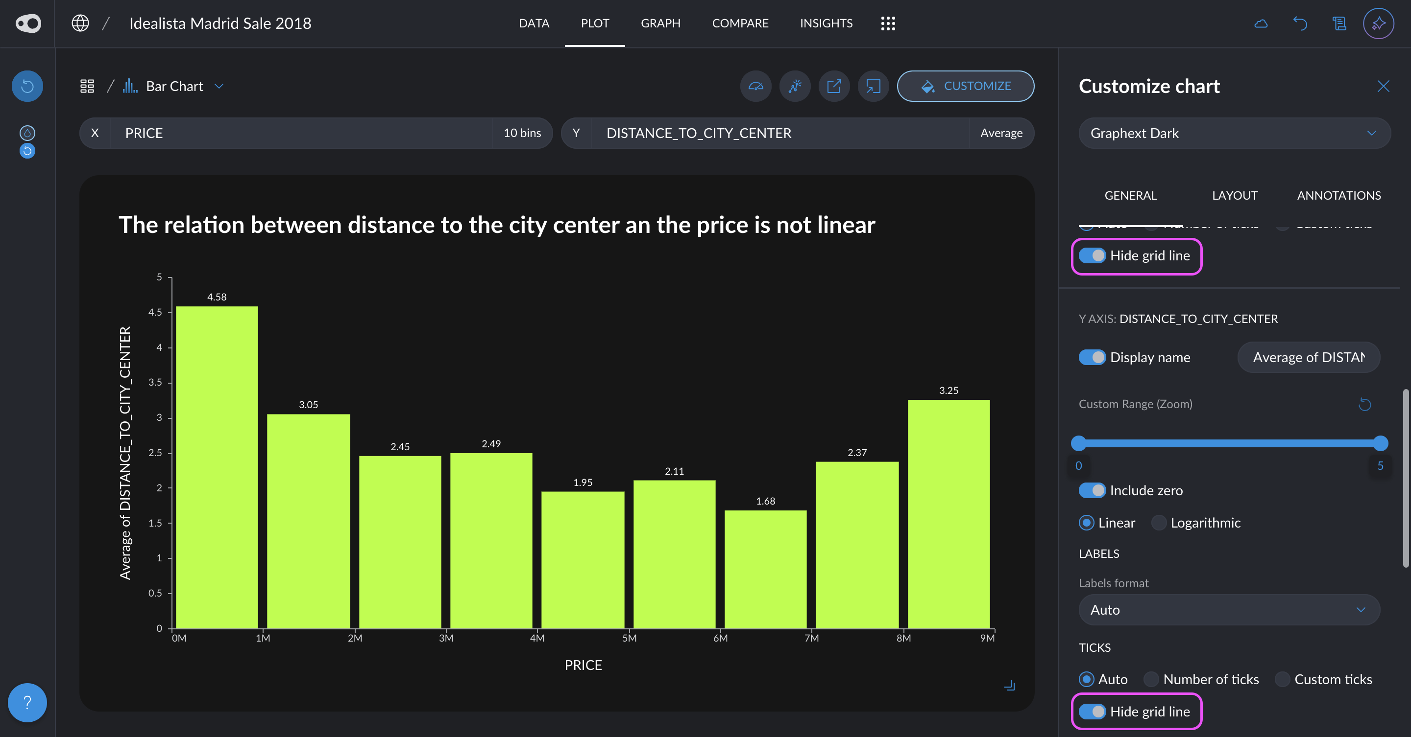
  • Hide the grid: You can now give a cleaner look to your plots by removing the grid

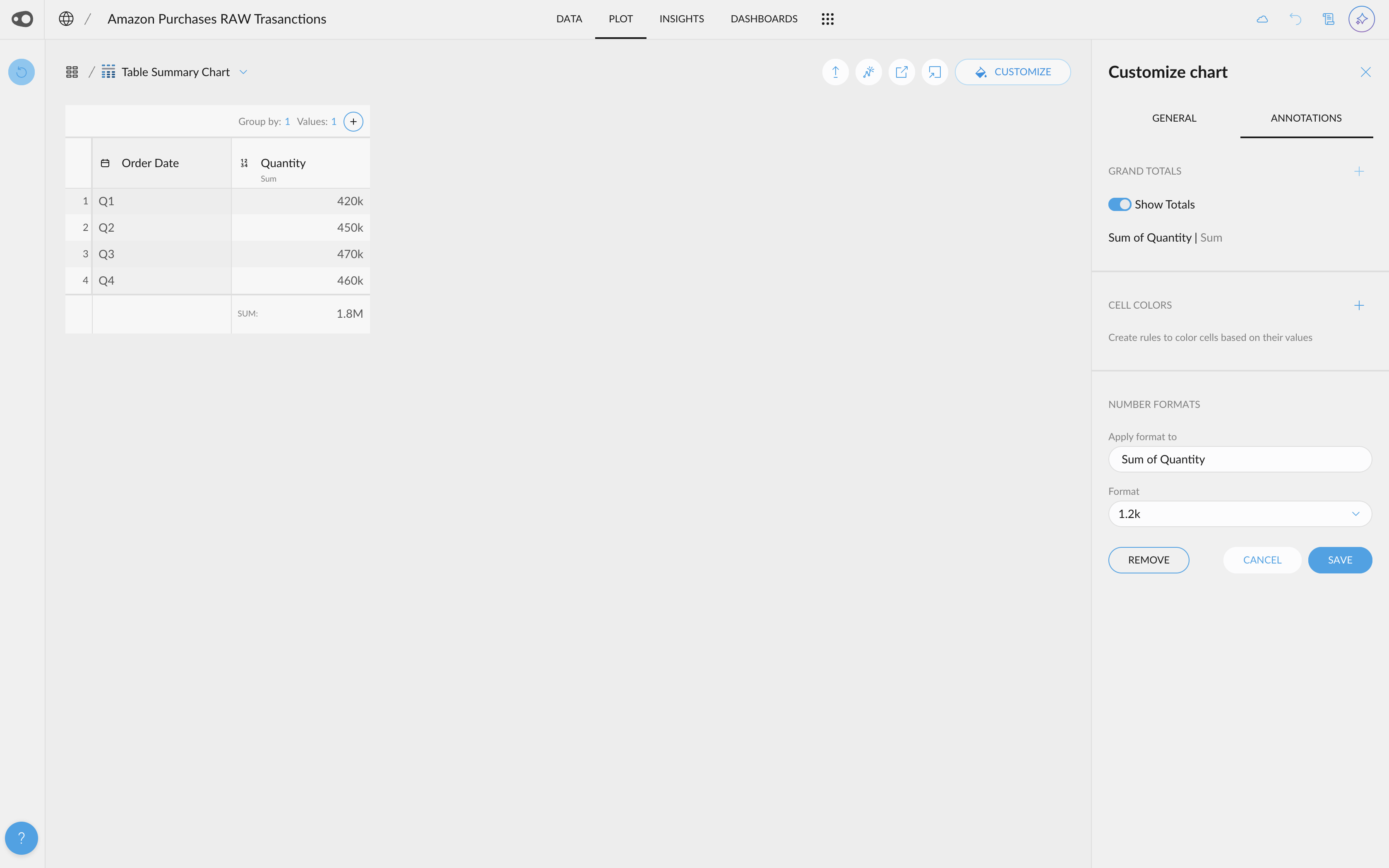
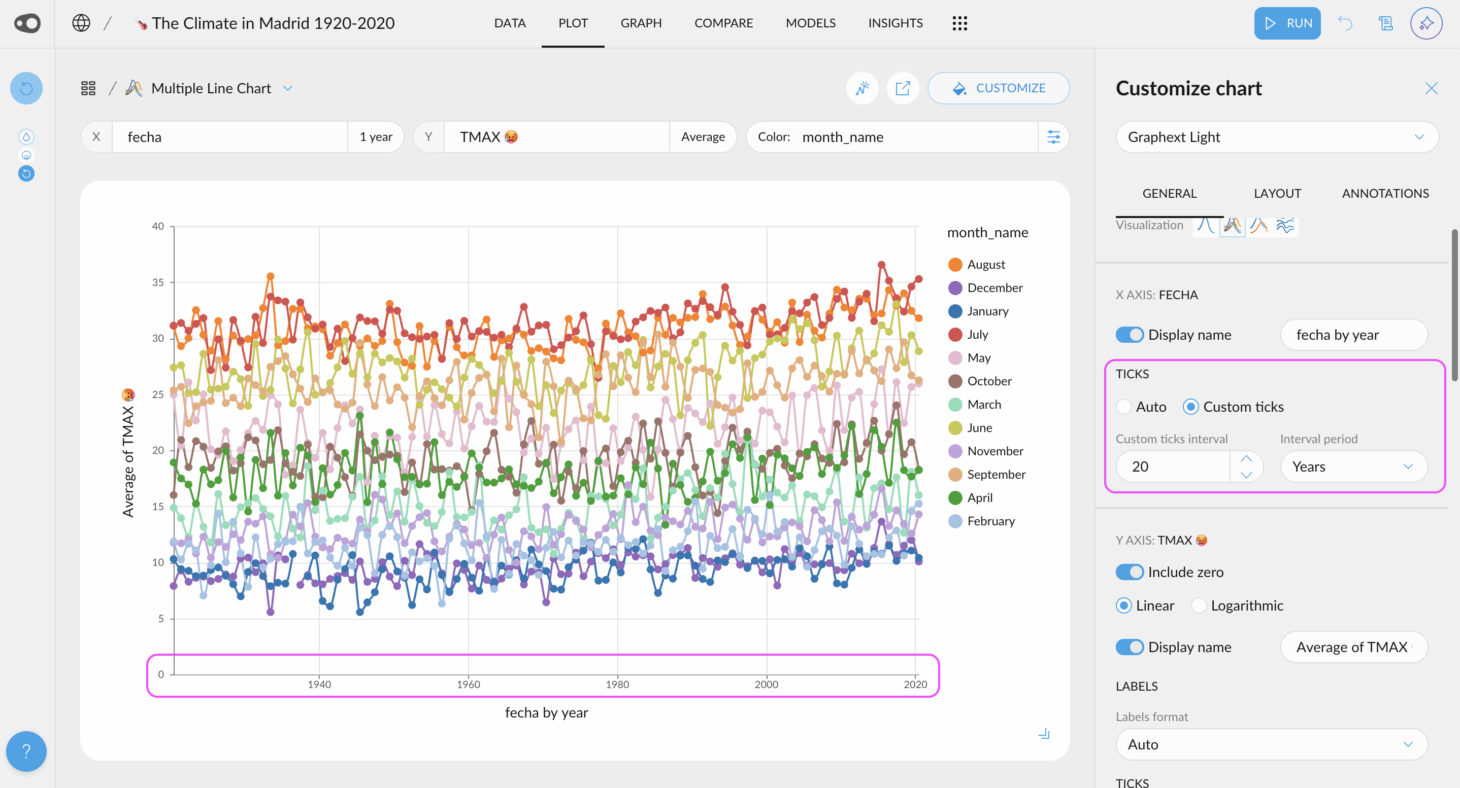
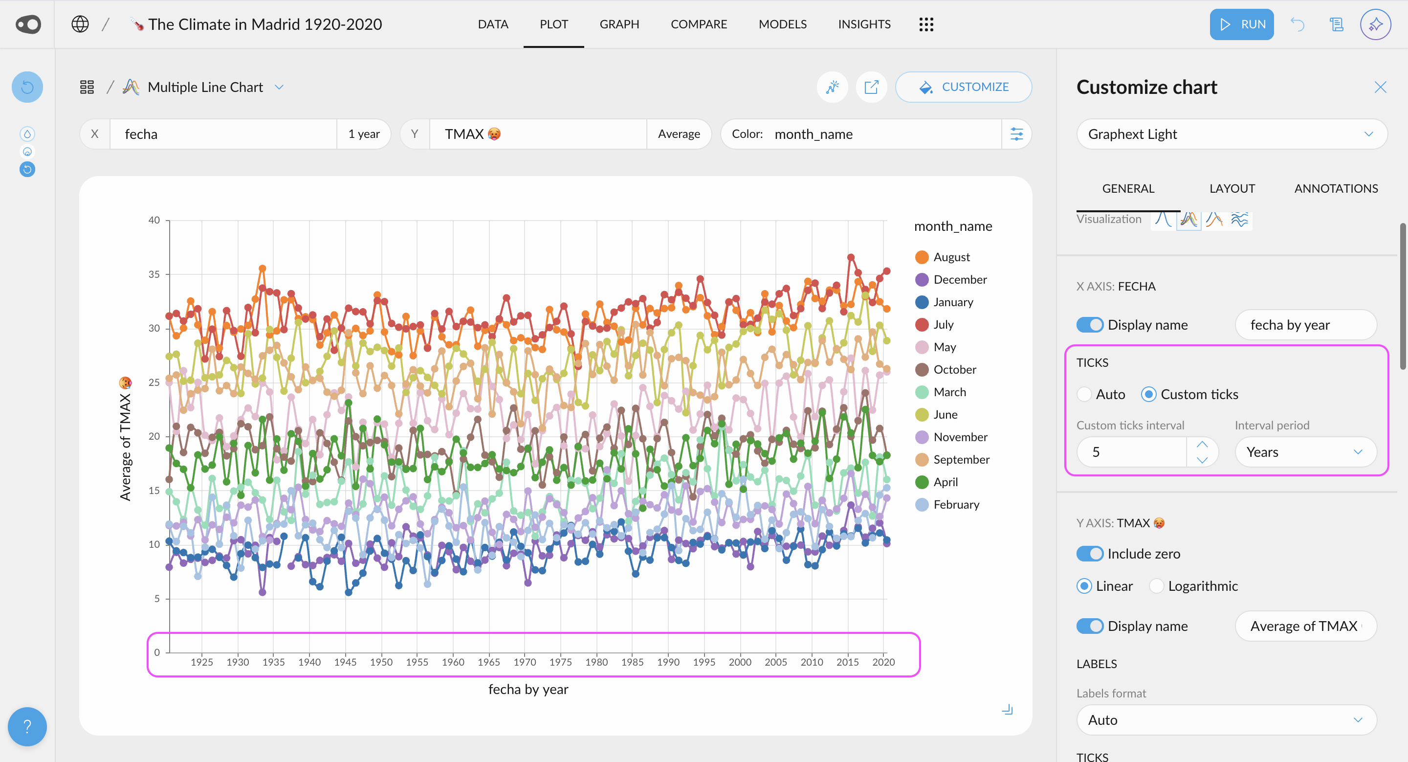
  • Zoom in plot without filtering the data: You can now focus on a region of a plot

March 4, 2025

Period-over-period comparison in plot,

🌟 New Features

  • Segment by a variable of date type: You can now color by a date variable in Plot while keeping the same aggregations! This is our first step towards enabling period-over-period comparisons. With this update, you can easily analyze trends over time. For example, you could plot average sales per weekday and segment by month to see if weekly seasonality shifts across different months. This makes it much simpler to spot trends and compare time-based patterns effortlessly.

  • Casting from filter icon: Casting is now available directly from the icon next to the variable name in cross filters, allowing for easier type conversion.
  • New metrics for model evaluation curves: the Precision-Recall curve now includes Average Precision, providing a clearer measure of performance. Additionally, the ROC curve now features AUC (Area Under the Curve) for a more comprehensive assessment of classification quality.
  • Formatting now also applies to totals. If you add a total for a specific column, the corresponding total will also be formatted accordingly.
  • Controls to customize axes range in Plot. Now you can use a slider to zoom in X or Y axes without having to select in the axis variable cross-filter.
  • Controls to hide axes grid lines in Plot. Now you can use a switch to hide X or Y axes grid lines.
  • Explode dataset internally when getting data for a Plot with multivalued X & Y variables.
  • Allow to configure quantitative color palettes for the project. Now you can select a sequential single-hue palette (used for correlations & heatmaps charts) or a sequential multi-hue palette (used for the graph, numerical variables histograms & scatterplot charts).

🐛 Bug Fixes

  • Allow to select percentage formats for Y axis labels when plot chart uses percentages
  • Allow to use value count in charts with List Index in X axis
  • Reverse Y axis for Heatmap charts when using a quantitative variable with quantiles
  • Fix Y axis labels & legend format in Heatmap with relative values
  • Avoid to recommend categorical columns with a single category in Plot distributor
  • Fix recreated plot insights to do not hide its chart

🎨 UI Updates

  • Unified Table Chart: We have merged the Table Chart and Table Summary Chart into a single chart. If no columns are selected for grouping, the table will be simple. However, if columns are chosen in the "Group By" section, the specified value columns will support aggregation.
  • Better Null bar tooltips: Now the user has more details about the null values of a column. The tooltip and the visualization shows the percentage of selected / unselected valid and null rows.

February 17, 2025

Nice or Exact Bins, New Insights Layouts, New Signup and Login, etc

🌟 New Features

  • Nice or exact bins: You now have control over how bins are calculated! Choose "Exact" to ensure you get the exact number of bins you specify, or select "Nice" to let the system adjust to the closest optimal number while ensuring bin ranges are defined by rounded, easy-to-read values.

🛠️ Improvements

  • Flexible insight export, choose your preferred layout: Now when exporting an insight, you have more control over the layout! You can choose to export just the plot for a clean and focused visualization or include additional text boxes to provide context and explanations.

🎨 UI Updates

  • We've updated the login and sign up screens, along with the entire registration flow. This better reflects Graphext's essence and gives a glimpse of what the product is all about!
  • New styles in the Group By columns. In the summary table, Group By columns are now easier to spot, thanks to a subtle adjustment in their cell colors.

🔧 Technical Updates

  • SHAP Value Grouping: We've introduced a new endpoint that allows you to group SHAP values into broader categories. Instead of receiving individual contributions for each factor (e.g., 20 separate factors), you can now aggregate them under meaningful categories—such as grouping all finance-related factors under a single "Finance" category. This helps reduce noise and makes it easier to interpret the key drivers behind your models.
February 4, 2025

AI-Powered Transformations, Custom Plot Ticks & Improved Model Preprocessing

🌟 New Features

  • AI-Powered Data Transformations: Easily derive new columns by simply specifying the transformation or enrichment you need. For example, ask AI to extract the weekday from a date, calculate the days between two dates, or classify customers as professionals based on their email domain— and much more.
  • Add multiple rules for coloring. Now, you can add multiple rules per column. Duplicating rules is also allowed, making it easier to color cells!
  • New shortcuts are accessible from the omnibar. For example, if you want to go to the plot section or share your project, you can find it there!
  • Models Preprocessing Steps: The preprocessing tab has been included in the Models section. We do a lot of magic under the hood when creating your predicitve models. Now we make it available for you in the models tab
  • Shortcut to create new metrics: We've introduced a special "New" button that allows you to easily create segmentations (both automatic and manual) and metrics.
  • Customize Ticks in Plots: Choose to display more or fewer ticks or even specify exact values. This flexibility helps you tailor your visualizations for clearer and more effective communication of insights.

🎨 UI Updates

  • Formatting and Autocomplete for Queries: We've added a code editor with SQL formatting for integration queries, along with autocomplete for table and variable names. This makes it easier to spot errors and write queries faster.
  • Nested sections in Models sidebar. Sections now display their subsections in the sidebar, making them easier to access.
January 21, 2025

AI Tagging, Metrics Manager, Label Rotation and size configuration, Integration Shortcuts and more…

🌟 New Features

  • Add tags with AI: Just upload your dataset, click add tags and our Gen AI will group your variables, putting under the same tags the ones that are from the same “family” e.g. Demographics, Economic, Usage metrics, etc
  • Columns in the Table Chart and Table Summary Chart can now be renamed! Plus, you can hide the subtitle to keep things clean and skip displaying details like aggregation (e.g., "Value Count") or date discretization (e.g., "1 day")
  • Metrics Manager: Now you can view all your metrics in a single modal, making editing and organizing them easier than ever!
  • Use categorical ordinal variables in more charts: Allow to use ordinal categorical variables in X axis for Line & Area charts
  • Labels Rotation: Allow to configure X axis labels rotation for any plot chart. Now X axis labels for categorical variables are rotated if there is not enought space for each bin. Also we can modify this default behaviour by using rotate or horizontal modes
  • Axes label width configuration: Allow to control the maximum width of labels
  • Find the integration connected to your project: To help identify the integration from which a project was created, we've added a shortcut to the integration icon. Simply click on it on the project's card, and you'll be able to edit the associated integration.
  • Edit the query associated to a project in a seamless way:  To simplify finding the integration linked to a project, we've added a shortcut within the project steps. Just click on it, and you'll be instantly redirected to the Hall, where you can edit the integration.

🎨 UI Updates

  • New color summary design: We've improved the rule color summary for easier identification and refined the section titles. A clear, concise interface remains our top priority.
  • We’ve clarified which date is displayed on the project card. Additionally, if you change the sorting criteria, the date shown will update to match the selected filter.
  • You can now select variables hidden in the cross-filter directly from the plot distributor. These variables will be grouped at the bottom of the selector for easy access.
  • Better error messages from Open AI API

🐛 Bug Fix

  • You are now alerted and prevented from trying to apply dimensionality reduction to datasets having a single column only (in steps like embed_datasetlayout_dataset and cluster_dataset)
  • SHAP explanations of model predictions now have correct JSON format. This means the corresponding column is now a valid input to steps like extract_json_values)

Page 1Next