Graphext is now able to handle even more data. We have increased our capacity by a factor of 2.4, with projects created with integrations of with up to 2M rows.
Graphext Enhanced: Current Status
With the addition of status updates and error messages, creating highly personalised projects and interpreting the Recipe has never been easier.
May 17, 2022
May 17, 2022
Adding, Sorting and Flipping Axes in Plot charts & Debug Blocks
Product Update: Adding, Sorting and Flipping Axes in Plot charts & Debug Blocks
Adding, Sorting and Flipping Axes in Plot charts
There are also new options available in Plot to make exploration infinitely easier. Now you can change your Variables' orientation (vertical or horizontal) and Sort by a third variable to make the visualization more intuitive.
Debug your New Projects with Ease
Keep your progress and applied steps in check at all times with the new access to a Project's Blocks. Blocks will help you debug since you will now receive improved feedback on warnings and errors about your project's execution.
May 4, 2022
May 4, 2022
Overwrite feature
Product Update: Overwrite feature
Overwrite: Update your Projects and Keep Exploring Without Hassle
We've added the option to Overwrite your Projects! Now you won't have to create a new Project outside the one you are working on. Simply go to Wizard, create an updated project, and select overwrite before you execute. You will also find the option to create a Backup copy of the existing project; this feature is great for version control. If you have saved Insights before updating your project, don't worry; we keep them for you!
April 18, 2022
April 18, 2022
Graphext Fluid | Major Release
Link to the Team in Pre with the Projects
Intro
Victoriano: Hi Elena! How are you doing?
Elena: How are you doing?
Victoriano: I have Covid but I am fine
Elena: Oh no! That’s ok, though. English sounds better with a runny nose.
Victoriano: I am one of the founders of Graphext and Elena is our new head of data literacy and just want to show many new exciting features we are introducing today with the big milestone release called Graphext Fluid
About the Data
Loading Data
Upload data (10 seconds)
Go to preview → project automatic (20 seconds)
Variable Manager - New!
Open Variable Manager
Start Adding tags to Rank (Score 💫 and Movie Properties 🎞)
Add the description to Metascore - as
Pin Title to the left
Order Variables up into de cross filters
Casting Genre and Actors to List from N5
Check what Genres are more common together
Filter by one of the 20 genres instead of 120
Data Table - New!
Pin the Title to the left and rating as the second variable
Order by score - oh The Dark Knight
Filter movies with high Revenue and low metascore
Plot - New!
Plot Metascore vs Revenue → critics can give really fail movies, most people on agregate give movies more than a 5. but in general there is a clear correlation
See what other things correlate more
Correlations - Old but better
Revenue more correlated to number of votes → open in Plot as a heatmap
Plot - Again
Filter Votes to remove outliers from the Chart
Change to % in Y axes
Filter by another variable like Genre
Show it as a box-plot and then as bars
Insights
Save one as an insight
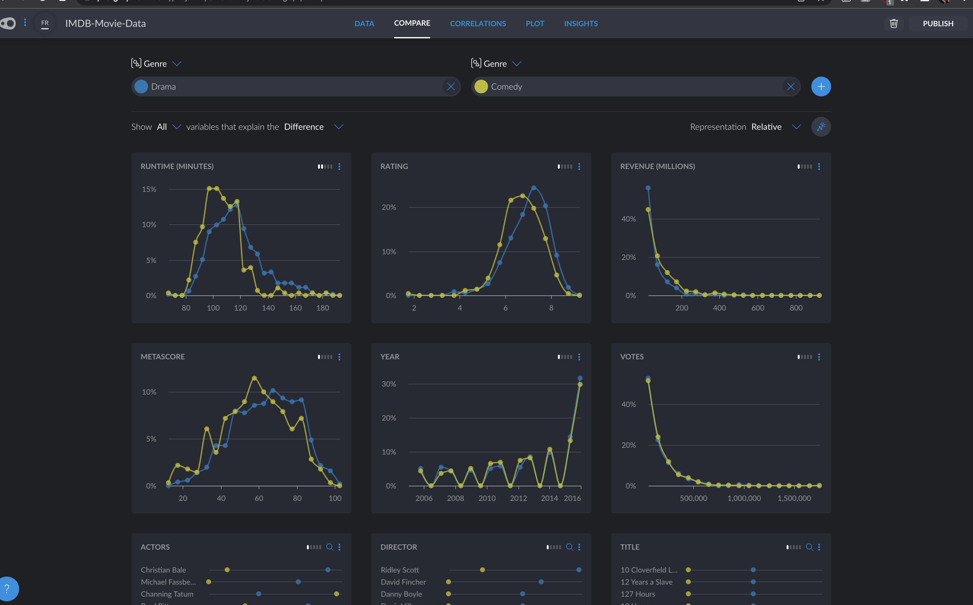
Compare
Saves as insight
Where is the Graph?
Victoriano about the decision of hiding the Graph and Models - not always neccesary but superpowerful for advanced data analytics.
Let do a model
Models
Blocks and the recipe
Overwrite → Transiticion to Graphext Fluid is not finished yet, getting close
Automatic Refreshing when you have a connection to a database
Old notes
Plot Genre vs Rating as a Box-Plot
Switch Rating to Revenue and comment on how biographies are good in rating but poor in revenue
Export chart
Save as an insight
Come back to Variable Manager and add more groups → ( Movie Property, Who, Score)
Go to Correlations
Talk about how Number of Votes is more correlated with Revenue than Rating but we can learn about it only after producing the movie, so not very useful to get insight to create high profit movies
Then jump to Runtime and open in in Plot as a heatmap, talk about the outlier that is between 60-75 minutes
Year and popularity - 2010 - Netflix effect
📣 Introducing Graphext Fluid
We’re proud to announce a major product update that we’re calling ... Graphext Fluid.
Data science should be an interactive cycle, giving analysts the autonomy to make reactive decisions and adapt their projects on the fly. To reflect this, we’re making Graphext more dynamic and more flexible so analysts can move faster from raw data to insights.
Feature Summary
Automatic Projects - Instantly explore your data with projects created as you upload data.
New Data Table - A smart tabular presentation offering value summaries and ways to grow analysis.
Cast Variable Types - Change the types of your variables on the fly.
New Variable Manager - Group, describe, move, pin and hide columns using variable cards.
Visualize with Plot - Plug your data into a range of common chart types and find patterns (guidance).
Create Graphs & Model Data - Layer on advanced data analysis steps like predictive models and clustering.
What’s Next?
More integration sources like Snowflake, Databricks, Redshift, Notion and Airtable.
Projects that automatically refresh as datasets update or change.
Apply transformation and enrichment functions to your dataas you go.
More chart types and better customization options in Plot, including adding custom styles to charts.
"Data analytics is iterative - you check the data, explore it, create models and you move back and forth. Fluid is about adapting Graphext so that it helps analysts to analyze data in a more natural way. At the same time, we’re adding major features that make Graphext more powerful."
- Victoriano Izquierdo, Graphext CEO & Co-founder
Public Pricing Coming Soon!
Alongside the release of Graphext Fluid, we’re excited to launch affordable pricing options on our website in the very near future. Soon, new customers will be able to pay using credit or debit cards through our website. We’ve designed our new pricing tiers to help you easily scale your plan as and when you need it. But if your just looking to try Graphext out ... our free accounts remain the same and will always be there.
🎁 New Features
01. Automatic Projects
As soon as you upload a dataset to Graphext, we’ll create a project for you to explore its contents. Exploratory data analysis is critical to getting familiar with datasets and involves inspection, visualisation and simple transformation. By creating an initial project for you to work with, we’ve pushed all of the decisions further down the line so you immediately have a chance to get to know your data.
Automatic projects are created with any new dataset you upload or integrate with Graphext. Whether you upload a simple CSV file or set up a PostgreSQL database integration, you’ll get an automatic project to explore. Open up automatic projects and get instant feedback on your datasets using Plot or Compare to visualize simple variable or value patterns.
02. New Data Table
Tabular representations can be so much more than endless rows of data points. Our new Data table presents value distributions, organizes variable names and descriptions and lets you filter, hide, pin, sort and search for variables.
But more than this, use the Data panel as a workspace to grow and adapt your projects. Data
is also home to Graphext’s data enrichments, data transformations and data modelling/network algorithms. In Graphext Fluid, you can add all of these analysis steps to your project on the fly.
03. Casting Variable Types
You can now change the type of variables inside of your project. Previously, variable types remained fixed inside projects. But as knowledge of a dataset increases, hypotheses can change. Changing the types of variables from inside of a project gives analysts more power to adapt their dataset at any point - a flexibility that can be very useful when applying Graphext’s predictive models to your datasets.
To cast variables, use the Wizard to Start a Project from inside your Data panel. Then, click on the icon next to any variable name and change its type to another from the dropdown list.
04. New Variable Manager
We’ve completely redesigned the management of variables in Graphext making it more intuitive to group, describe and organize the columns in your dataset. Our new variable manager brings together everything you need to manage columns in your data into one central hub, featuring draggable interactive cards to add descriptive information and tags to your columns.
Use the variable manager icon at the top of your right variable sidebar to bring up the variable manager, then start organizing the variables in your data. Add tags to group similar variables together throughout your project, hide variables or use the description text box to clarify more complex ones.
05. Visualizing Data with Plot
As you might already know ... Plot is a space to visualize simple patterns in your data. It contains a range of common data science chart types like histograms, bar charts, time-series charts, box plots and heat maps that you can use to instantly visualize value distributions.
Plot is a fundamental component of Graphext Fluid because exploring data visually is one of the best ways to expose insights that will guide and direct further analysis. Open up Plot in your automatically created project to start visualising key variable and value patterns.
06. Creating Graphs and Adding Models
You can now add advanced analytics steps like predictive models and Graphs that cluster your data to Graphext projects - on the go. Rather than building new projects as you level up your analysis, Graphext Fluid lets you add steps like clustering and NLP transformations using the Data panel inside your existing project. This way, analysts can get to know their datasets better before deciding which models to use and how to apply them.
To add a Graph and/or Model to your project head to the associated panel in the top menu bar of your project and click Create Graph orCreate Model. This will bring up the setup wizard where you can choose which kind of analysis you want to conduct. Follow the wizard steps to configure your Graph or Model.
Checking the box to overwrite your project will add the Graph or Model to your existing project, whereas leaving the box unchecked will tell Graphext to make another version of your project containing the Graph or Model.
February 21, 2022
February 21, 2022
Plot Special Release
🎁 New Features
Inside Plot - our new analysis panel - we’ve added more charts to visualise the relationships between one or two variables. With Plot, you can create bar charts, heat maps, box plots and all of the time-series visualisations previously found inside Trends!
Yep ... Graphext’s exploratory features just got a lot more powerful. Here’s an overview of what we’ve added but check the full Plot documentation to learn more.
"There is magic in graphs. The profile of a curve reveals in a flash a whole situation - the life history of an epidemic, a panic, or an era of prosperity."
- Henry D. Hubbard
What Can I Do With Charts in Plot?
Plot charts are designed to help you quickly measure value distribution between one or two variables in your data. The different types of charts you will find require different data types - for instance Overview, Compared Segments and Segmented Overview charts require date values.
You can use your sidebar filters to restrict the data presented inside charts in Plot as well as changing the way that data is aggregated or summarized using the dropdowns at the top left of your chart.
New Charts in Plot
Bar Charts
Bar charts are a simple representation of two variables. The variable represented on the Y axis must be quantitative. The variable on the X axis can either be quantitative or categorical.
Best used for ... Understanding how values from one or two variables are distributed.
Box Plots
Box plots are great for showing the value distribution belonging to a quantitative variable over a number of different categorical data segments. They represent quartile ranges and median values associated with these categories.
Best used for ... Measuring correlation between pairs of variables.
Heat Maps
Heat Maps are great at spotting correlation patterns between pairs of variables. They use a color spectrum to represent density of your dataset at points where values from two variables meet.
Best used for ... Measuring correlation between pairs of variables.