What's New?

December 6, 2021

December Update

🎁 New Features


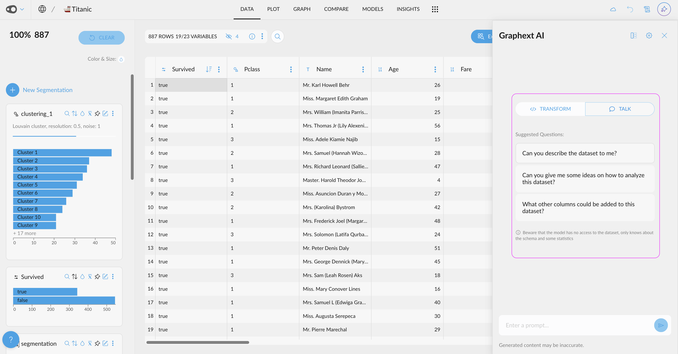
This month we've added search bars in our data tables as well as making it easier to explore Compare Correlations with large datasets. We've also made it easier for you to monitor the progress of your project setup with a new distinction between processing & configuration steps. 


01. Search Bars Across Data Tables

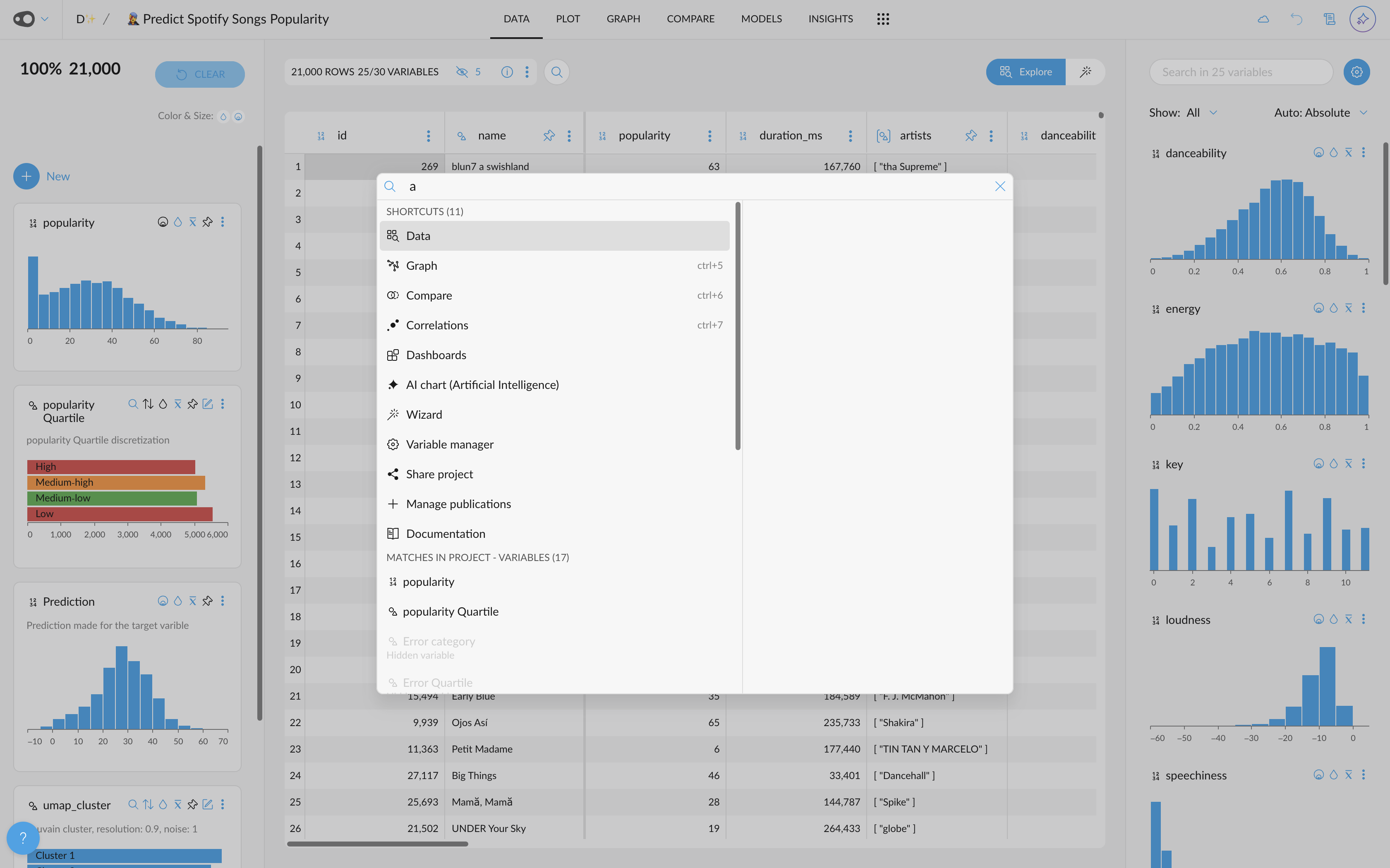
Finding variables in large datasets can be frustrating. We've added a search bar to data tables across Graphext to help you find variables quickly and simply.


Start typing the name of a variable inside the search bar in either Details or the Datasets panel of your team workspace. Graphext will automatically scroll to the location of your variable in the data table.


How can I start using it?

  1. Open up a data table in either Details or the Datasets panel of your team workspace.
  2. Start typing the name of a variable in the search bar.
  3. Click on the variable name from the dropdown list.
  4. Done ... watch as Graphext finds your variable.


02. Dynamic Scrolling in Compare & Correlations

We've changed the way that charts are loaded in Compare & Correlations. To make it easier to work with datasets with lots and lots of variables, we've added dynamic scrolling to these panels.


You probably won't notice much difference here on the face of it but behind the scenes ... this feature means that you can load charts a lot faster even when you are working with surveys that have thousands of questions to compare or correlate.  


How can I start using it?

  1. Open up Compare or Correlations and load up some charts.
  2. Keep scrolling ...
  3. That's it. 


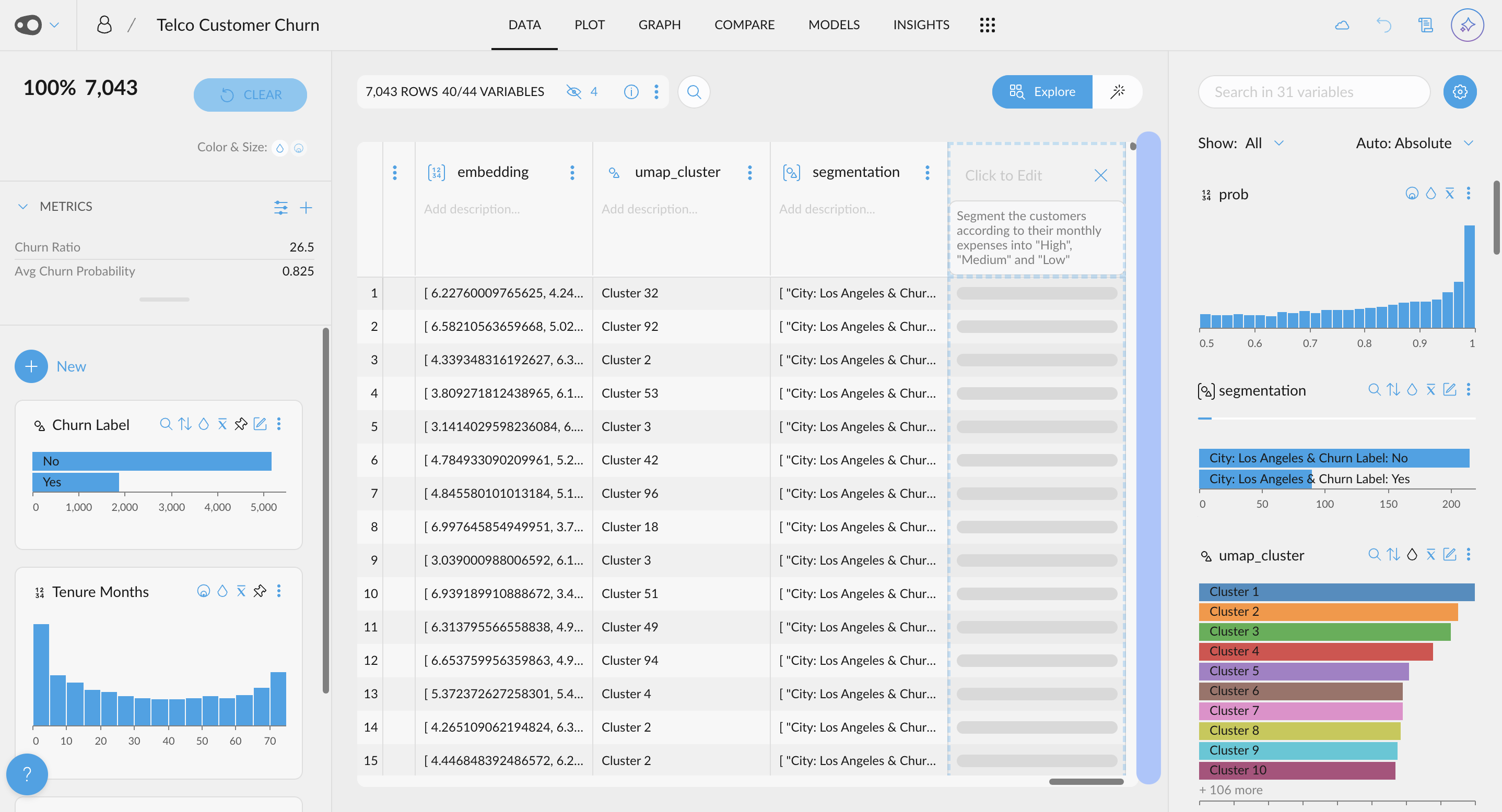
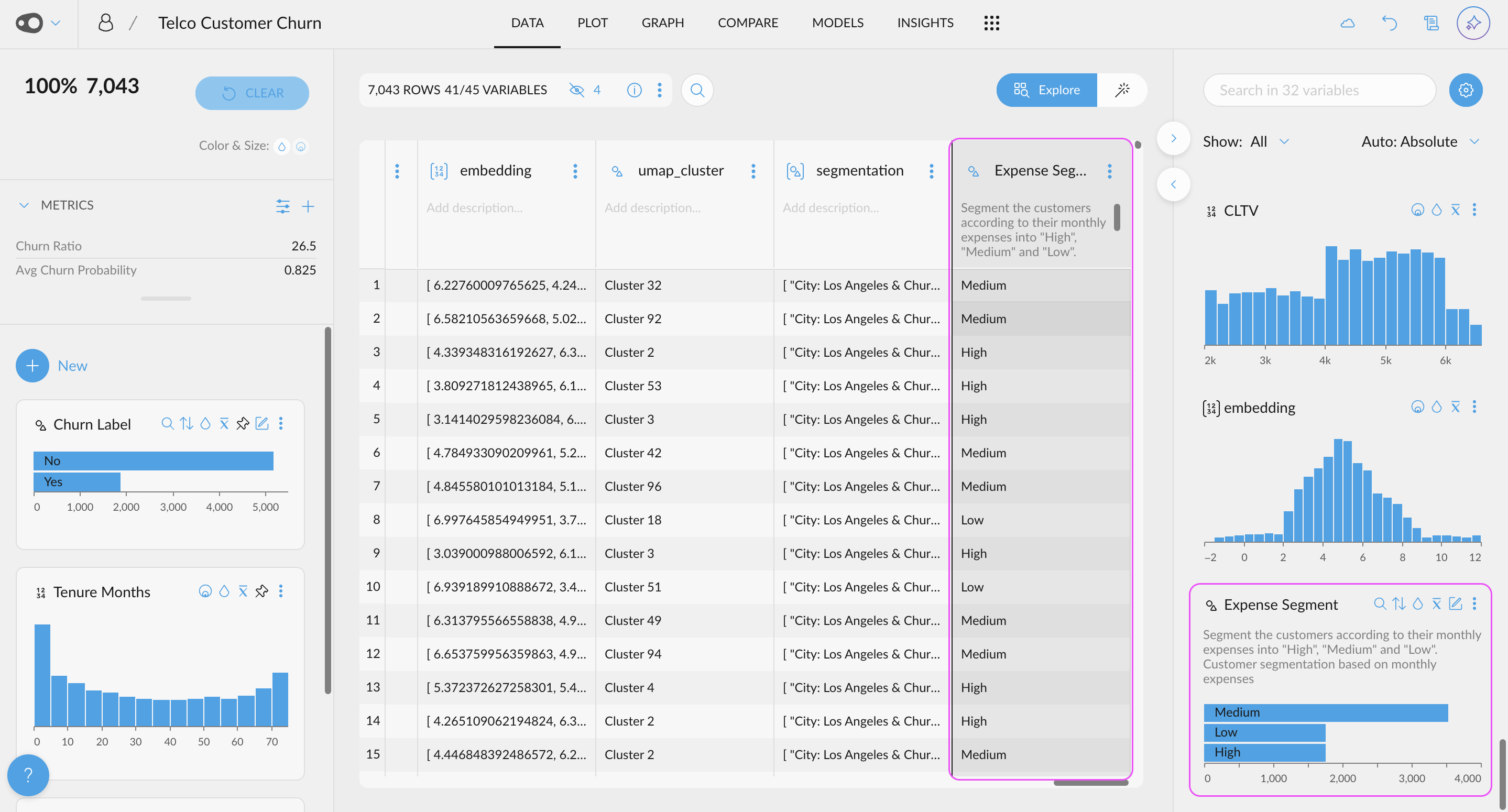
03. Filtering Steps During Project Setup

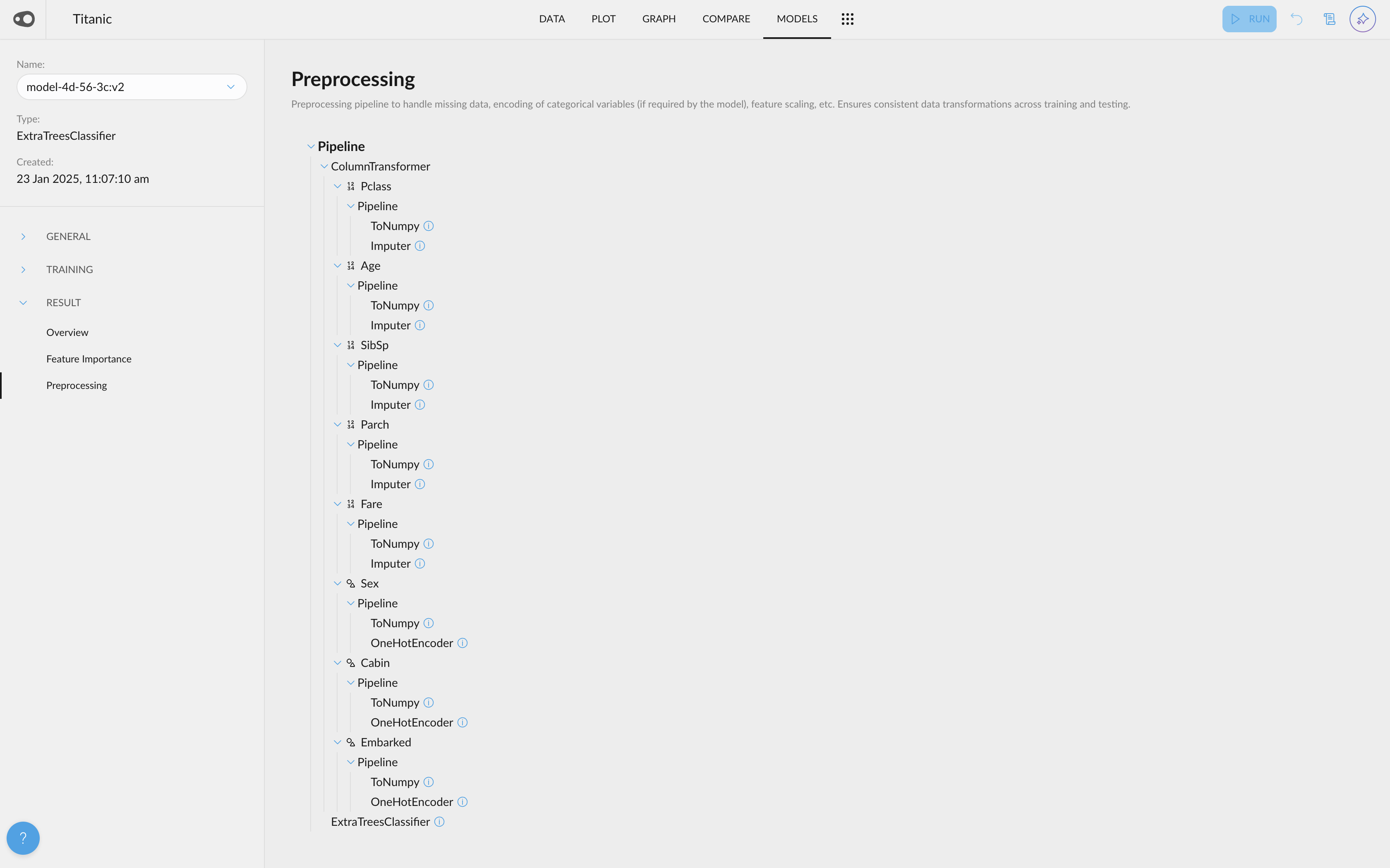
The steps you see as your project is being created are now separated into processing and configuration steps. We've made this change to make it easier for you to monitor the progress of your project setup.

Processing steps relate to the data science steps involved in transforming your dataset and creating your network. Configuration steps relate to the presentational aspects of your project setup. Start building a project and check the new dropdown menu inside of the project execution sidebar.


How can I start using it?

  1. Start building a project and execute the setup.
  2. Check the project execution sidebar.
  3. Toggle between processing steps and configuration steps using the new dropdown menu.

🐞 Bug Fixes & Improvements


  • Fixed a bug making it difficult to filter data using our interactive histograms
  • Fixed a bug preventing a user from editing a manual segmentation with expected behaviour.


📖 Stories worth Sharing


01. How Aquaservice Use Graphext To Improve Their Prediction Models

We spoke to the data science team at Aquaservice about how they used Graphext to build a clustering model to improve the way they forecast consumer demand. Their project grouped delivery routes using over 30 factors to calculate similarity and exposed patterns in the errors made by their prediction models. Read more.


02. Reverse Engineering Infamous Marketing Strategies from Innocent Drinks

Why are the social media strategies of Innocent Drinks considered as the gold standard for marketing teams the world over? We collected every tweet (10,521) posted by the communication department to deconstruct Innocent's content, style, reach and engagement with a simple topic analysis. Read more.


November 17, 2021

Correlations Update Special Release

🎁 New Features


We've made significant improvements to Correlations! With the addition of relative mode, Correlation charts can be simpler & easier to read because they show the percentage distribution of values belonging to a variable. 


Correlations: Relative Mode

Across Graphext's UI, relative mode presents data as a proportional representation. In practise, this means you see data as a percentage distribution rather than an absolute count.

This is especially useful in Correlations charts because these use size and color to visualize the correlation between lots of values belonging to pairs of variables. With relative mode, the size and color range of bubbles in Correlations charts are restricted to a percentage distribution (either on the x or y axis). This makes it easier to spot patterns.


How can I start using it?

  • Open a project and head to the Correlations panel 
  • Choose a variable to map your correlations charts or choose.
  • Using the Relative vs Absolute dropdown - switch to Relative mode.
  • Notice how the size and color of your bubbles adjust to present a percentage distribution.


October 25, 2021

November Update

🎁 New Features


Sentiment analysis in Graphext just became much more powerful with our new enrichment -integrated with an industry-leading model from Cardiff NLP - hosted by Hugging Face.

We've also added detailed documentation about our analysis types on our website and in the app!


01. New Enrichment: Sentiment Analysis Integration with Cardiff NLP & Hugging Face

Our new sentiment analysis enrichment is built using an industry-leading model from the team at Cardiff NLP and hosted by Hugging Face. Sentiment analysis models predict whether text is positivenegative or neutral. Check out the documentation describing the mechanics of the model here.

Choose this enrichment using the Data Enrichment tab in your project setup wizard to start classifying the sentiment of news headlines, song lyrics, tweets and more text of all shapes and sizes.


How can I start using it?

  • Open up a dataset that contains a text variable.
  • Choose any type of analysis to perform.
  • Inside your Data Enrichment tab, choose Analyze Text Sentiment - Cardiff NLP.
  • Select the text variable you want to analyze the sentiment of.
  • Complete your project setup.
  • Once Graphext has built your project, open it up and explore your new Category of Sentiment (Cardiff NLP) variable.


02. Analysis Type Documentation

We've started adding documentation to help you make the most of our analysis types. You can find these in the app using the information icon inside the card for each analysis type or in the docs on our website.

We've written this to help you understand the best way to approach each of our analysis types. Expect walkthroughs, use case examples and exact directions on getting started.


How can I start using it?

  • Choose a dataset to work with.
  • Click on one of the information icons inside of your project setup wizard.
  • Click the link at the bottom of the documentation to read more.


Search For Variables in Data Tables

Working with datasets that have lots of columns can be tricky at the best of times. Now you can find variables instantly using our search facility across data tables in Graphext.


In the Datasets panel of your Graphext workspace, use the search bar to find a variable. Inside Details use the search bar at the top of your right sidebar.


How can I start using it?

  • Open up a dataset in your Graphext workspace.
  • Search for a variable using the search facility.
  • Now open up a project and navigate to the Details panel.
  • Search for a variable using the search bar at the top of your right sidebar.
  • Notice how Graphext instantly scrolls to reveal the variable that you are looking for. 


🐞 Bug Fixes & Improvements


  • Fixed a bug causing Graphext to freeze after a user saves a manual segmentation.
  • Fixed a design issue making it impossible to download datasets from Details when the dataset has an especially long name.
  • Fixed an issue stopping relative mode from being available in published projects.
  • Fixed a design issue with the alignment of chart legends inside Insights


📖 Stories worth Sharing


An Introduction to NLP for Text Analysis | Data Academy

Our latest Data Academy instalment looks at how NLP can be used by businesses to analyze text. Starting from text analysis fundamentals and moving on to look at more complex recent developments in the field of NLP, this article is intended to introduce and equip business and data analysts with knowledge, techniques and tools to take forward in their text analysis projects.


Make or Break: After 5 Years ... Couples are Less Likely to Break Up

What's the most important milestone in a relationship? Moving in together? Getting married? Having a baby? According to a Stanford study, How Couples Meet and Stay Together, it's a day like any other during the 4th year of a relationship as the likelihood of a couple staying together becomes higher than the likelihood of them breaking up.


September 27, 2021

September Update

🎁 New Features


You can now customize the values shown in Compare & Correlations charts. We've added a search bar to help you add important categories to these visualisations. 

We've also added a new color palette to your projects that uses a dynamic color scale that updates depending on the number of values belonging to a variable.


01. Add Custom Categories in Compare & Correlations

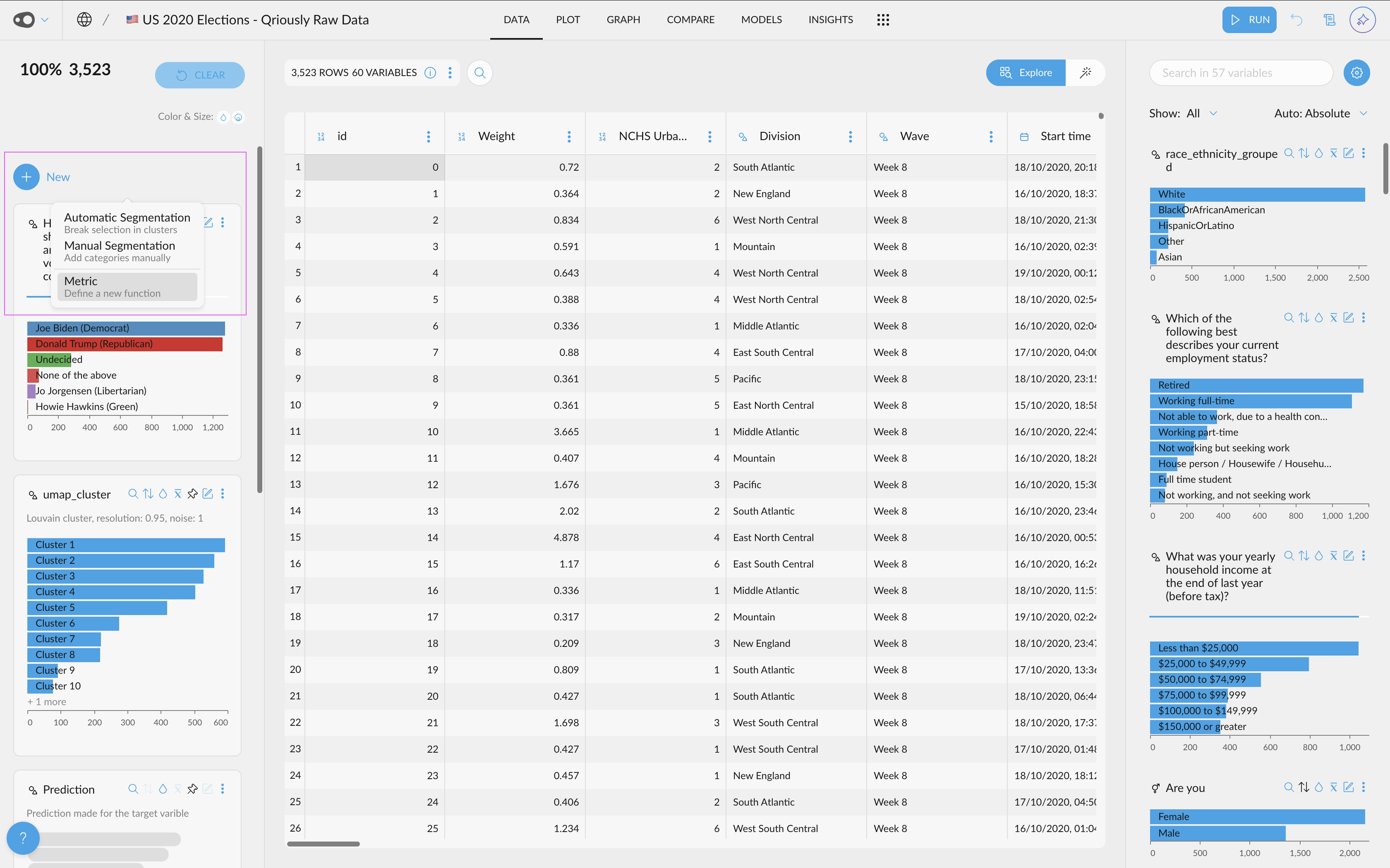
Up until now, charts in Compare and Correlations presented only the most frequently occurring values from a variable. You can now choose which values to present in these charts using the search bar at the top right of each chart card.


Open up Compare or Correlations and choose a chart with hidden values. Click the search bar from the top of the chart and add in your new value.


How can I start using it?

  • Choose a Compare or Correlations chart featuring some hidden values.
  • Click the search icon at the top of your chart. 
  • Start typing the name of the value you want to add into the chart.
  • Select the value and click the tick icon to add it into your chart.


02. New Color Palette: RE

We've added a new color palette to your projects. Re is slightly different to Horus and Osiris in that it offers a dynamic scale of colors that will update depending on the number of values belonging to a variable. 


Re is particularly useful when exploring a small to medium range of categorical values. Its colors move from light blue through orange and red to purple on a scale that is calculated according to the number of values in a category.


How can I start using it?

  • Open up your project settings.
  • Navigate to the Appearance tab. 
  • Choose Re from the dropdown list of color palettes.
  • Clicking Save will update the color palette in your project settings.


🐞 Bug Fixes & Improvements


  • When you upload a new dataset - Graphext will now be able to tell the difference between Categorical values and Text values with greater precision.
  • Your color palette will now be saved to your project settings. This means that closing then returning to the project will not affect your choice of color palette.
  • We've improved the way URL variables are presented throughout your datasets and projects. URL variables will now be presented in the same way that categorical variables are presented. 


📖 Stories worth Sharing


01. What is Exploratory Data Analysis?

For our first Data Academy release - we've gone back to basics with Exploratory Data Analysis. This article covers what cleaning, transforming and enriching data means as well as explaining why different visualisation types can be useful for studying different types of variable relationships. 


September 7, 2021

Mid-September Update

🎁 New Features


You can now copy datasets and projects between Graphext teams.

We've also made it easier to inspect text or quantitative values in greater detail with new text tooltips in data tables and the ability to save variables that capture zoom-ins on quantitative ranges.

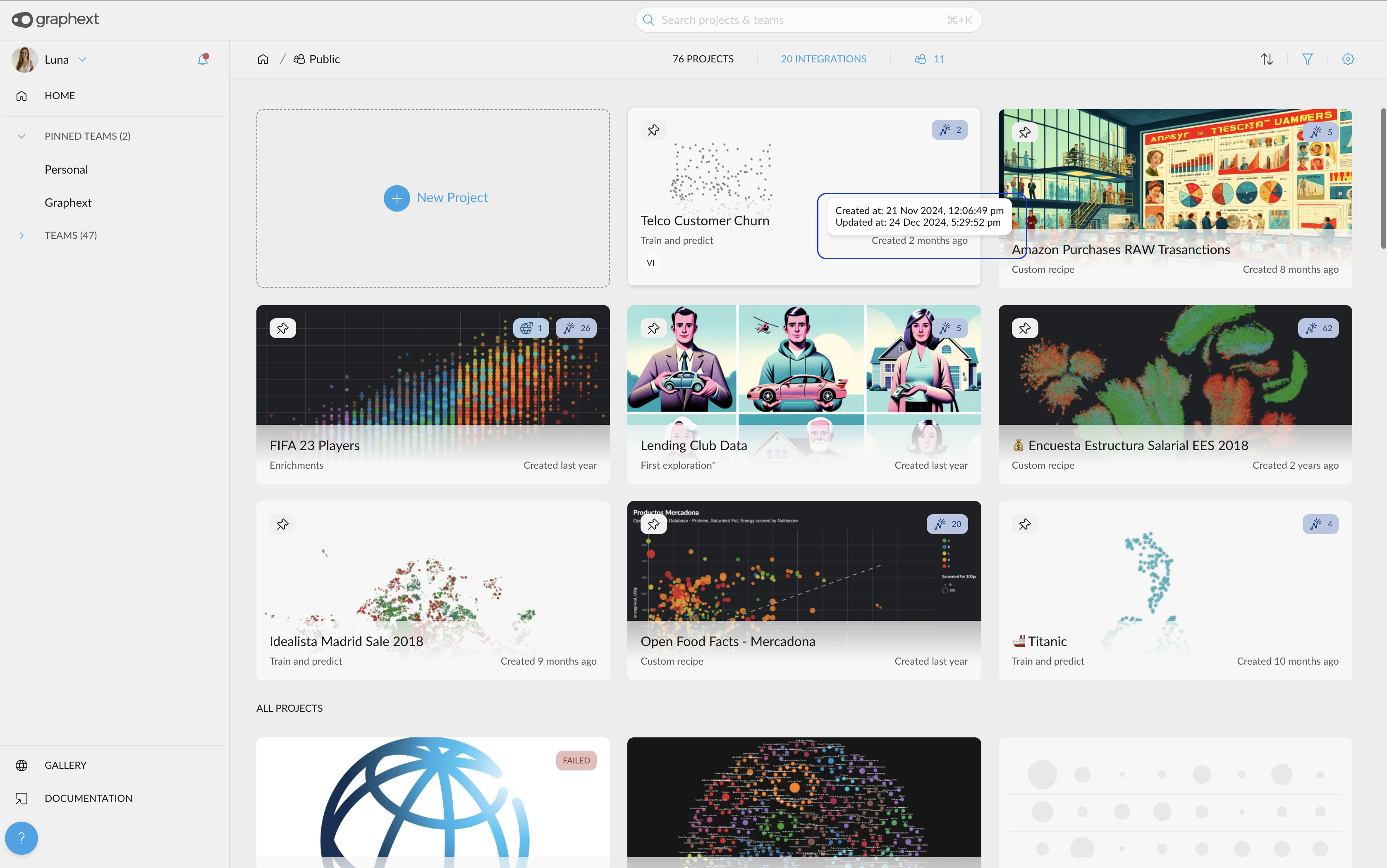
We're also pretty excited to announce that you can now customize the thumbnails inside your project card - using uploads or new Graph captures.


01. Move + Copy | Datasets + Projects

You can now move or copy datasets across workspaces as well as making copies of key projects. Click the menu icon from your Graphext team workspace and choose 'Move to' or 'Make a copy in' to give other teams access to your data and analysis.


We've added this feature to make it easier for you to collaborate on and share important analyses that you create. Making changes in a copied project won't affect the state of your original project.


How can I start using it?

  • Find a dataset or project in one of your Graphext teams.
  • Click the 3 dots to bring up the menu options.
  • For datasets - choose either Move to or Make a copy in. Then, choose a team destination.
  • For projects - choose Make a copy in. Then, choose a team destination.
  • Click Accept and head over to your destination team to inspect your relocated resources.


02. Changing Project Thumbnails

You now can upload, regenerate or enlarge your project thumbnail images! Head to your project settings, click on the project image and choose how to set your new one! 


The size of project thumbnails is set to optimal dimensions - meaning that any image you set is guaranteed to look snazzy!


How can I start using it?

  • Open your project info.
  • Click the current image associated with your project.
  • Choose to either upload, enlarge or regenerate your project thumbnail.
  • Save your changes and head to your workspace to check your changes.


03. Save Zoomed In Quantitative Ranges

Zooming in on specific value ranges isn't a new Graphext feature. But up until this point - any zoom-ins you make on quantitative variables will disappear as soon as you reload a project. Now ... they won't!


Zooming in on quantitative ranges helps you account for extreme values in your data. Zoom in on specific ranges to explore data distribution between two points.


How can I start using it?

  • Choose a quantitative variable in your project.
  • Set a filter range by clicking and dragging on the variable sidebar chart.
  • Click the 3 dots and choose Zoom In from the menu list.
  • That's it ... your new zoomed-in variable will be saved to your project.


04. Inspect Text with Tooltips

We've added tooltips to the table in your Details panel - helping you inspect the full content of text in your data. Hover over a text value to reveal its full content.


You can also copy the content of a text value by right-clicking on it and selecting Copy!


How can I start using it?

  • Head over to the Details panel of your project.
  • Find a text variable and hover over it.
  • Check out the full content of that value inside the tooltip.


05. Remove Any Variable

Now you can remove any variable from your project. Click the right menu next to the variable card in your project sidebar and choose Remove from the menu list.


Cleaning up your analysis is a useful habit to get into. Removing a variable from a project will delete any reference to it in all of your project panels.

🐞 Bug Fixes & Improvements


Core Improvement

When filtering data in your projects, your sidebar charts will now jump to Relative mode by default. Relative mode means that data in your selection is shown in proportion to the distribution of values in your whole dataset. 

We feel that Relative mode gives a clearer indication of patterns in your data but you can prevent automatic relative mode by choosing another option from the Relative | Absolute dropdown at the top of your project's right sidebar.


  • Added the ability to view and edit the project recipe from the project settings window.
  • Removed automatic filtering on datasets of any size so that - by default - projects will be built using the full dataset.
  • Fixed a bug stopping labels from appearing when users hover above nodes in the Graph.
  • The wrong factor tagged columns in Cluster Flow
  • Fixed a bug stopping users from sending data to the trash from panels outside of the Graph.
  • Fixed a bug causing mixed JSON data to crash on upload.


📖 Stories worth Sharing


Sentiment Analysis & The Billboard Top 100: The Changing Mood of Popular Music

We used sentiment analysis to model 5100 Billboard chart-toppers between 1964 and 2015. Our analysis predicted whether song lyrics were positive, negative or neutral as well as detecting the topic and intent behind the most popular tunes in music history.


August 13, 2021

August Update

🎁 New Features


You can refresh and recreate Graphext projects created with data from Google Sheets or database integrations. On top of this, it's now simple to change the color of values from anywhere in your projects and you can switch color palettes inside of your project settings!


01. Refresh Data Integrations & Recreate Projects

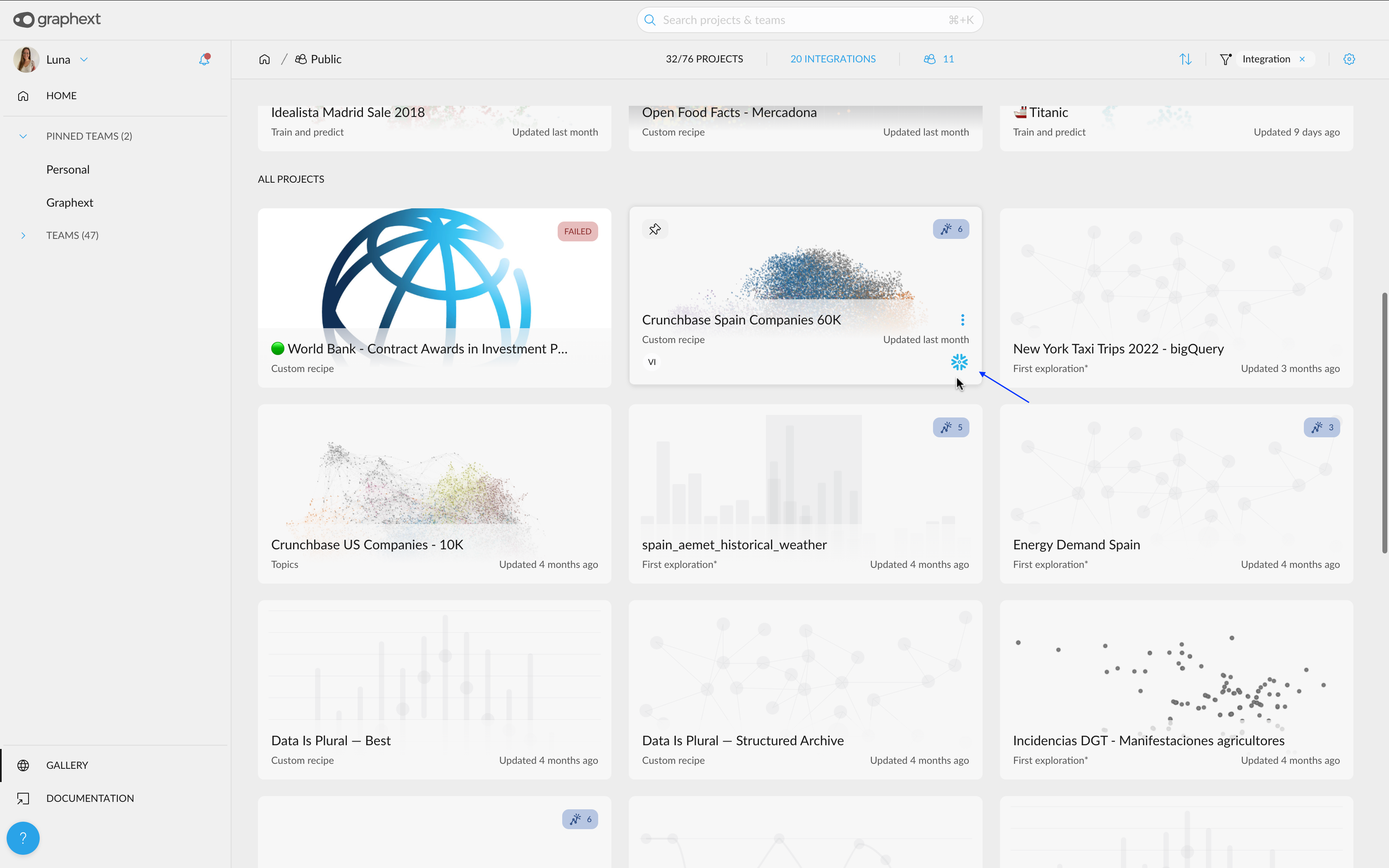
We've added the ability to refresh and recreate projects built with integrated datasets from Google Sheets, SQL databases and more remotely hosted sources


Find a project you've created with integrated data and choose to Refresh and Recreate the project. Graphext will then retrieve a new - up to date - dataset from your source and automatically create a new project using the data. 


How can I start using it?

  • Make sure you've created a project using data that you've integrated with Graphext from Google Sheets or a remotely hosted database.
  • Find the project inside your Graphext workspace and click the 3 dots on the project card.
  • Choose 'Refresh and Recreate' from the menu list. 
  • Graphext will recreate your project using up to date data from your integrated source.
  • Graphext will store a new dataset in your Datasets panel containing up to date data from your integrated source.


02. Changing Colors Across Graphext: Trends & Compare

Your Compare and Trends charts now support the full spectrum of variable colors. Not only this, but you can change the color of any categorical value across the interface.


Recently, we extended the number of automatically generated variable colors but - up until now - these weren't available in Compare or Trends charts. Now, you can see the full range of colors across all interface panels as well as changing these colors directly in either Compare or Trends charts.


How can I start using it?

  • Inside a project, open up Compare and add values into your charts.
  • Click on a color dot associated with a value from the top of your panel.
  • Choose a new color using the color picker and click OK.


03. Switching Color Palette

You can now switch the color palettes used to represent data in your projects. Color is crucial to grouping and spotting connections between data. Head over to the Appearance tab inside your project settings to change color palettes.


Choose Horus for the standard Graphext color palette. Choose Osiris for a more vivid color palette. We'll be adding more color palettes to this list very soon!


How can I start using it?

  • Navigate to the Appearance tab inside your project settings.
  • Select a color palette from the dropdown list.
  • Click Save.
  • That's it. Check out the new colors representing data in your project. 


04. Expand Charts in Compare and Correlations

You can now expand charts in Compare & Correlations. Because expanded charts are BIGGER, they let you inspect more values at the same time. 


To expand Compare or Correlations charts, click on the 3 dots from the top right of your chart card and choose Expand chart. Insights that you save from expanded charts will also be bigger and contain more values than standard-sized charts.


How can I start using it?

  • Inside a project, generate charts in either Compare or Correlations.
  • Click on the 3 dots inside a chart card.
  • Choose Expand chart from the menu list.
  • Check out your chart in all of its glory!


🐞 Bug Fixes & Improvements


🍏 Core Improvement 

We've improved the way that data is presented inside Trends charts. You can now represent values in time-series charts using a Cumulative Sum - which works like a running totalChoosing Cumulative Sum - instead of a count or an average - means that the y-axis in your Trends charts can now represent the total sum of data as it grows over time. 


  • Added the ability for users to set up more than one SQL integration.
  • Fixed an issue with Amazon S3 Data Integrations.
  • Fixed a bug in the Text - Keywords analysis type.
  • Fixed a bug with the Social Media - Analyze Author Bios analysis type.
  • Fixed an issue with dataset names containing a long sequence of characters.

📖 Stories worth Sharing


A Beginners Guide to Market Segmentation

Market Segmentation means splitting your customer base into distinct communities based on the similarity of their features. This guide walks through the fundamental techniques, tools & types of market segmentation and shows you how to perform advanced market segmentation with Graphext. Read more.


A Guide to Clustering Supermarket Transactions

This guide is intended to walk you through the process of creating a clustering model to group your data. We'll build a project using a dataset of 1000 supermarket transactions from stores in Myanmar and expose the supermarket's most valuable market segment. Read More.


How to Study Brand Conversations with Advanced Text Analysis?

How can we use text analysis of data from Twitter to improve our understanding of markets? This is the question prompting Paul, a strategist in our business team, to scrape tweets about Lloyds bank and conduct a Twitter topic analysis using advanced NLP and network creation. Read More.


July 20, 2021

July Update

🎁 New Features


Graphext is now more powerful at text analysis. We've added support for the incredible range of NLP models at Hugging Face including intent detection and sentiment analysis. On top of this, we've built a new enrichment to group location values that are spelt differently 


01. Support for Hugging Face Models

We've integrated Hugging Face models with Graphext. You can now build, train and deploy state of the art models for common NLP tasks including intent detection, sentiment analysis and token classification. Hugging Face also has models for translation, image classification and speech recognition.


Check the Hugging Face model documentation to browse the models you can now use in Graphext, check how to use them and try them out! We'll soon be adding an easier way to deploy Hugging Face models on your text but for now - open up the code editor and paste in a code snippet from our docs.


How can I start using it?

  • Start building a project with data containing some text.
  • Open up the code editor.
  • Somewhere towards the end of the script - copy and paste the code snippet from our docs.
  • Replace the name of the model with the name of your chosen model.
  • Don't forget to add parameters if you need them!
  • Execute the project. 


02. New Enrichment: Extract URL Components

When working with URLs in your data, it is often useful to extract new variables containing the domain, path and schema of the URL. Using this enrichment you can parse the URL values in your data and use the components of a URL to filter your data.


 After you built a project that extracts URL components - look for the new variables in your data; path, domain, query, schema and more ...


How can I start using it?

  • Select Extract URL Components as an enrichment using the Data Enrichment tab during your project setup.
  • Tell Graphext which column contains the URL values in your data.
  • That's it. Open the project and look out for the new variables containing the components of your URL values. 


03. New Enrichment: Standardize Locations

Variation in the way that people write and record location data can make for a messy analysis. 

Similar to the way that our Group Similar Spellings enrichment works, standardizing location data means grouping variations that refer to the same place but are spelt differently.


For instance, without deploying this enrichment, 'Manchester' and 'Manchester, UK' would be considered as two separate places. Our enrichment has been designed to let you collect these two values and filter your data more accurately with locations.


How can I start using it?

  • Select Standardize Locations as an enrichment using the Data Enrichment tab during your project setup.
  • Tell Graphext which column contains the location values you want to group.
  • Set a threshold to control the strength of your merges.
  • That's it. Open the project and look out for the new merged variable.


🐞 Bug Fixes & Improvements


  • Fixed a bug preventing the saving of new team names.
  • Fixed a bug causing quantitative filter ranges to jump unexpectedly.
  • Fixed a bug allowing incorrectly formatted data sources to be referenced (not an URL).

📖 Stories worth Sharing


01. Using Mutual Information to Cluster Variables and Discover the Associations Between Survey Questions

Our team set out to build a type of analysis that could be used to measure the strength of association between variables in a dataset. Read more.


02. Mapping New York's Airbnb Listings

Our team set out to build a type of analysis that could be used to measure the strength of association between variables in a dataset. Read more.


June 30, 2021

June Update

🎁 New Features


It's been a colorful month ... we've added the ability to change the color of any categorical variable and extended the spectrum of colors automatically generated for your values. We've also added a new enrichment letting you fill missing values in your data!


01. Extended Variable Colors

We've increased the scale of our default color palette to include 30 colors! 

On top of this - clicking to show more categorical values will add appropriate color to nodes in your Graph that would previously have been grey.


Color is a powerful analytical tool and lets you quickly identify the features of your data points inside visualisations. Up until now, we've used grey to color any categorical value beyond the 10 most frequently occurring

We believe that more color means more clarity. Clicking to see more categorical values will extend the colors presented in your Graph. 


How can I start using it?

  • Open a project with a categorical variable that contains many values.
  • Apply color mapping to this variable in your project's Graph.
  • Click to show more values.
  • Notice how your color palette extends inside the Graph and variable sidebar chart.


02. Changing Colors For Any Categorical Value

You can now change the color of any categorical value!


Although every value in your categorical variable will be automatically assigned a color - you can change these by editing the variable and selecting a new one using the color picker


How can I start using it?

  • Open up a project and find a categorical variable
  • Click the edit button at the top of your variable card. 
  • Now, click the color picker icon. 
  • Choose a new color and save your changes!


03. New Enrichment: Fill Missing Values 

We've built an enrichment to fill missing values in your data. Missing values can be annoying, misleading and disruptive to your analysis. Replacing them with specific values can help to clean up and prepare your dataset for analysis.


Choose Fill Missing Values from the data enrichment tab inside of the project setup wizard to start replacing missing values. Then, select a variable with missing values and tell Graphext how you would like to fill these values. You can choose from options like using a constant value, using the most or least frequently occurring value and using the column's minimum or maximum value. Look for the replaced variable in your transformed dataset.

If you'd prefer, you can always use a different enrichment to predict missing values!


How can I start using it?

  • Start building a project using a dataset with missing values.
  • Choose Fill Missing Values from the data enrichment tab inside your project setup wizard.
  • Tell Graphext which column contains your missing values.
  • Choose how you want to replace your missing values.
  • That's it. Look for the replaced variable in your transformed dataset.


04: Dataset Info: Sources & Descriptions

We've added space to describe your dataset and reference it's original source inside Graphext. 

Context is always important but when dealing with data - it is essential. Referencing your data leaves behind a trail that other team members or researchers can trace to validate or continue your analysis. 


To start describing and referencing a dataset, find it from inside of your team's Graphext workspace. Then open the dataset info menu using the 3 dots on the far right of your dataset card. Enter the source URL and write a description then click on the dataset to see this information listed above your data. 


How Can I Start Using It?

  • Find a dataset inside your Graphext workspace and select the three dots from the far right of the dataset card.
  • Choose Dataset Info from the menu list.
  • Enter a source URL and write a short description.
  • Save your changes.

🐞 Bug Fixes & Improvements


  • Added the ability to change the name of a team.
  • Fixed an issue with info cards not appearing after clicking on a node in the Graph.
  • Fixed a bug causing the creation of a new project to fail after moving some data to the trash.
  • Added a menu button to instantly open a variable in the Correlations panel.
  • Added a legend to list variables. A white circle indicates that white-coloured nodes refer to data belonging to more than one list category.


📖 Stories worth Sharing


01. Segmenting 1000 Supermarket Customers Using Sales Data 

Our team clustered 1000 supermarket sales in order to segment customers according to their buying habits.


Graphext | Graphtex | Graphnext: Grouping Similar Spellings Using Chars2Vec and Agglomerative Clustering

'España' and 'Españha' are just spelling variations. We built a way of grouping words spelt differently but referring to the same concept and made it available alongside any type of analysis you perform with Graphext. 


Getting Started Videos

We've created a collection of Getting Started videos to help guide you in using Graphext's interface panels and core features.