Docs Pricing

What's new in Graphext?

Page 1Next
February 4, 2025

Graphext Release Notes

šŸŒŸ New Features

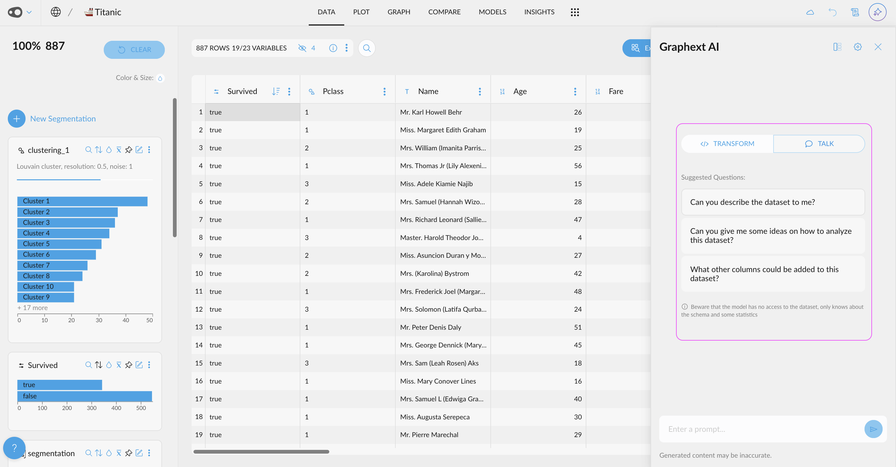
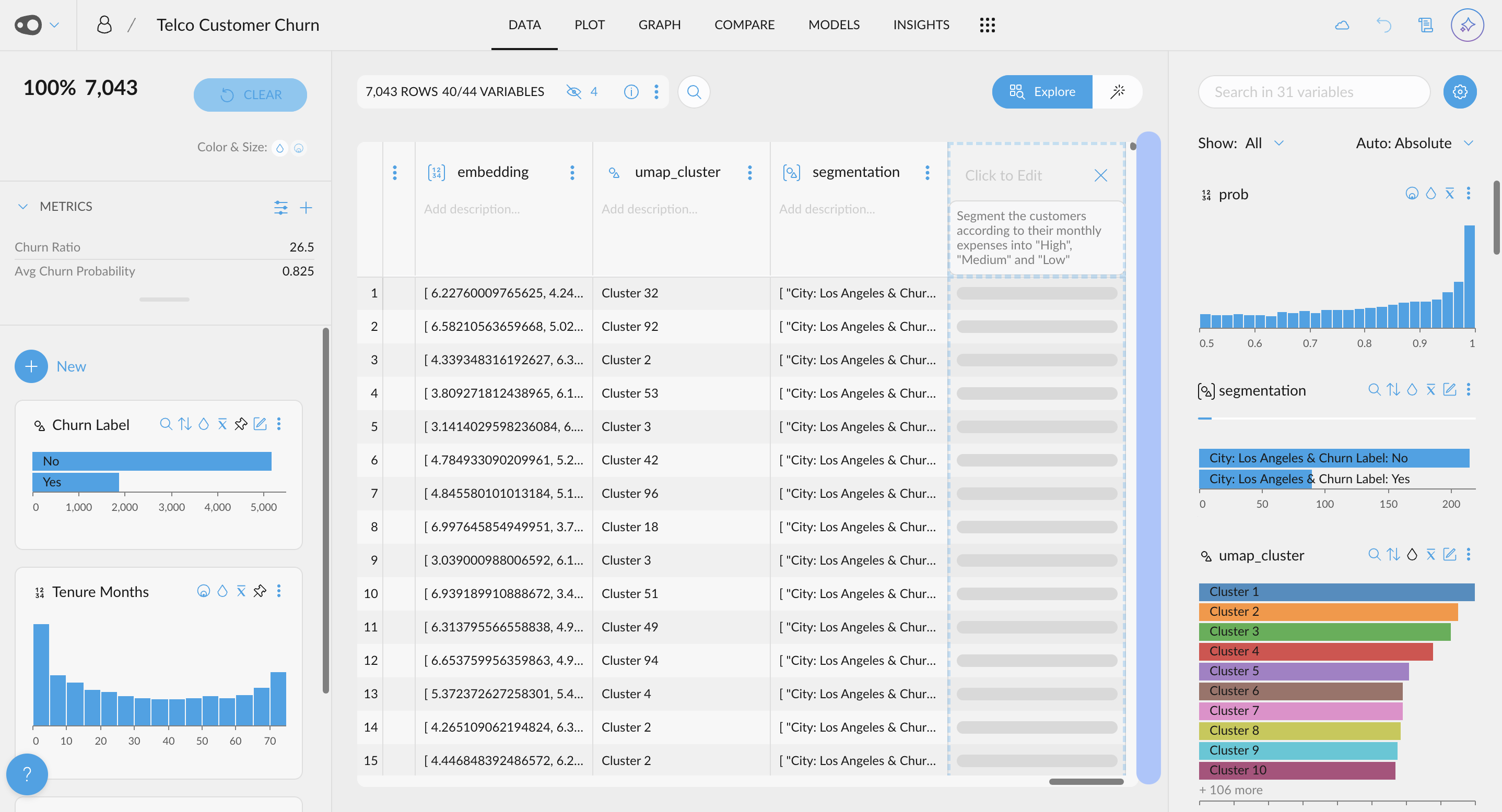
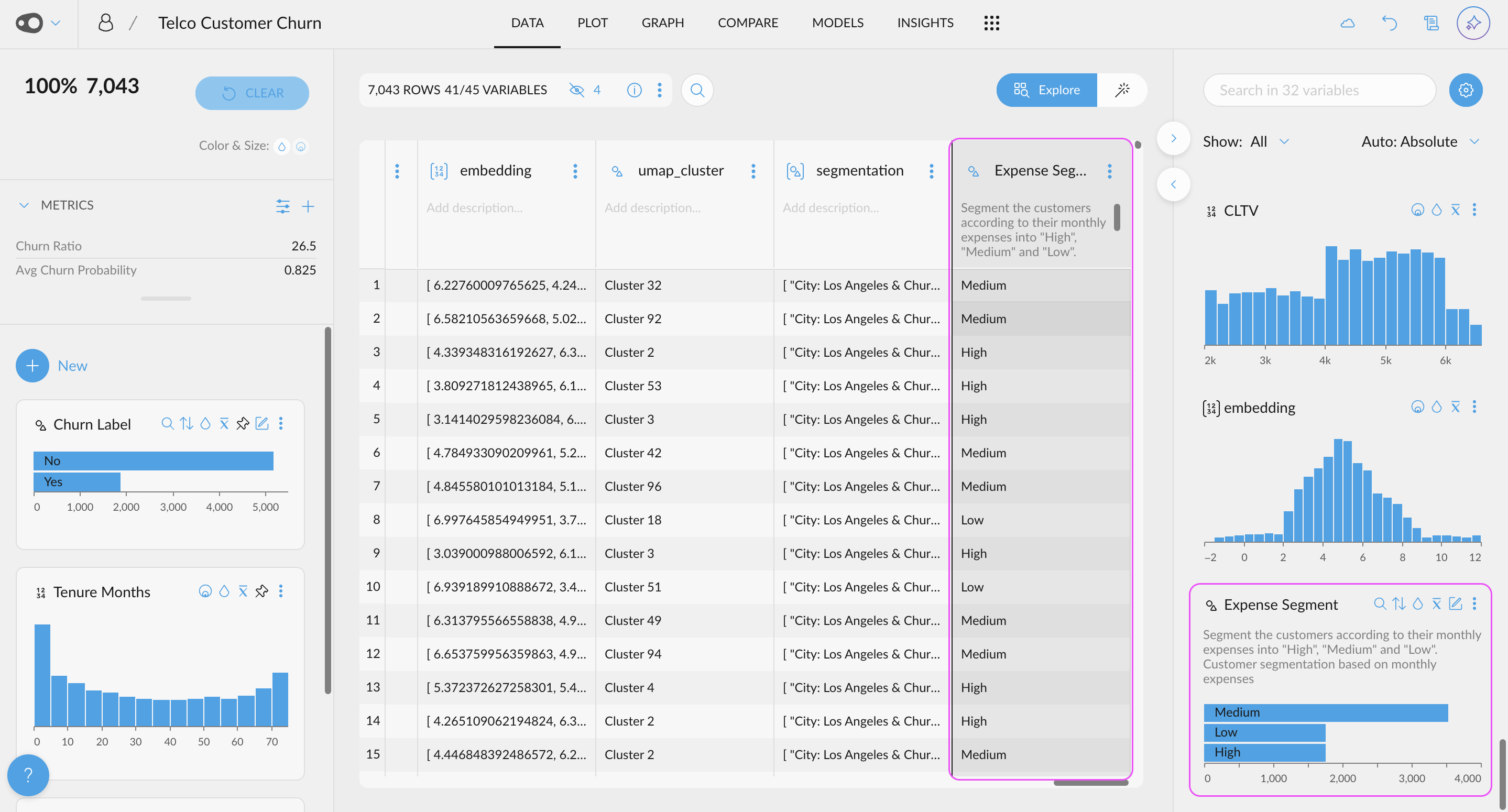
  • AI-Powered Data Transformations: Easily derive new columns by simply specifying the transformation or enrichment you need. For example, ask AI to extract the weekday from a date, calculate the days between two dates, or classify customers as professionals based on their email domainā€” and much more.
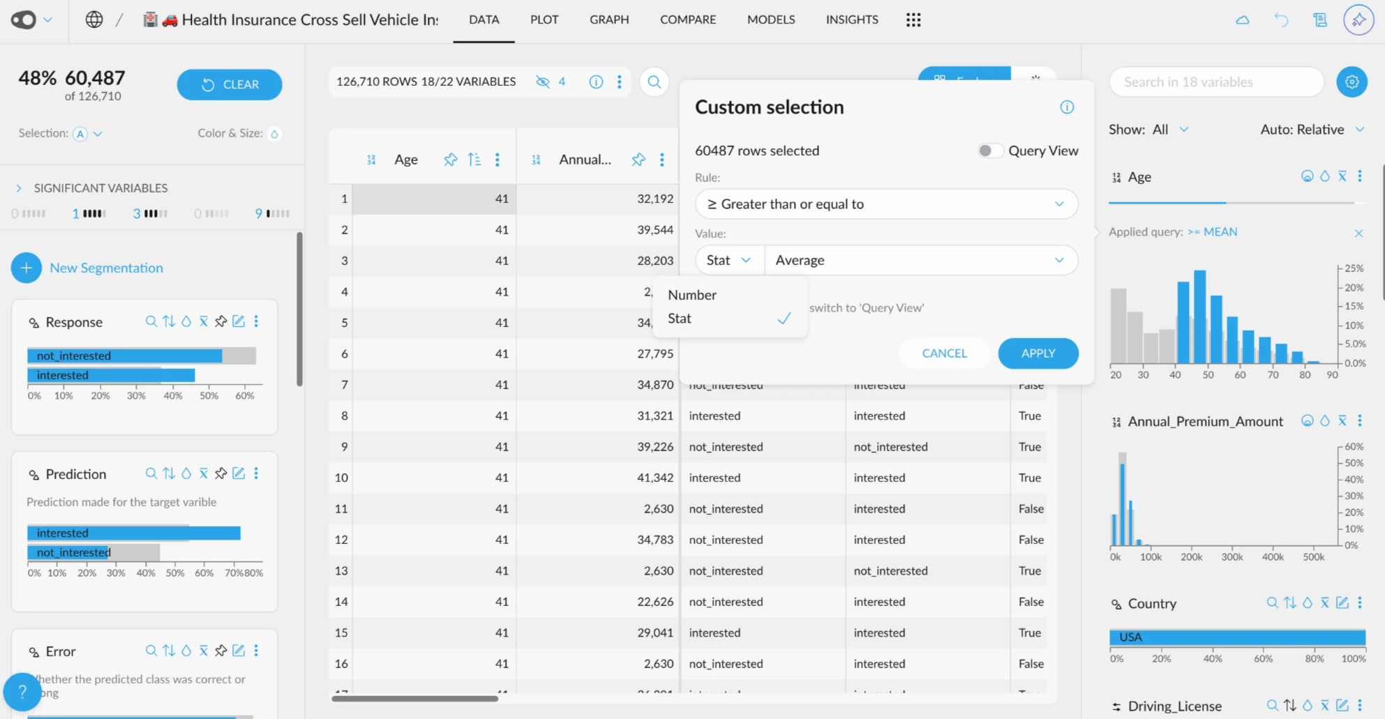
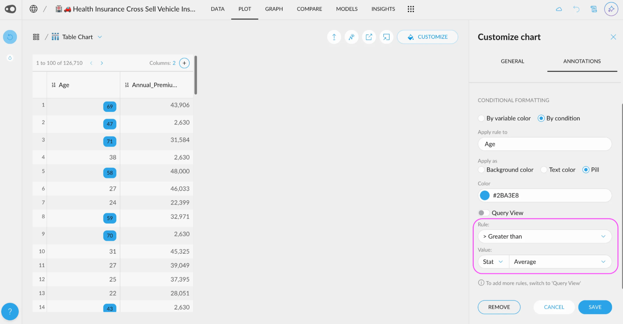
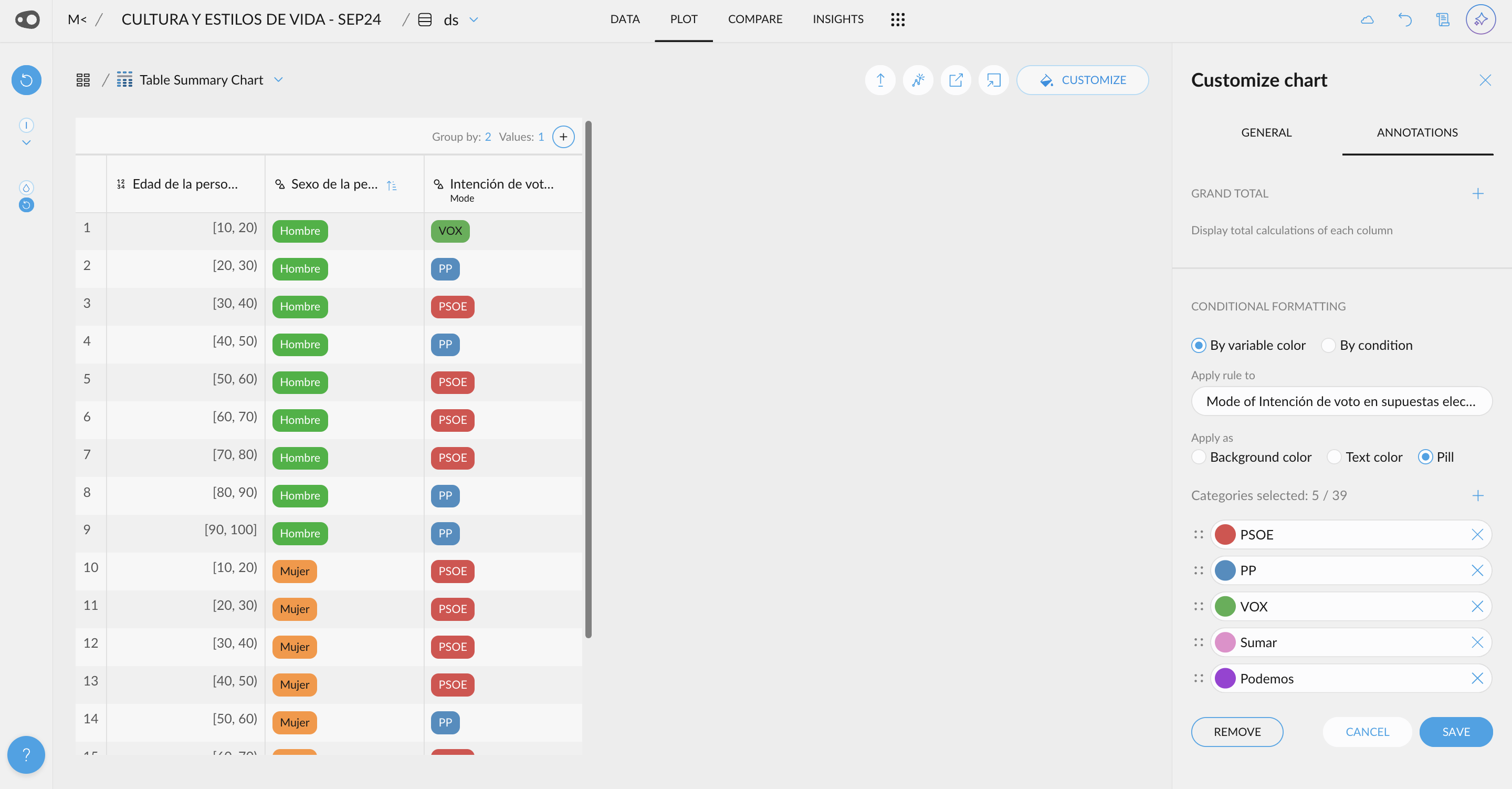
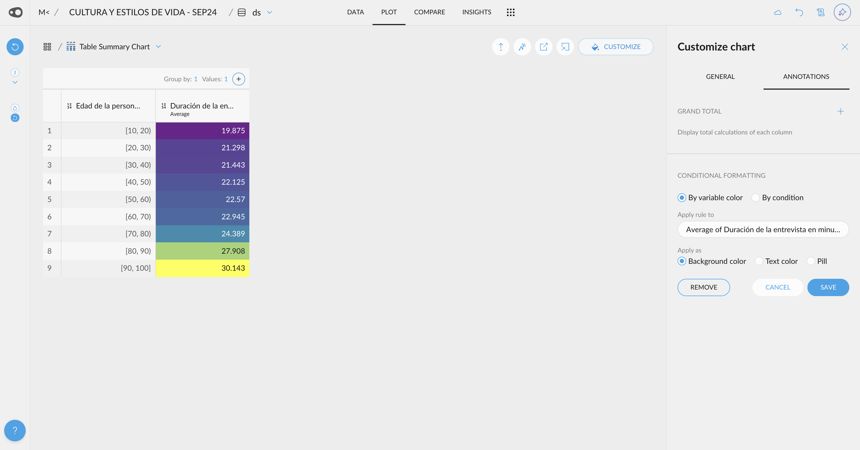
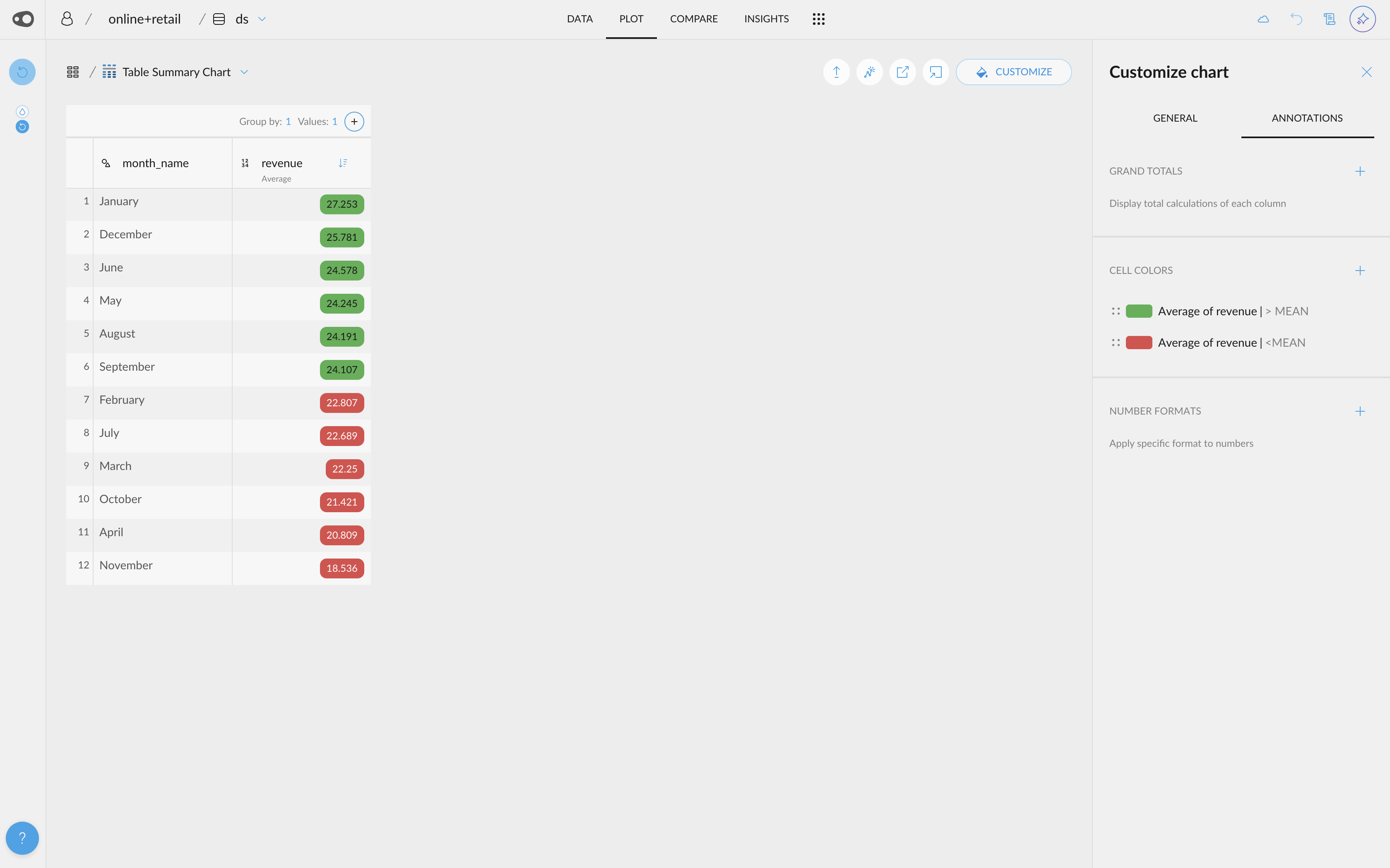
  • Add multiple rules for coloring. Now, you can add multiple rules per column. Duplicating rules is also allowed, making it easier to color cells!
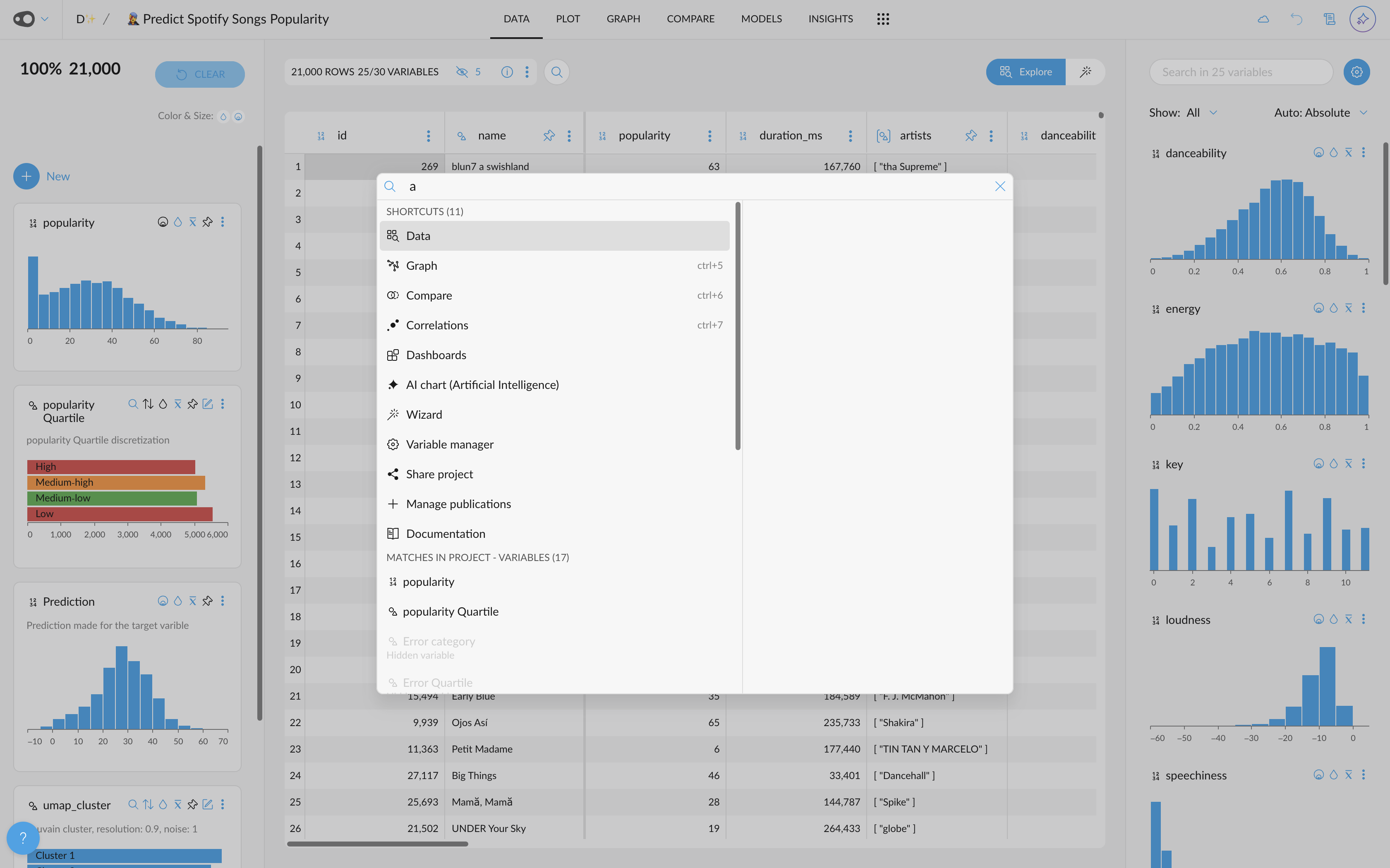
  • New shortcuts are accessible from the omnibar. For example, if you want to go to the plot section or share your project, you can find it there!
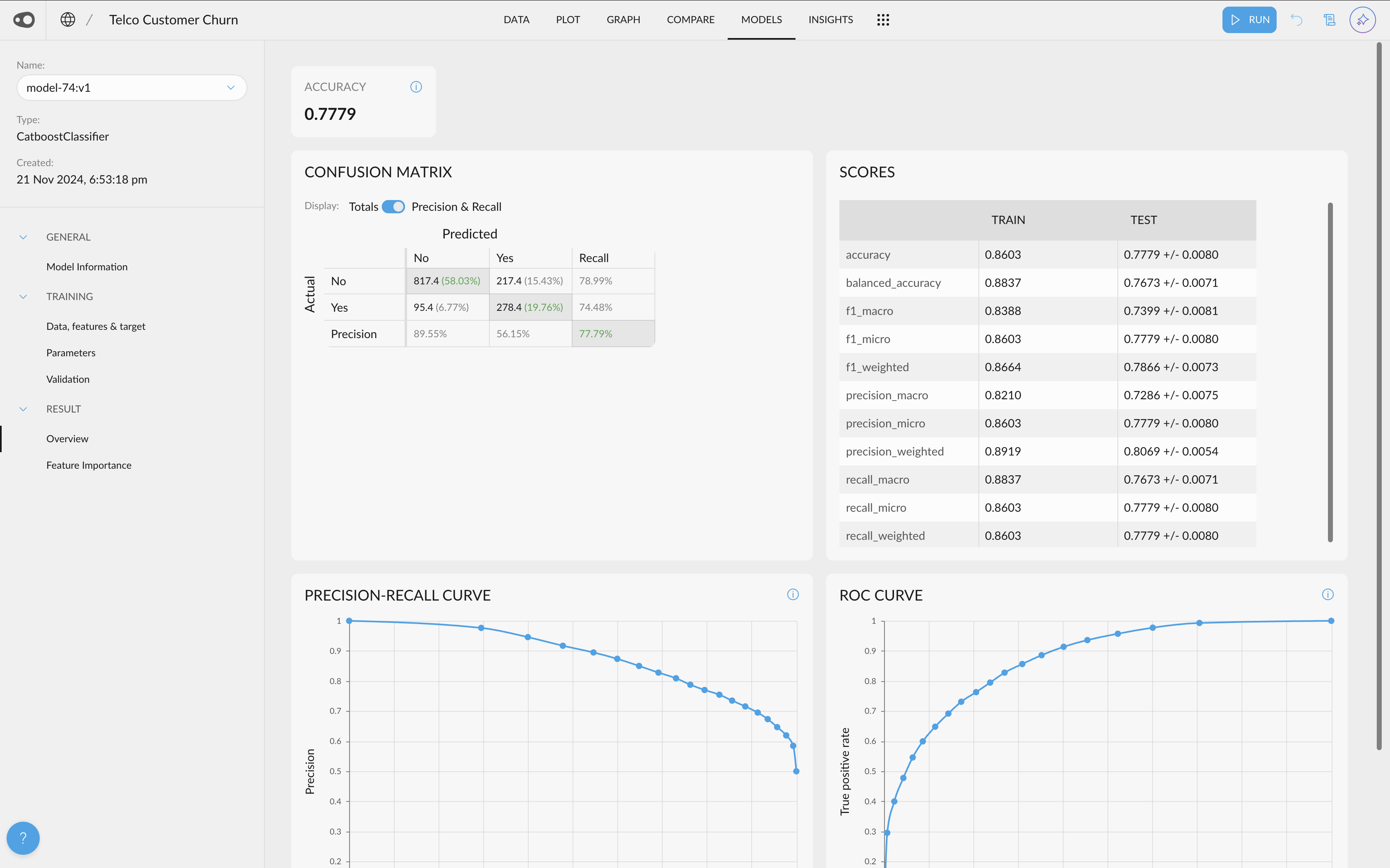
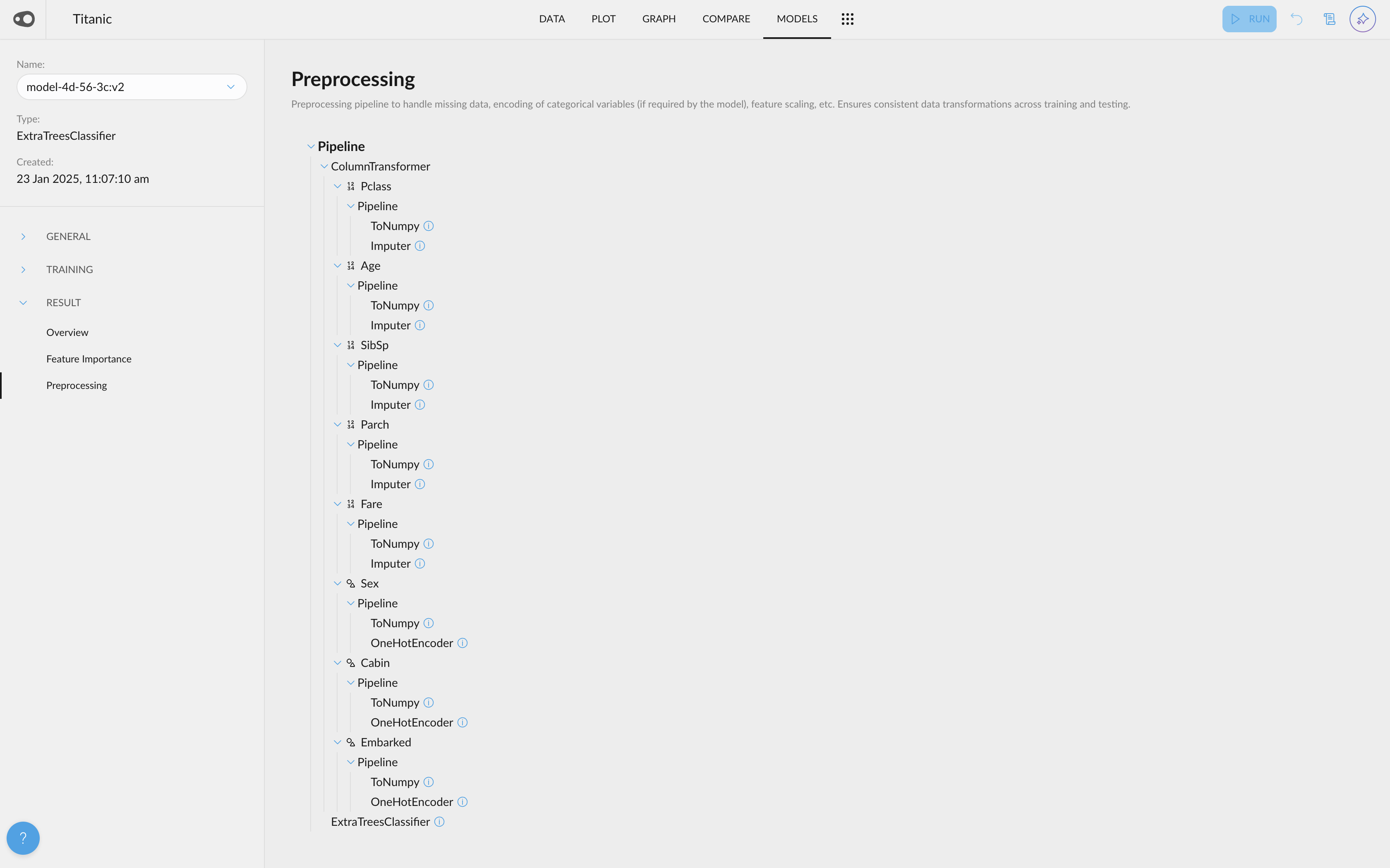
  • Models Preprocessing Steps: The preprocessing tab has been included in the Models section. We do a lot of magic under the hood when creating your predicitve models. Now we make it available for you in the models tab
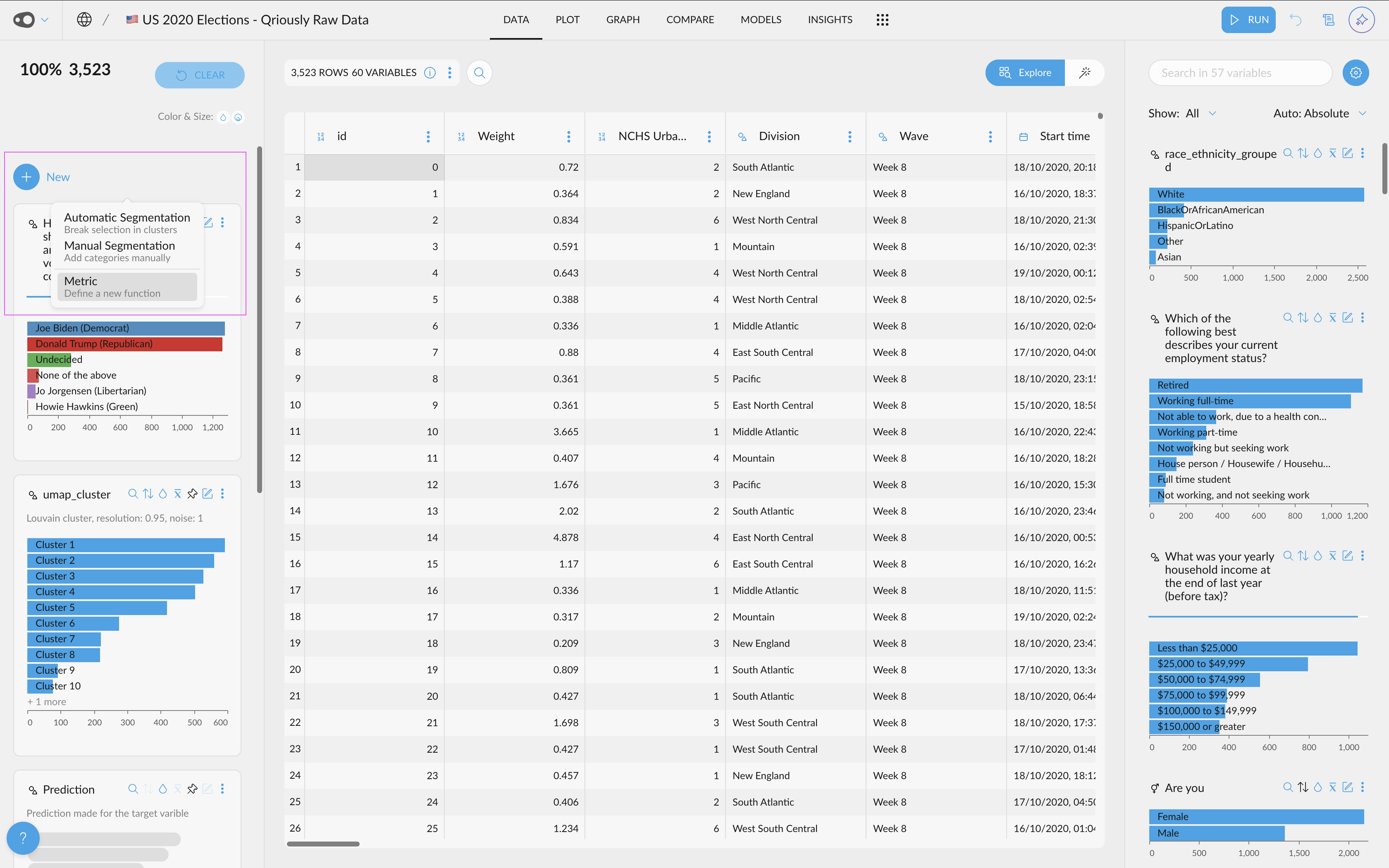
  • Shortcut to create new metrics: We've introduced a special "New" button that allows you to easily create segmentations (both automatic and manual) and metrics.
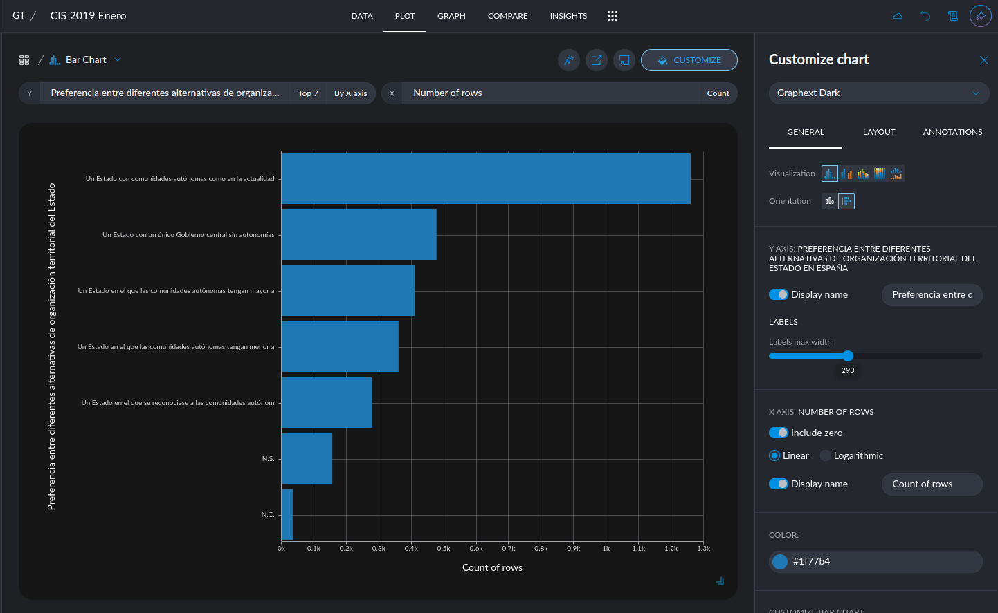
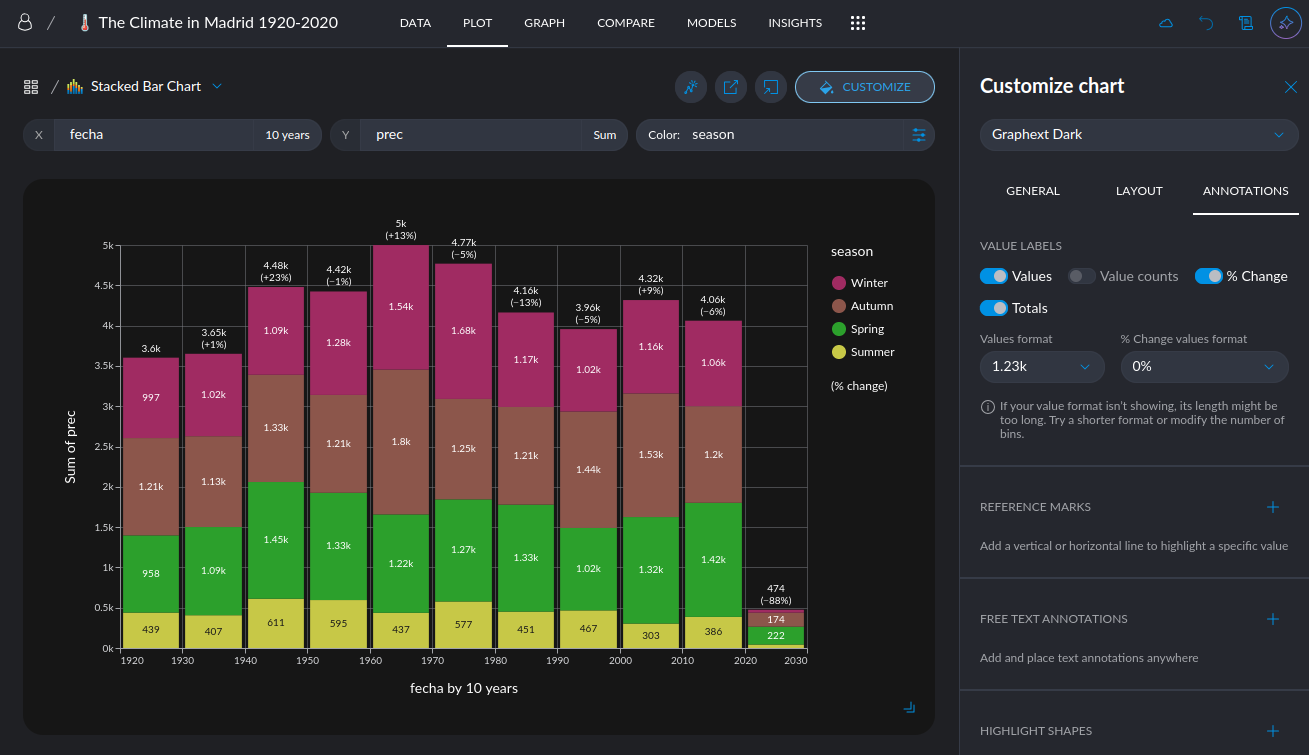
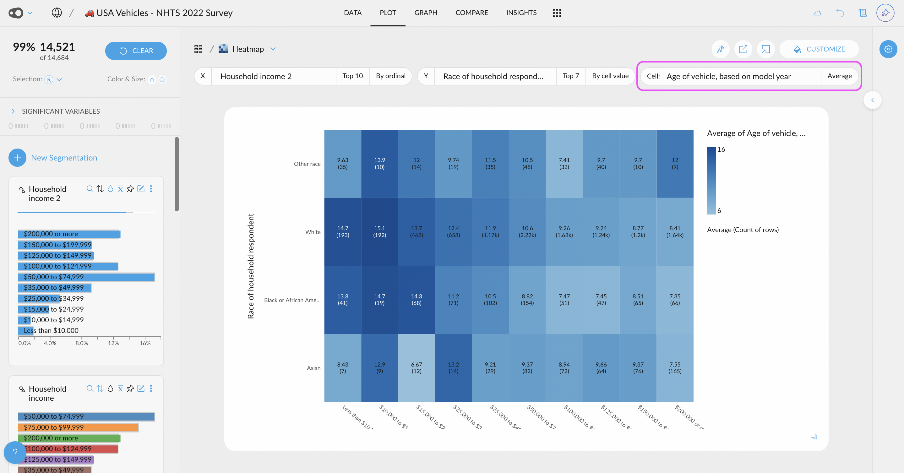
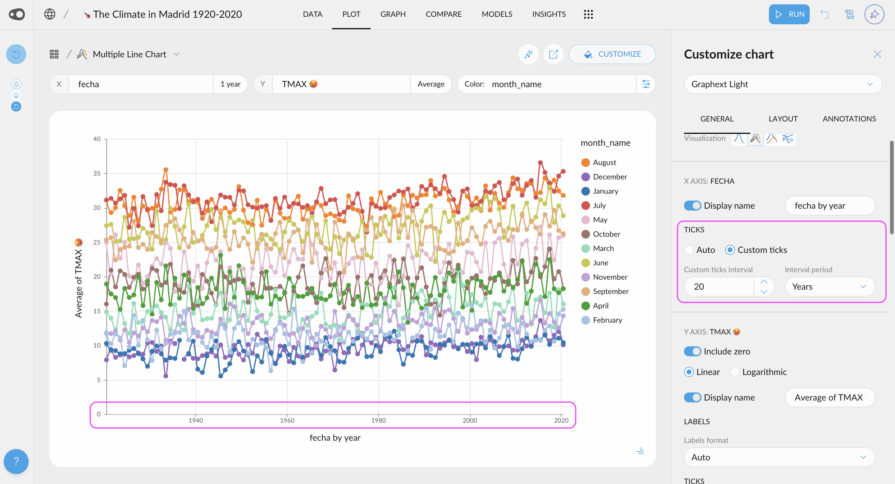
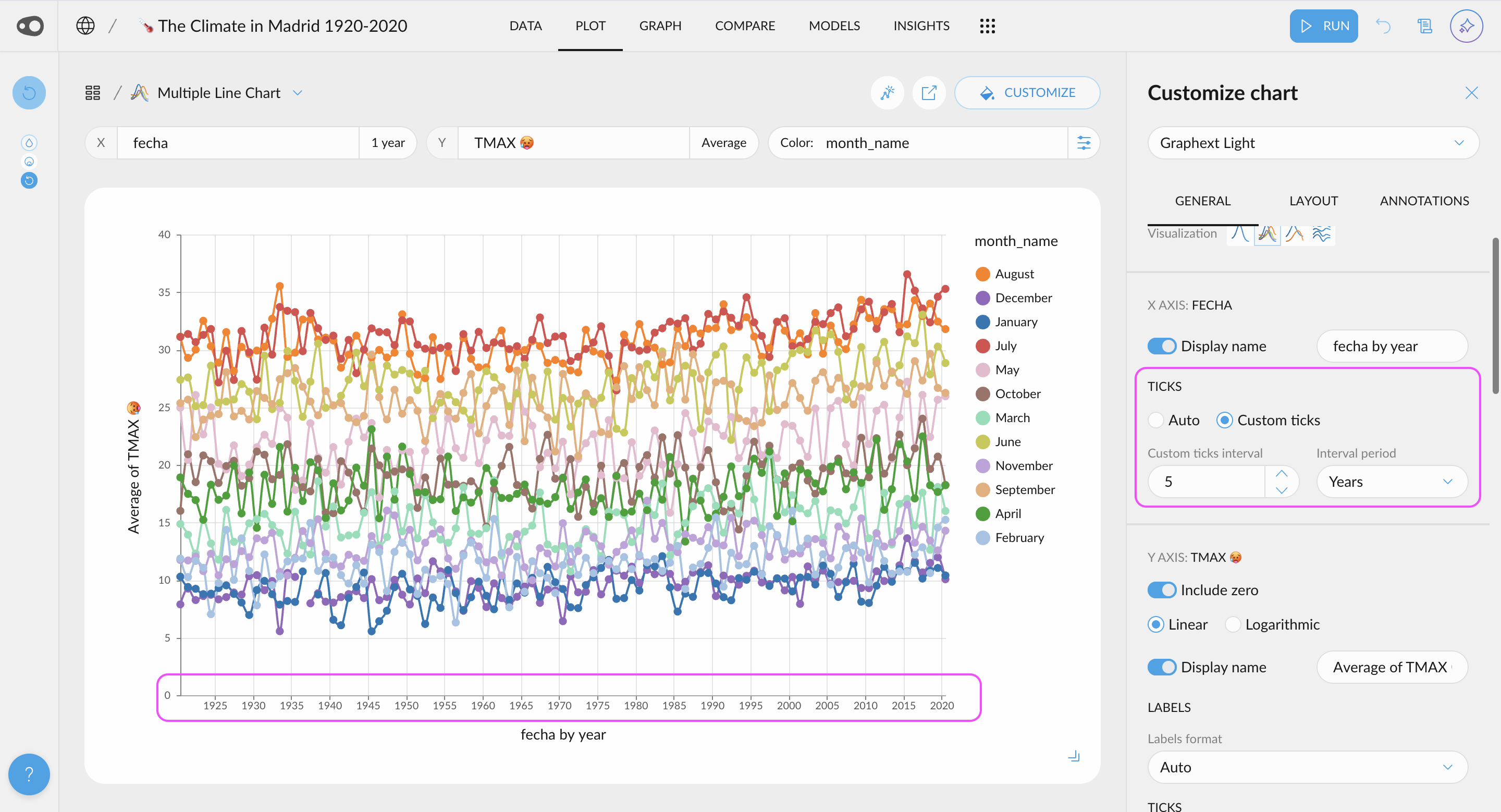
  • Customize Ticks in Plots: Choose to display more or fewer ticks or even specify exact values. This flexibility helps you tailor your visualizations for clearer and more effective communication of insights.

šŸŽØ UI Updates

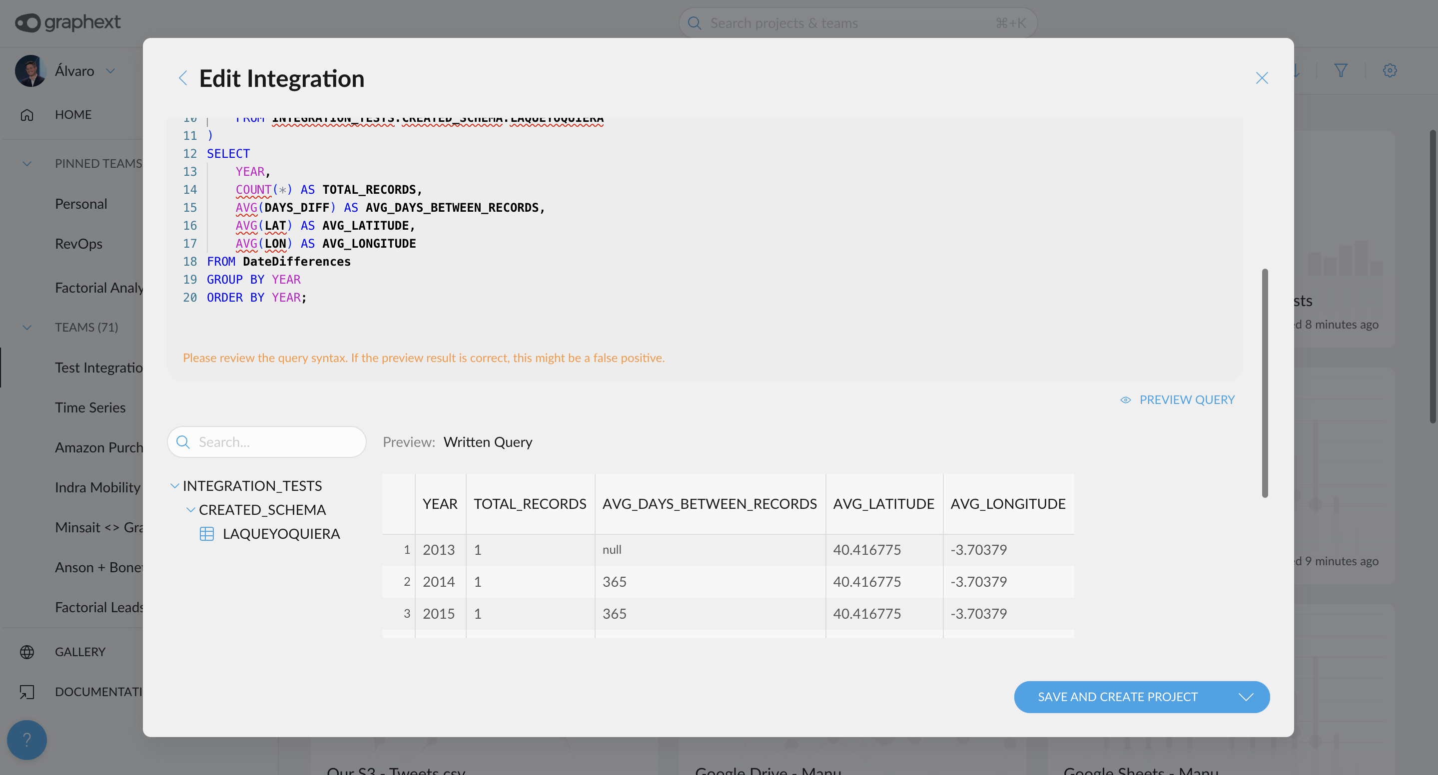
  • Formatting and Autocomplete for Queries: We've added a code editor with SQL formatting for integration queries, along with autocomplete for table and variable names. This makes it easier to spot errors and write queries faster.
  • Nested sections in Models sidebar. Sections now display their subsections in the sidebar, making them easier to access.
January 21, 2025

AI Tagging, Metrics Manager, Label Rotation and size configuration, Integration Shortcuts and moreā€¦

šŸŒŸ New Features

  • Add tags with AI: Just upload your dataset, click add tags and our Gen AI will group your variables, putting under the same tags the ones that are from the same ā€œfamilyā€ e.g. Demographics, Economic, Usage metrics, etc
  • Columns in the Table Chart and Table Summary Chart can now be renamed! Plus, you can hide the subtitle to keep things clean and skip displaying details like aggregation (e.g., "Value Count") or date discretization (e.g., "1 day")
  • Metrics Manager: Now you can view all your metrics in a single modal, making editing and organizing them easier than ever!
  • Use categorical ordinal variables in more charts: Allow to use ordinal categorical variables in X axis for Line & Area charts
  • Labels Rotation: Allow to configure X axis labels rotation for any plot chart. Now X axis labels for categorical variables are rotated if there is not enought space for each bin. Also we can modify this default behaviour by using rotate or horizontal modes
  • Axes label width configuration: Allow to control the maximum width of labels
  • Find the integration connected to your project: To help identify the integration from which a project was created, we've added a shortcut to the integration icon. Simply click on it on the project's card, and you'll be able to edit the associated integration.
  • Edit the query associated to a project in a seamless way: Ā To simplify finding the integration linked to a project, we've added a shortcut within the project steps. Just click on it, and you'll be instantly redirected to the Hall, where you can edit the integration.

šŸŽØ UI Updates

  • New color summary design: We've improved the rule color summary for easier identification and refined the section titles. A clear, concise interface remains our top priority.
  • Weā€™ve clarified which date is displayed on the project card. Additionally, if you change the sorting criteria, the date shown will update to match the selected filter.
  • You can now select variables hidden in the cross-filter directly from the plot distributor. These variables will be grouped at the bottom of the selector for easy access.
  • Better error messages from Open AI API

šŸ› Bug Fix

  • You are now alerted and prevented from trying to apply dimensionality reduction to datasets having a single column only (in steps likeĀ embed_dataset,Ā layout_datasetĀ andĀ cluster_dataset)
  • SHAP explanations of model predictions now have correct JSON format. This means the corresponding column is now a valid input to steps likeĀ extract_json_values)

January 7, 2025

Navigate Integrations, Preview Tables, Chat Freely with AI, and Discover Trending Projects

šŸŒŸ New Features

  • Integrations Navigation and Query Preview: Connecting to your data source just got smarter! Graphext now validates your connection before proceeding, reducing errors and saving you time. Once connected, explore your data warehouse with a navigation panel on the left-hand side. Click on tables to preview their structure, including variable names and data samples. You can even preview query outputs, such as joins, before creating your Graphext project. Watch the video example to see this streamlined workflow in action!
  • Chat Freely with the AI About Your Data: Introducing a toggle to switch modes in the AI Chat! Seamlessly switch between Chat Freely mode for open-ended questions and Transformations mode to focus on specific data operations.
  • Discover Trending Projects in the Home Section: Find out whatā€™s buzzing in your team! A new section in the Home view highlights recently visited projects from teams youā€™re part of. Stay informed about the projects generating the most interest and quickly find the ones your teammates are discussing in daily meetings.
  • New Filter & Sorting Criteria for Projects: Organize your projects with greater flexibility. In both the Home and Team views, you can now sort projects by additional criteria: viewed, created, updated, and refreshed. Find what you need faster than ever!
  • New UI for Quantitative Variable Selections: A new user-friendly interface allows you to customize your selections with just a few clicks. You can also use this UI, for the coloring rules in the table in plot
December 24, 2024

ROC Curves, Quantile Binning, and Redesigned Models Tab for Better Analysis

šŸŒŸ New Features

  • ROC & Precision-Recall Curves in the Models section: When training a predictive model, youā€™ll now have detailed performance insights. Evaluate your modelā€™s performance with ROC and Precision-Recall curves, giving you a clearer understanding of its strengths and weaknesses.
  • Discretize date columns in the Summary Table: You can now group date columns directly in the Summary Table (Group by)! Discretize by Year, Month, Week, Day, Hour, and more to make analyzing date-based trends easier and more flexible.
  • Format numbers in the Table & Summary Table (Plot): Bring consistency to your data presentations by formatting numbers in tables. Add decimal precision for better comparison or use a compact format like 1.23k for large numbers.
  • ā€˜Count Whereā€™ and ā€˜Percent Whereā€™ are now available as an aggregation option in the Summary Table: Unlock new aggregation possibilities with the Count Where and Percent Where options. For example, calculate the percentage of users in a segment (e.g., Age 18ā€“30, Male, from Barcelona) who voted for a specific political party.
  • Now you can manually adjust the width of the table columns: Say goodbye to truncated headers! You can now manually adjust table column widths, making it much easier to handle long column names and optimize table readability.
  • Group by and Create Bins by Quantiles: Introducing dynamic quantile creation for variables in plots and tables! This is especially helpful for skewed data distributions. For instance, when your model's predicted probabilities are mostly low with a few high values, you can now group them into quantiles for clearer analysis. Quantiles are also available in the Group By table, adding even more flexibility to your data exploration.

šŸŽØ UI Updates

  • Models Tab Redesign: Weā€™ve given the Models tab a fresh new look! Components have been reorganized for a cleaner and more intuitive layout, with an emphasis on the most relevant metrics. Explore your models with improved clarity and focus.

šŸ”§ Technical Updates

  • The group_by step, supports ā€˜Count Whereā€™ and ā€˜Percent Whereā€™
December 10, 2024

Percentage Change Labels, Numerical Heatmap Metrics, and more Table Aggregations

šŸŒŸ New Features

  • Percentage Change Labels for Bar and Line Charts:

Easily track trends with percentage change labels! You can now display the percentage change between consecutive bins in simple or stacked bar charts, as well as in line charts. This addition provides a clear, visual way to highlight growth, decline, or fluctuations over time, making your data storytelling more impactful and intuitive.

https://x.com/victorianoi/status/1862068925015408892
  • Map numerical variables to the cells in the Heatmap: Enable mapping of numerical variables to heatmap cell values. Previously limited to count or relative count, users can now display metrics such as total revenue, average age, or any other numerical aggregation.

  • New aggregations in the Summary Table: Use list, list unique & concatenate aggregations for quantitative & date columns in Summary Table. Also Unlock new aggregation possibilities by grouping date variables into lists! This feature is perfect for cases where you need to group by a customer ID and retain all the unique transaction dates, or when you want to capture individual purchase datesā€”even if multiple purchases occurred on the same day. Combine this with segment or gradient-based coloring for tables to make your visualizations even more insightful and impactful.
  • Color Tables by Segment or Numerical Gradients:

You can now apply segment-specific colors directly to table rows or cells, making it easier to align visuals with existing segment definitionsā€”such as brands, political parties, or any other categoriesā€”boosting communication clarity and impact. Additionally, numerical variables can now be colored with gradient scales, providing a powerful way to highlight patterns and trends at a glance.

Page 1Next