Women's Rise in US Congress and Senate: From Absence to Dominance

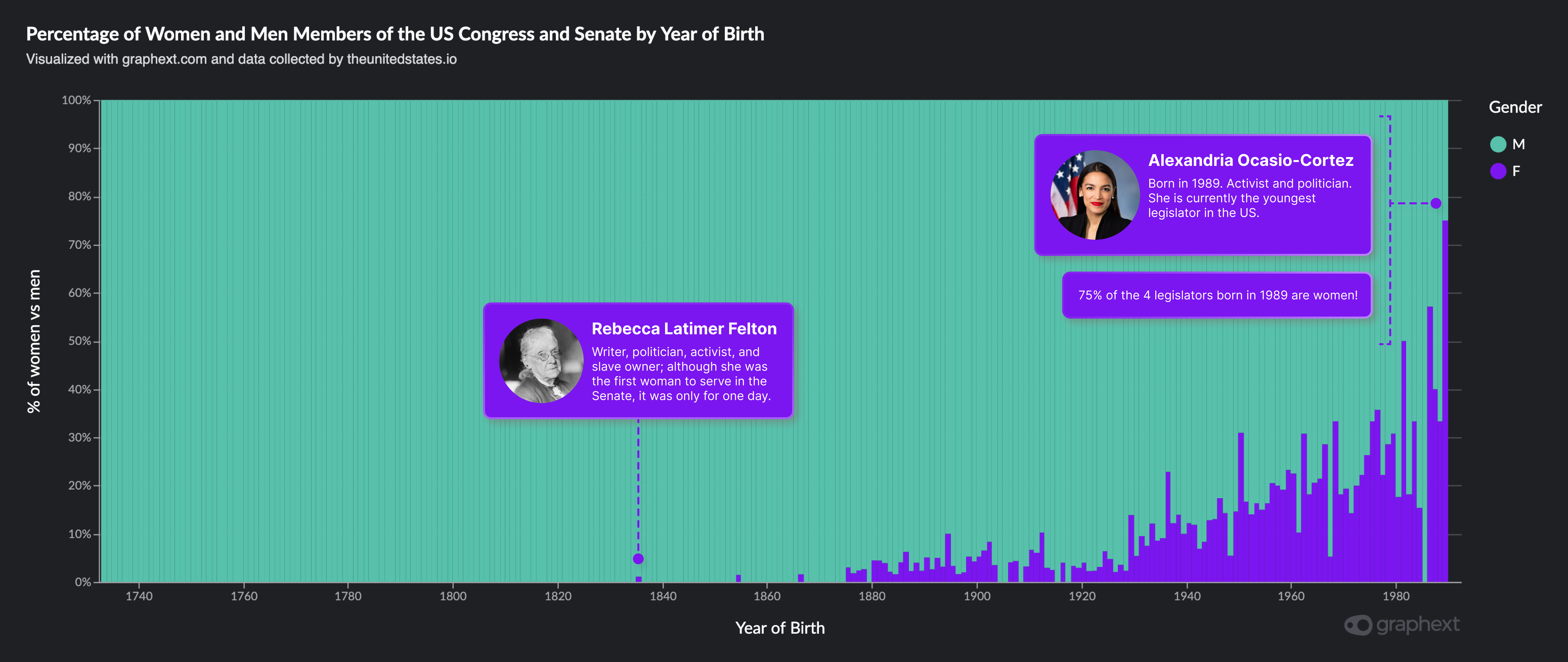
I found this dataset on Github by chance and when I opened it in Graphext, simply selecting the date and gender, I got this compelling chart about the increasing representation of women in the US Congress and Senate. The gender balance has tipped, with women moving from a nearly nonexistent presence for 200 years to a position of dominance among the new generation of politicians.
The turning point finds its roots in the 1930s, a time marked by the stirring of women's political ambitions. The momentum gathered pace in the 70s, an era vividly brought to life in the "Mrs. America" series. Now, the landscape is irrevocably altered. The case of Alexandria Ocasio-Cortez, the youngest woman in Congress, born in 1989, exemplifies this transformation. She is one among a burgeoning number of youthful legislators who are women. In fact, the data shows that 75% of legislators born in 1989 are women.
Given that the median age of legislators is 55, if women begin to surpass 50% of legislators under 40, within a decade we should anticipate a balance or even a predominance of women, assuming this trend continues and other impacts, such as the well-known child penalty, do not emerge.
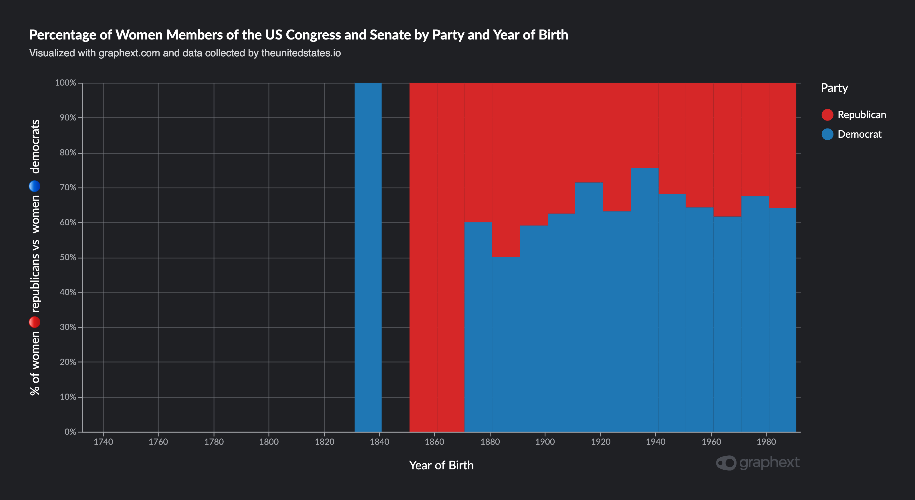
This second chart demonstrates the Democratic Party's leading role in representing women in Congress and the Senate, with 65% of the women historically coming from that party. This divergence may signify an ideological divide in gender representation within the two major political parties.

For those interested in exploring this data further, You can access the project here to reproduce the results or create new charts by playing with the data yourself :)
Here is a a mini-tutorial showing how easy it was to create the first graph.