
Conspiracies, Complexity and Clustering: Investigating Reports of Adverse COVID-19 Vaccine Effects
Modelling data from the Vaccine Adverse Event Reporting System (VAERS) - a US government-sponsored vaccine reaction monitoring service - our team set out to investigate reports of adverse health effects related to the seismic rollout of the COVID-19 vaccination programme in the USA.
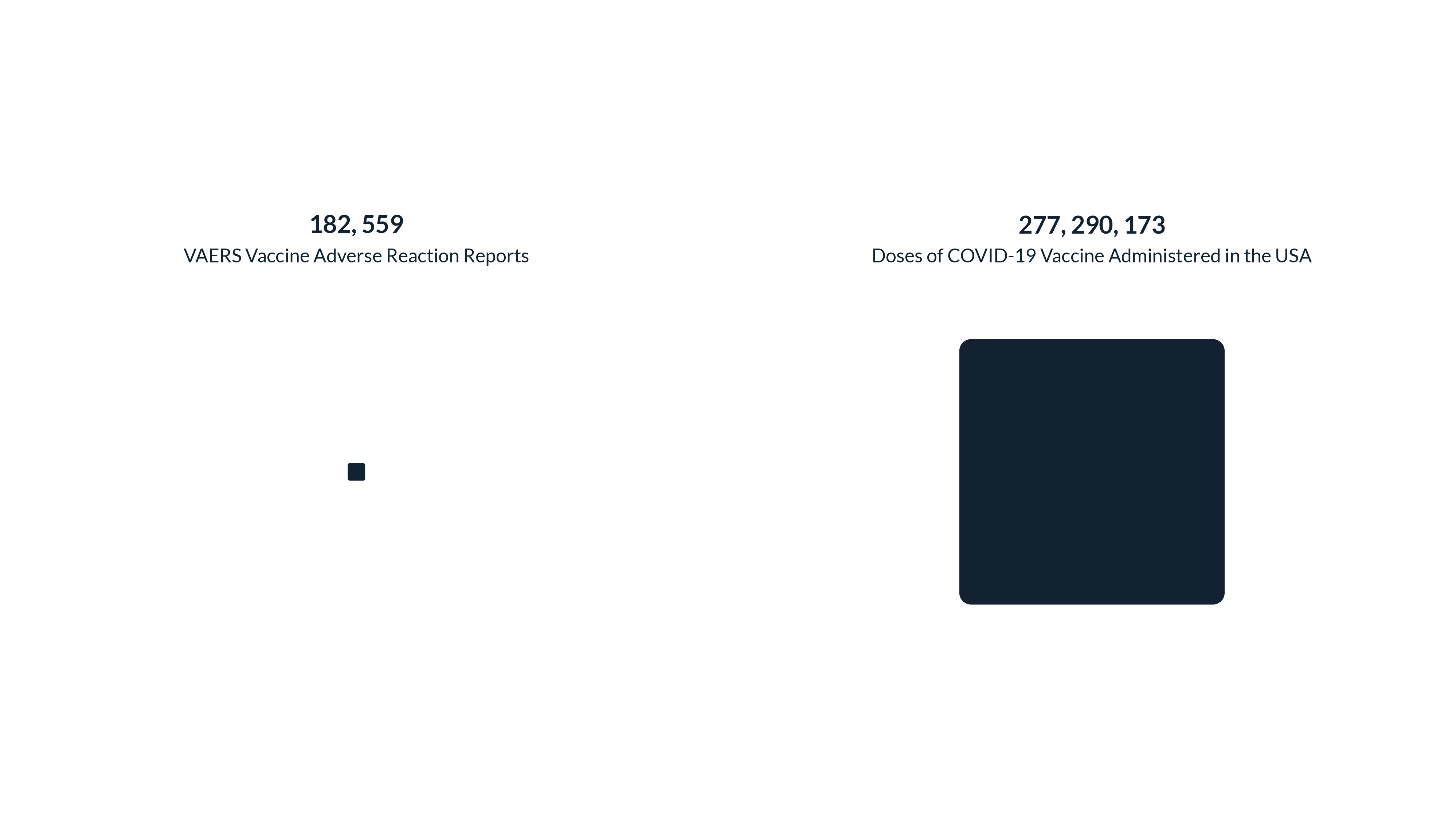
By the middle of May, the USA had administered 277 million COVID-19 vaccinations - almost 18% of worldwide doses. The most recent wave of VAERS data, which runs up until 7th May 2021, records 182,559 reports of adverse vaccine effects from the US population. This makes for a ratio of 1 VAERS report of adverse vaccine effects for every 1,519 doses of a COVID-19 vaccination given to an American citizen. Considering that adverse effect reports can be as harmless as a headache or a sore arm, this ratio seems pretty reasonable ... right?
Give Me Some Context
But it's impossible - and perhaps irresponsible - to ignore context here. As the pandemic continues to affect people the world over, there is a significant minority that remains sceptical about the effects of the vaccine programme. Unfounded claims are spread quickly on social media without the backing of scientific evidence. It is easy to persuade someone to be worried but less easy to reassure them.
So, armed with a dataset of adverse vaccine reactions, the temptation was clearly to dig out a set of conclusions signifying whether the sceptics have any foundation with which to hold their beliefs. A dataset of this magnitude would seemingly reveal 'truths' about how COVID-19 vaccines are affecting people. But in the world of immunology and vaccine research, things are not as simple as this.
"The system (VAERS) is not designed to determine whether a reported adverse event was caused by the vaccine, but serves as an early warning system and helps CDC and FDA identify areas for further study."
CDC representative corresponding with Graphext
The key point here is that VAERS data is not scientific evidence. Whilst VAERS is co-managed by the CDC (Centre for Disease Control and Prevention) and the FDA (Food and Drugs Administration), both arms of the US government, its exclusive use of reporting to collect data serves only as an "early warning system" to flag areas of further research.
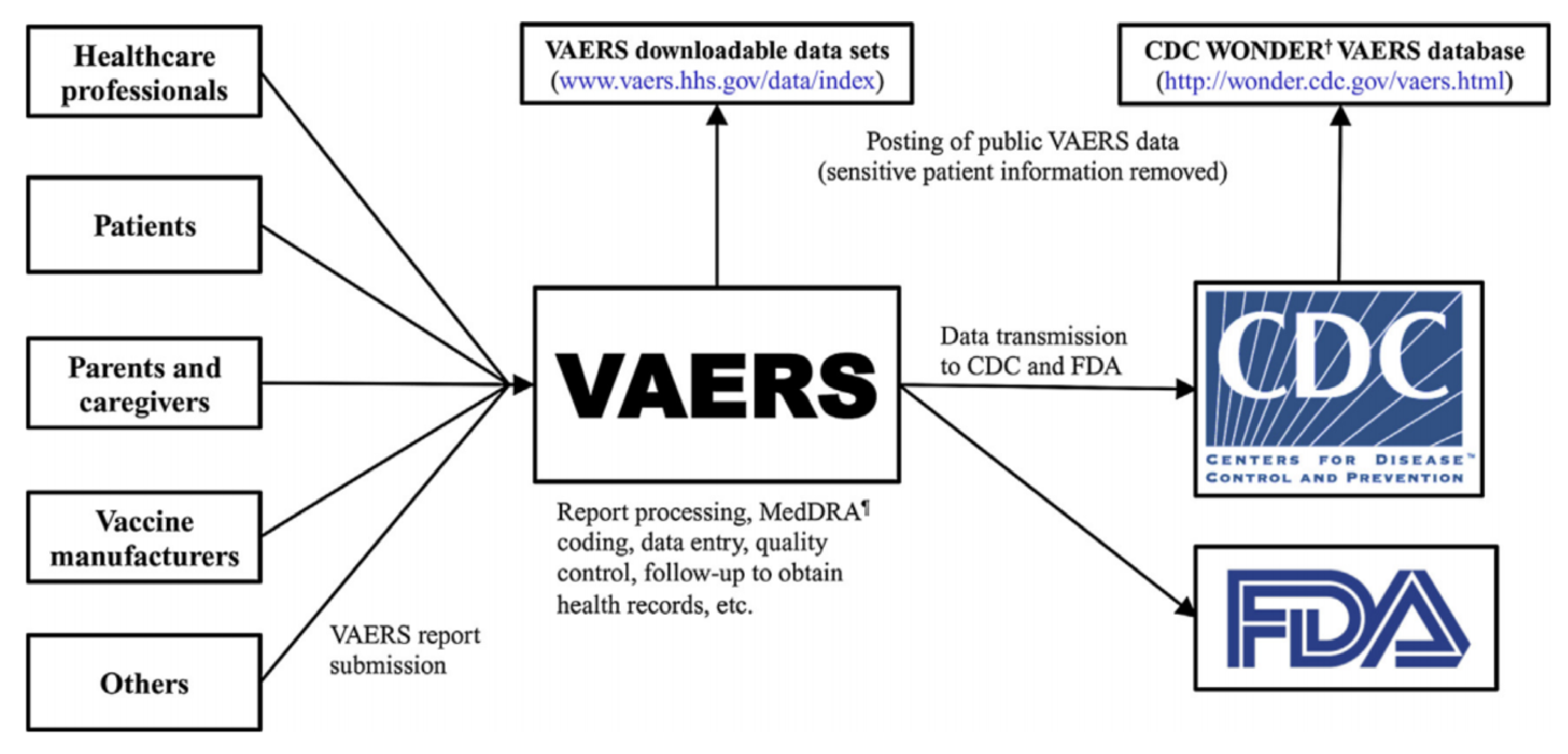
A representative from the CDC told Graphext that because VAERS passively rely on patients and healthcare providers to report adverse vaccine events, no conclusions can be made using VAERS data alone - despite the fact that healthcare providers are - in some cases - required by law to report to VAERS.
Immunologists we spoke to emphasized the need to compare vaccination populations with unvaccinated populations in order to determine the statistical significance of a theory about adverse vaccine events.
This makes sense. In order to validate a theory regarding the side effects of a vaccine, laboratory conditions are required to carry out tests that can be used to determine the statistical significance of variations between vaccinated and unvaccinated populations. VAERS data must be understood as a record of adverse vaccine events reported by members of the American public. This is a far cry from laboratory conditions and in no way offers a comparison to unvaccinated or asymptomatic people.
What's in VAERS Data
Updated regularly on their data portal, VAERS data is published in annual waves and details the adverse vaccine event reported by a person, their carer or their healthcare provider following a vaccination. Established in 1990, VAERS documents the symptoms felt by a person, whether they died, whether they were hospitalized or recovered from their symptoms as well as information concerning their existing health condition.
VAERS data exclusively records information from people that reported an adverse vaccine event.
We clustered VAERS data based on the similarity of an adverse vaccine event report. Factors modelled for similarity included the demographics of the reporter, the symptoms they suffered and the severity of the event.
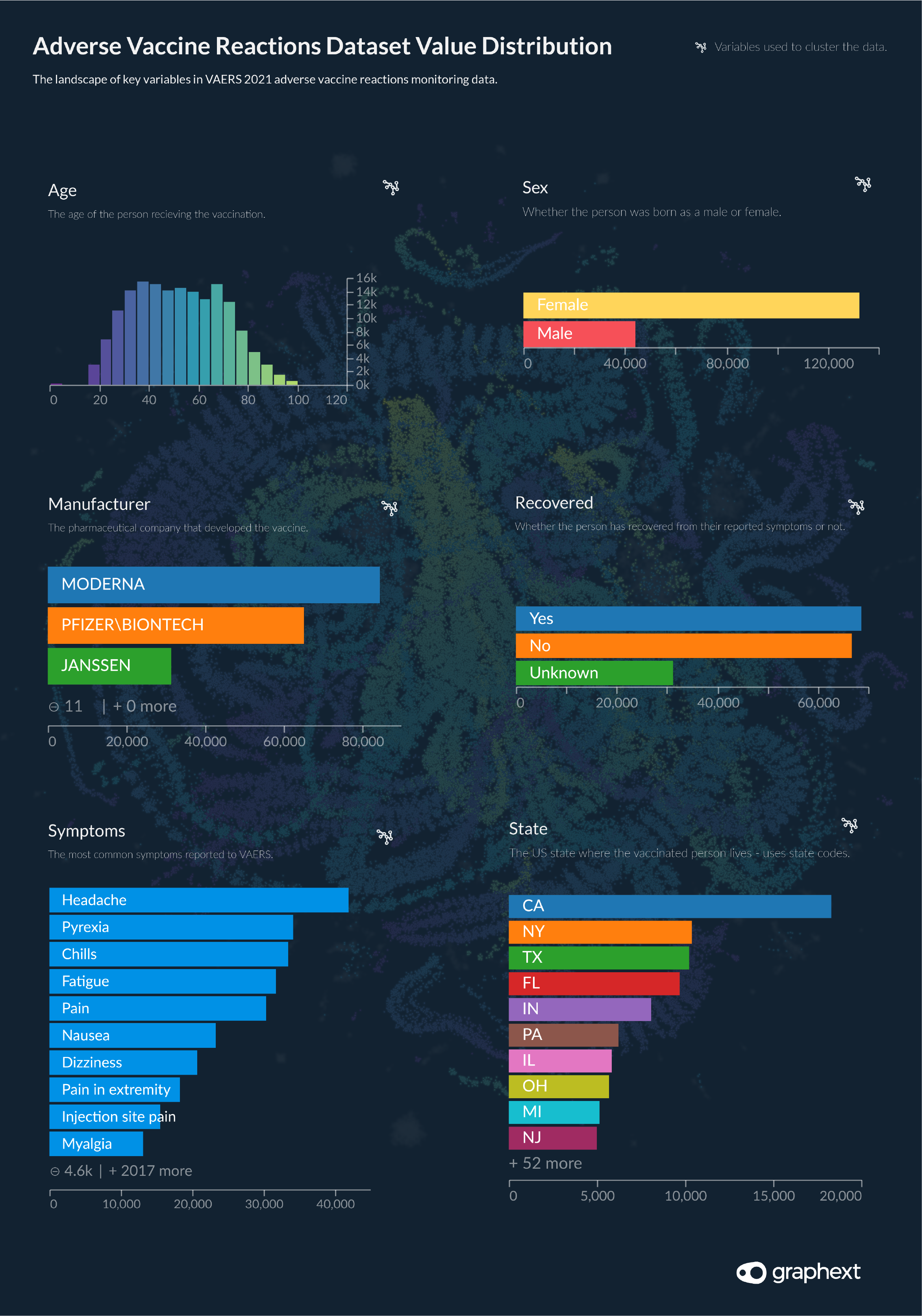
Value Distribution: VAERS Data 2021 Wave
Vaccine adverse event reports range from Nov 2020 - May 7th 2021
Clustering + NLP: Building the Project
Moving forward to start analyzing the data, our team built a clustering model, grouping adverse event reports according to the similarity of the demographic information about the reporter, the symptoms they suffered and the severity of the event. Setting two target variables - Died and Recovered - our aim was to uncover connections between reports that shared a similar outcome. In line with the purpose of VAERS as an "early warning" system, our intention in clustering VAERS data with Graphext was to point to areas of further study.
But clustering alone here was not enough to account for the complexity of the dataset. VAERS include 6 text columns; Other Medication, Allergies, Medical History Notes, Symptom Description, Prior Vaccinations and Current Illnesses. All of these text columns contained potentially useful information but unless processed and parsed would remain largely useless in our analysis. Mitigating this problem, the team opened up Graphext's code editor and added NLP steps to extract keywords and, in some instance adjectives and nouns from these columns.
To understand more about how we built the project including a step-by-step guide on the methods we used to extract language features from the data - check out the methodology behind this project.

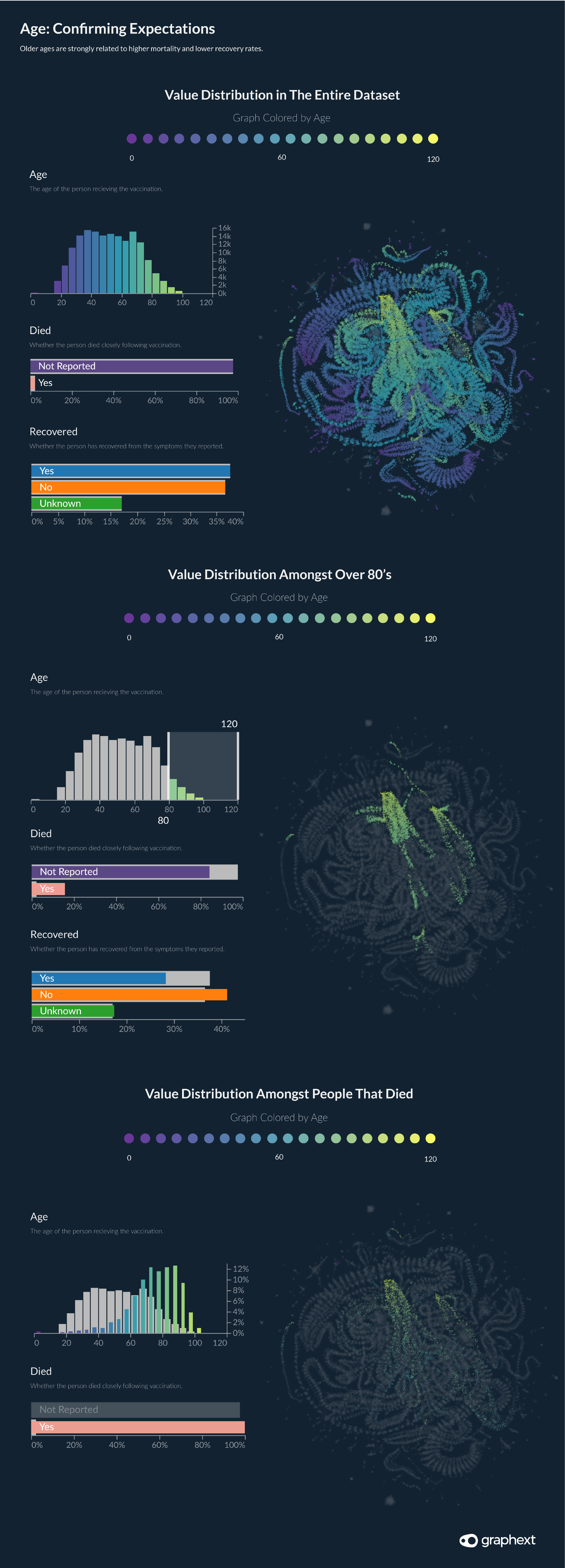
Age: Confirming Expectations
Inspecting the Graph for the first time using color mapping to show the distribution of values across our network of reports, our team immediately picked up on the influence of the variable Age. As seen in the first Graph above, a person's age had a significant bearing on their position in the network as well as the likelihood of them dying.
The pandemic has driven home the vulnerability of older people. Our intuition told us that older generations would be more likely to be overrepresented in communities of people that died or didn't recover from their symptoms. Excluding the presence of Americans under the age of 20 - who would be less likely to have been vaccinated at the time of writing - age distribution in the VAERS dataset follows a similar distribution to age distribution in the US population at large. However, as we hypothesized, older generations saw greater representation amongst populations reporting not to have recovered from their symptoms or to have passed away.
Over 60's represented 79.7% of deaths recorded in VAERS data but make up just 29% of the dataset.
Is this to be expected? Pretty much. Over 60's represented 79.7% of deaths recorded in VAERS data but make up just 29% of the dataset. No doubt this is an overrepresentation but it is one that most likely has not been influenced by vaccination and instead is more likely to represent the known fact that older people suffer more illness, poor health and in general are more likely to die.
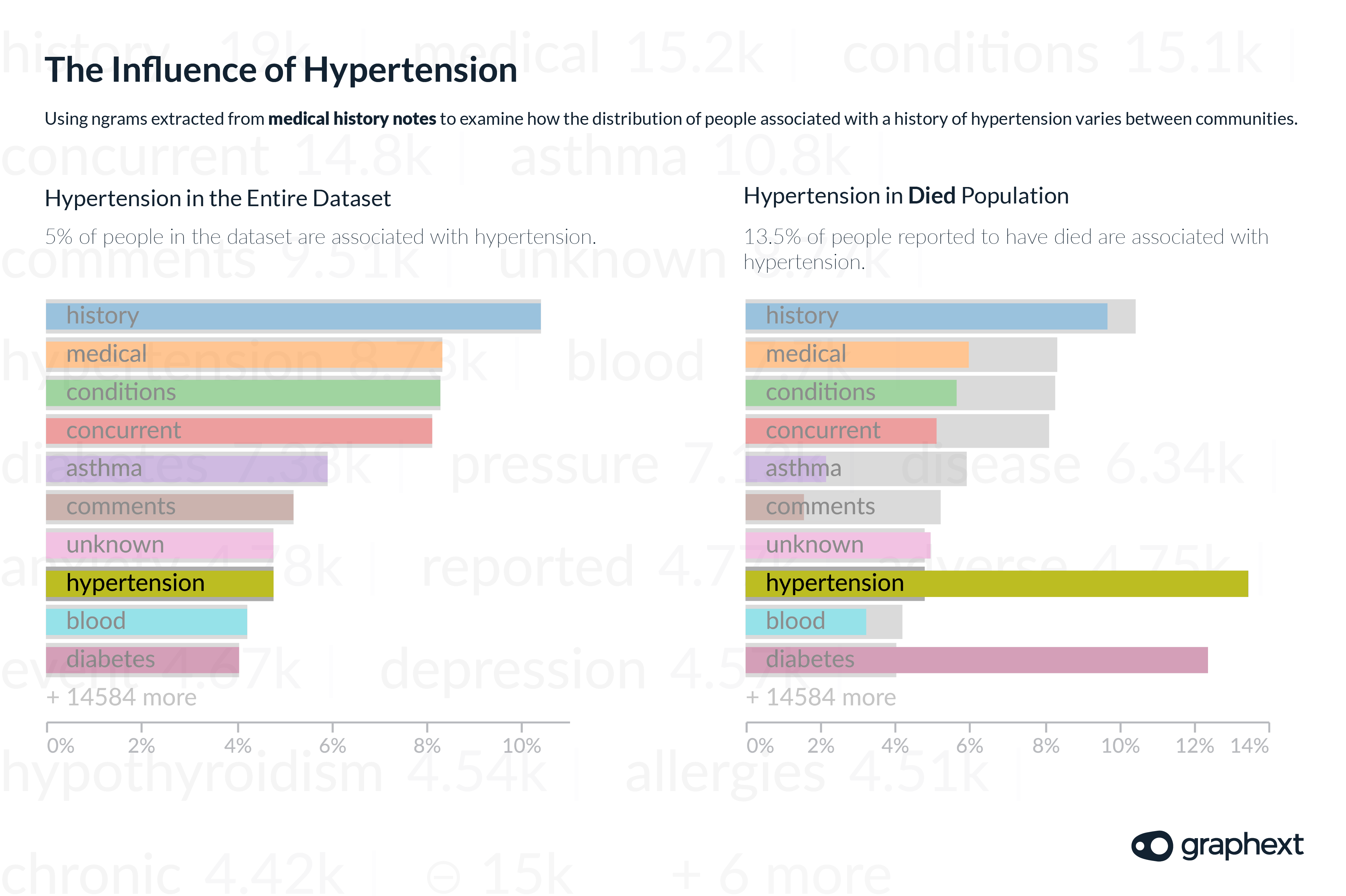
Hypertension
Turning our attention to more specific features of adverse vaccine reports, we began inspecting the keywords extracted by our NLP steps from the medical history notes associated with people in the dataset.
Hypertension - commonly known as high blood pressure - was noted 8731 times, signifying that approximately 5% of the dataset have a history of hypertension. Next, we filtered the dataset to display values exclusively for people that were reported to have died - 4015 out of a total of 182,559 - and again turned our attention to the relative distribution of keywords in the medical history notes column.
People associated with a history of high blood pressure account for 5% of the entire dataset but represent 13.5% of the population of people reported to have died.
This time the presence of hypertension was more notable. Of the 4015 belonging to the sample of people that were reported to have died - 13.5% were associated with hypertension in their medical history notes. The data here seems to flag an overrepresentation of people with high blood pressure amongst those that have been suffering the most severe events following vaccination. It should also be noted that due to the increased vulnerability that people with hypertension have in regard to COVID-19 - if this overrepresentation was validated by further research - then the benefit of vaccination would still outweigh the risk.
Men vs Women: The Distribution of Reports
The ratio of women to men in America is as good as a 50 / 50 split. But in the VAERS dataset, 73% of adverse vaccine event reports were made by women or on behalf of women. Striking our team as strange, we put this finding to the immunologists we spoke to. They highlighted several confounding factors which might be at play here.
Not only have more women been vaccinated in the USA but women also have a longer life expectancy in America compared with their male peers. An overrepresentation of women in older age groups could be contributing towards a bigger population of vulnerable women more likely to suffer adverse vaccine reactions. Other factors could include the possibility that men are less likely to report symptoms.
73% of VAERS reports came from women.
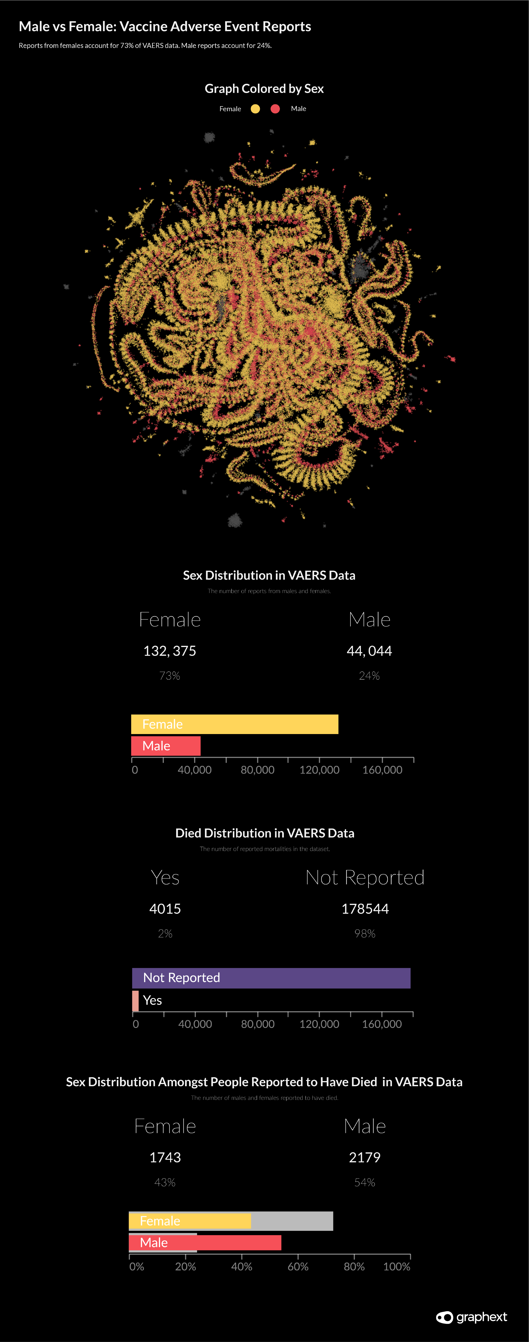
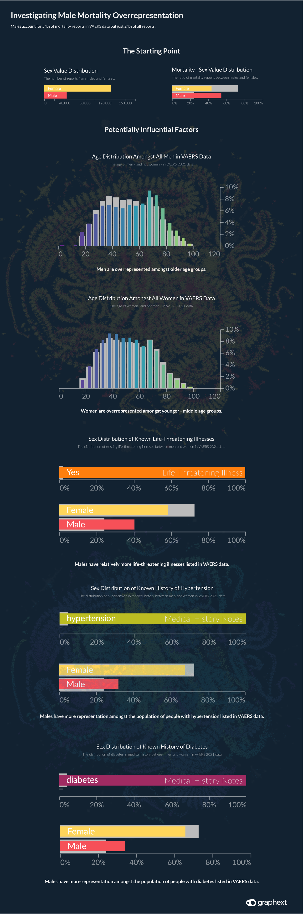
Male Mortality Rates
Despite only representing 24% of the dataset, males make up for 54% of deaths.
Despite only representing 24% of the dataset, men make up 54% of the 4015 deaths reported in the data. This is quite a substantial overrepresentation. Looking into the influential factors at play here, it is likely that some of the following points could be affecting this distribution.
- Men are overrepresented amongst older age groups reporting to VAERS.
- Men are overrepresented amongst the population of people with life-threatening illnesses in VAERS data.
- Males are also overrepresented amongst VAERS communities associated with hypertension and/or diabetes in their medical history notes.
- Men could be less likely to report less severe symptoms to VAERS.
"Vaccine safety monitoring of COVID-19 (and other) vaccines continues, and any safety concerns pertinent to particular geographic locations or risk populations are investigated appropriately."
CDC representative speaking with Graphext
The academics we spoke to emphasized the need to validate this finding before any definitive conclusions could be made about male mortality rates following a COVID-19 vaccination. It would seem counterintuitive that reports for the population of men reported to have died are spread fairly evenly across different vaccine manufacturers.
Further investigation of this statistic is probably required to explain it. Our team understands that this involves comparing results from an unvaccinated population with results from the vaccinated population - something that isn't possible using VAERS data alone.
But when we approached the CDC to understand if they were aware of this finding or investigating it - they avoided specific comments but instead said that "vaccine safety monitoring of COVID-19 (and other) vaccines continues, and any safety concerns pertinent to particular geographic locations or risk populations are investigated appropriately."
Kentucky & Puerto Rico Mortality Rates
Looking through the geographical distribution of people reported to have died, we discovered a crucial variation between the mortality rates across all states compared with those in Kentucky.
Recovery rates were lower and death rates were higher in Kentucky when compared with other states. The data suggested that although entries for Kentucky account for only 1% of the dataset - deaths in Kentucky account for 3% of all reported deaths. This statistic is 154.3% higher than the average mortality rate across all states. Similarly, the rate of people recorded as not having recovered from their symptoms is 22.4% higher in Kentucky compared with the all-state average for the same statistic.
Recovery rates were lower and death rates were higher in Kentucky and Puerto Rico when compared with other states.
In Puerto Rico, the same statistic was 375% higher than the all-state average. Although in our opinion, these qualify as findings that warrant further research, it is important to note the absolute figures here. Relative to the 182,559 adverse vaccine event reports in the VAERS dataset and the 277 million doses of vaccine given in the USA at the time of writing, the 52 deaths reported in Kentucky and the 32 in Puerto Rico seem less influential than they would initially appear.