How to Do Exploratory Data Analysis in Python

July 13, 2023
Short Studies
Alex Gonzalez
Alex Gonzalez

Python is the most popular language among data scientists for its simplicity and flexibility. Additionally, Python includes multiple libraries to deal with Exploratory Data Analysis (EDA). In this post, we'll perform exploratory data analysis on a dataset using Python code to solve each step of the exploration process.


In this example we are using a dataset that contains information about the marketing campaigns of a bank, and the conversions of the customers associated to the campaigns. The original dataset was uploaded in the UCI Machine Learning Repository.

By exploring and asking the right questions to the data, EDA becomes a powerful tool for data scientists, enabling them to perform analysis effectively using data visualization, without complex modeling.

EDA in python involves multiple steps including:

  1. Importing the libraries
  2. Importing the data
  3. Getting to know your data
  4. Data Preparation
  5. Data Analysis

1. Import the libraries

In order to work with data tables, generate exploratory data analysis report, perform mathematical operations, and create a visualization, we need to import a few libraries, which you can do by executing this code:

# Well known library to manage data tables and perform transformations on them
import pandas as pd

# Library to generate automatic EDA reports that include distribution, correlations, etc.
from pandas_profiling import ProfileReport

# Library to perform operations on arrays of numbers
import numpy as np

# Library including modules of statistics that are useful for EDA
import scipy

# Well known library to visualize data in python
import matplotlib.pyplot as plt

# Alternative visualization library with strong focus statistical basis and visual appealing charts
import seaborn as sns

2. Import the data

To import the data, if we have a CSV containing the dataset, in pandas it is as easy as to use the read_csv method.

# Import the data and store it as a pandas DataFrame
df = pd.read_csv("path/to/my/file.csv", sep=",")

It is worth mentioning Lector, an open source library for reading and importing CSV data. Lector is fast and flexible, performing automatic detection of files encoding and customizable type inference, and casting. Currently, Lector is used in Graphext to read CSV datasets optimally.

3. Get to know your data

Determine the number of rows and columns

After importing the data, it's time to get familiar with it. Understanding the size of the data is crucial, as working with thousands of rows is different from working with millions.

# Return a tuple with the nºrows and nºcolumns
df.shape

(11162, 17)

In this dataset, each row represents a client targeted by a marketing campaign. Therefore, the DataFrame contains 11,162 targeted customers with 17 different variables recorded.

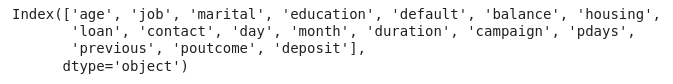
Retrieve the names of the columns

We can get the names of these 17 variables by calling the columns attribute from the DataFrame.

# Display a list with the names of the variables columns
df.columns


Look up the types of the columns

However, if we use .info(), we will obtain a list of the DataFrame columns together with additional information, such as the data type of each column and the count of non-null values.

# Display information about each column of the DataFrame
df.info()


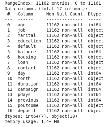
Now we know that we have 7 integer columns and 10 columns representing categorical data.

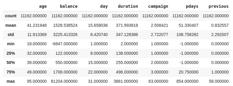
Get the statistics of numerical columns

Another useful method to get to know your data better is .describe() . This method returns the most important metrics for the distributions of the numerical variables, line the percentiles, the mean, the lowest and highest values, etc.

# Display the most important metrics of the numerical variables distributions
df.describe()

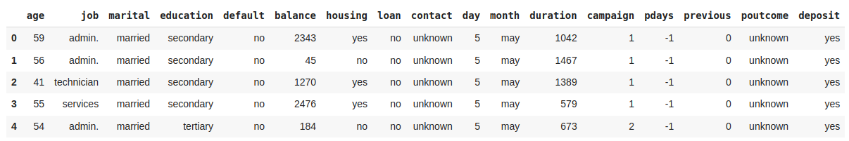
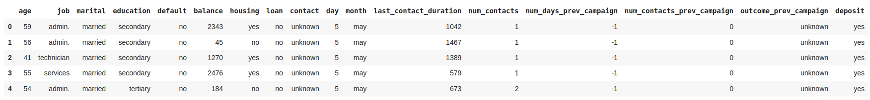
Visualize the first rows of the DataFrame

Another useful method when starting EDA is .head(), which allows you to display the first rows of a DataFrame.

# Displays the first 5 rows of the DataFrame
df.head()

Rename columns

Most variable names are self-explanatory, but some lack of clear names to understand what they contain. Let's rename these variables to improve the analysis. The inplace parameter indicates that the changes will be made directly to the current DataFrame, df.

# Rename some columns to more understandable names
df.rename(
    columns={
        'duration':'last_contact_duration', 
        'campaign': 'num_contacts', 
        'pdays': 'num_days_prev_campaign', 
        'previous': 'num_contacts_prev_campaign', 
        'poutcome': 'outcome_prev_campaign'
        }, 
    inplace=True)

Get advanced EDA report with pandas-profiling

Use pandas-profiling to generate a report that includes the distributions of all variables, the number of missing values per variable, the summary of all data types and all the relevant correlations found among the variables of the dataset.

# Generate report for DataFrame "df"
prof = ProfileReport(df)

# Generate iframe of the report
prof.to_notebook_iframe()

https://s3-us-west-2.amazonaws.com/secure.notion-static.com/44c08f2f-cf85-499d-9751-cc473ae06993/pd_profile_report.html


4. Prepare your data

Data preparation, also known as data preprocessing, includes all transformations performed on the data before analysis, including data cleaning and feature engineering. This process is done following the next steps:

  1. Deal with Null values
  2. Deal with duplicates
  3. Deal with outliers
  4. Transform data

Deal with Null values

We can start preprocessing our data by looking for null values. When we find null or NaN values there are three approaches to deal with them: 

  1. Remove rows containing null values.
  2. Drop columns with a high percentage of null values.
  3. Fill null values with an arbitrary value, such as the mean of the variable's distribution.
# Drop rows containing missing values
df.dropna(axis=0, inplace=True)

# Drop columns containing missing values
df.dropna(axis=1, inplace=True)

# Fill missing values with the median
df.fillna(df.mean())

Luckily, this dataset does not have any missing values in its columns. Therefore, there is no need to drop any rows. However, if we had encountered any NaN values, we could have used the dropna function as shown in the code above.

Deal with duplicated samples

Another common issue in data is the presence of duplicated samples. Usually, the data comes from traditional databases, and believe me it is not uncommon to encounter databases where the data is duplicated more than once or twice. Hence, it is important to check if our dataset has any duplicated samples and remove them if necessary using drop_duplicates.

# Displays the amount of duplicated samples in the DataFrame 
df.duplicated().sum()

# Drop all duplicated samples but the first appearance
df.drop_duplicates(keep="first", inplace=True)

Deal with outliers

Outliers are samples that deviate significantly from the rest of the data, and it is key to handle them to maintain the integrity of our EDA. One typical approach to detect outliers is by calculating the Z-score for each sample, which measures the number of standard deviations std  from the mean of the distribution to the . Observations with a Z-score greater than 3 are typically considered outliers.

One way to deal with the outliers is to drop all the rows containing outliers, but depending the variable and the use case we can decide to stick with them.
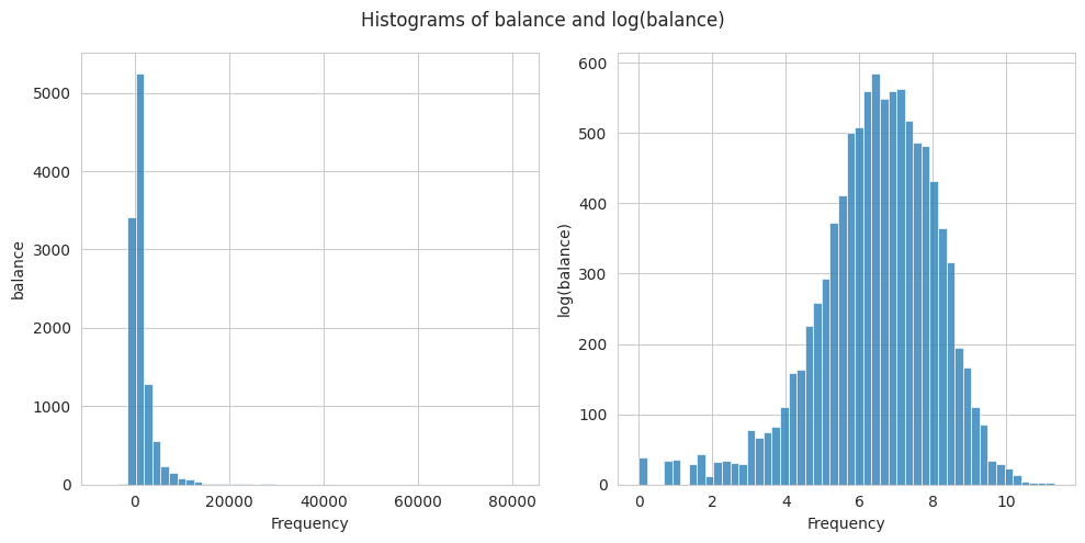
# Create a list with the names of numerical columns
numerical_columns = ["age", "balance", "day", "last_contact_duration", "num_contacts", "num_days_prev_campaign", "num_contacts_prev_campaign"]

# Keep the samples that do not contain any outlier (all Z-scores below 3)
df[(np.abs(scipy.stats.zscore(df[numerical_columns])) < 3).all(axis=1)]

Transform data

The Z-score assumes that the data follows a normal distribution to calculate the number of std away from the meanNonetheless, we often find distributions that are not following a normal distribution and are difficult to deal with. To address outliers originating from a right-skewed distribution, such as the balance variable, a possible solution is to apply a log transformation to normalize the distribution first.

# Create a new column with the log transformation of balance
df["log_balance"] = df['balance'].transform(np.log)

# Create a figure and axes
fig, axes = plt.subplots(1, 2, figsize=(10, 5))

# Plot the histograms of balance and log(balance)
sns.histplot(df['balance'], bins=50, ax=axes[0]).set(xlabel="Frequency",ylabel="balance")
sns.histplot(df['log_balance'], bins=50, ax=axes[1]).set(xlabel="Frequency",ylabel="log(balance)")

# Add a titles to the charts
fig.suptitle('Histograms of {} and {}'.format('balance', 'log(balance)'))

# Adjust the spacing between subplots
plt.tight_layout()

# Show the plot
plt.show()

5. Analyze your data

Data analysis is key when building a model, and in general when we want to find relationships with respect to a target variable. However, even without a specific target, data analysis can be useful generating relationships among the variables. The main steps to perform the data analysis are:

  1. Analyze the distribution of the target variable
  2. Identify the variables relationships with the target variable
  3. Visualize the relationships with the target variable

Distribution of the Target Variable

The dataset we are exploring includes the target variable deposit, which the marketing department aims to optimize. This variable is a boolean indicating whether a customer opened a deposit after being contacted in the marketing campaign. Hence, the objective of the analysis is to identify the strongest relationships between customers who opened a deposit and the other variables.

As Data Scientists the first thing we want to know is the amount of customers that opened a deposit.

# Plot a bar chart with the count of customer opening and not opening a Deposit
df["deposit"].value_counts().plot.bar()

# Plot the values of each category on top of the bar
plt.text(0, df["deposit"].value_counts()[0], str(df["deposit"].value_counts()[0]), ha='center', va='bottom')
plt.text(1, df["deposit"].value_counts()[1], str(df["deposit"].value_counts()[1]), ha='center', va='bottom')

# Set the labels and title
plt.xlabel('Deposit')
plt.ylabel('Count')
plt.title('Counts of Customers that opened Deposit after contact')

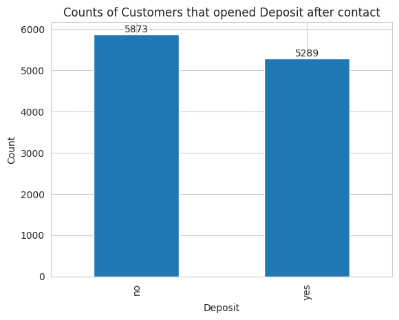
The dataset contains 5289 customers that opened a deposit after being contacted while the remaining 5873 didn’t open the deposit.

Identify relationships with the target variable

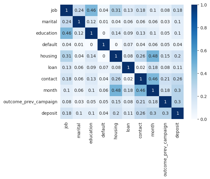
To quickly identify strong relationships with the target variable, we can plot the correlation matrix. However, since we have both categorical and numerical variables, the standard Pearson correlation coefficient, which only detects linear relationships among numerical variables, is not suitable. Instead, we can use Cramer's V coefficient to find relationships among the categorical variables of the dataset.

# Define a function that calcualtes Cramer's V coefficient among two variables
def cramers_v(x, y):
    confusion_matrix = pd.crosstab(x, y)
    chi2 = scipy.stats.chi2_contingency(confusion_matrix)[0]
    n = confusion_matrix.sum().sum()
    phi2 = chi2 / n
    r, k = confusion_matrix.shape
    phi2corr = max(0, phi2 - ((k-1)*(r-1))/(n-1))
    rcorr = r - ((r-1)**2)/(n-1)
    kcorr = k - ((k-1)**2)/(n-1)
    return np.sqrt(phi2corr / min((kcorr-1), (rcorr-1)))

# Store in a list the names of the categorical variables
categorical_variables = ['job', 'marital', 'education', 'default', 'housing', 'loan', 'contact', 'month', 'outcome_prev_campaign', 'deposit']

# Factorize the categorical variables, i.e., convert the categories to discrete numbers
df_factorized = df[categorical_variables].apply(lambda x: pd.factorize(x)[0])

# Plot the correlation matrix in a heatmap
sns.heatmap(round(df_factorized.corr(method=cramers_v), 2), annot=True, cmap='viridis')

On the other hand, to learn how the numerical variables are correlated to the binary target we can use the point biserial correlation coefficient.

# Define a function that returns the point biserial r between a numerical and a categorical variable
def pointbiserialr(x, y):
  r, p_value = stats.pointbiserialr(x, y)
  return r

# Store in a list the names of the numerical variables
numerical_columns = ["age", "balance", "day", "last_contact_duration", "num_contacts", "num_days_prev_campaign", "num_contacts_prev_campaign"]

# Factorize the categorical target. 
df["deposit_fact"] = pd.factorize(df["deposit"])[0]

# Create a DataFrame with the numerical variables and the factorized target
df_biserial = pd.concat((df[numerical_columns], df["deposit_fact"]), axis=1)

# Plot a heatmap with the point biserial r coefficients between the target and the numerical variables
sns.heatmap(pd.DataFrame(df_biserial.corr(method=pointbiserialr)["deposit_fact"]), annot=True, cmap="cividis")

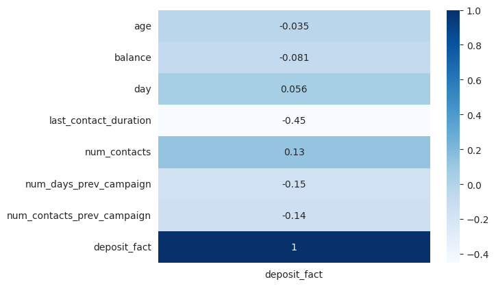
The correlation plots show that the target variable has no strong correlations with other variables but only moderate correlations. There is a correlation between the target variable deposit and last_contact_duration. Additionally, there are moderate correlations between the target and variables such as contactmonth, and outcome_prev_campaign.

It is important to note that other methods, such as Mutual Information, are recommended for calculating correlations among all variables regardless of their type.

Visualize relationships with target variable

In the previous sections, we discovered the strongest relationships with the target variable. However, we don't know the nature of these relationships. The best way to understand them is through data visualization. Different types of variables require different types of plots for optimal visualization.

Determine the relationship between a categorical and a numerical variable

To understand the relationship between a categorical and a numerical variable, we should look at how the distribution of the numerical variable changes across different categories. Two effective visualizations for this purpose are overlaid histograms and segmented boxplots.

# Create a figure with two subplots
fig, axs = plt.subplots(1, 2, figsize=(12, 5))

# Plot the overlais histogram on the first subplot
sns.histplot(data=df, x="last_contact_duration", hue="deposit", bins=50, element='poly', palette=["C2", "C3"], kde=True, ax=axs[0])
axs[0].set_title('Histogram')

# Plot the segmented boxplot on the second subplot
sns.boxplot(data=df, x="deposit", y="last_contact_duration", palette=["C2", "C3"], saturation=1, orient="v", ax=axs[1])
axs[1].set_title('Boxplot')

# Adjust the spacing between subplots
plt.tight_layout()

# Show the plot
plt.show()

The call duration is significantly longer for customers who ended up opening a deposit. This validates the hypothesis that longer conversations have a higher probability of conversion.

Determine the relationship between two categorical variables

To visualize the relationship between categorical variables, heatmaps are a useful tool. Heatmaps display the count of samples for each combination of categories and show the relative distribution of all categories from one variable across each category of the other variable. In addition to heatmaps, we can use clustermaps, which are special type of heatmaps that order the categories to highlight the differences using hierarchical clustering. 

# Create crosstab between the desired categories
df_crosstab = pd.crosstab(df.job, df.deposit, normalize='index')
# Create clustermap
g = sns.clustermap(df_crosstab, annot=True, cmap='Blues', fmt=".2f", col_cluster=False, cbar=False, cbar_pos=None)
# Add title
g.fig.suptitle('Clustermap')
# Plot figure
plt.show()


Additionally, relative stacked bar charts are effective for quickly visualizing the relative distribution, particularly when there are not many categories.

# Create stacked barchart
df_crosstab.plot(kind="bar", stacked=True, width=0.7, color=['lightcoral', 'limegreen'], title="Stacked barchart")
# Plot figure
plt.show()

The charts show clear relationships between certain occupations of the contacted customers and conversion. Students and retired individuals have the highest conversion rates at 75% and 66% respectively. In contrast, blue-collar workers (manual workers) and entrepreneurs have the lowest conversion chances at 36% and 38%.

Determine the relationship between two numerical variables

The scatterplot is a popular way to visualize relationship between numerical variables. It offers the flexibility to incorporate a 3rd and even a 4th variable by using color and size. To show the amount of information scatterplots provide, we have plotted age on the X-axis, log(balance) on the Y-axis (to lower the impact of outliers), marital status represented by color, and last_contact_duration indicated by the size of the data points.

df["log_balance"] = df['balance'].transform(np.log)
ax = sns.scatterplot(data=df, x="age", y="log_balance", hue="marital", size="last_contact_duration", marker="$\circ$", sizes=(2, 150), legend="auto")

plt.setp(ax.get_legend().get_texts(), fontsize='8') # for legend text

plt.show()

In the chart, one relevant pattern is that single customers are more frequent in the 20-40 age range. Besides, the chart displays that it is not very frequent to find older customers (>60 years) with low balances.

Top 3 challenges when using Python for EDA

Exploratory Data Analysis, as any other field faces some challenges, which need to be considered to achieve accurate analysis and this is why we built Graphext. Some of the most important challenges to have in mind during EDA are:

  1. Data Volume and dimensionality: Extracting insights from large and high-dimensional datasets with complex relations can be very challenging.
  2. Data Visualization: Choosing the right visualization to effectively explore variable relations in a meaningful and informative way can be very difficult.
  3. Time and Resource Constraints: Exploratory data analysis is time-consuming, and in many cases it is only the beginning of the work for a data scientists. Hence, making this process fast and simple would ease the life of data scientists.


Aim

The Data

Explore Yourself

Key Variables

Type of Analysis

Relevant Industries

Other stories

Ready To Get Started?

Ready To Get Started?

Let's dive into your data with Graphext. It's super simple, and you'll get your project ready in a few minutes.